

Klik4 :: Magazine
graphic design :: magazine design
Magazine design for Klik 4
The company Klik4 from Zagreb, Croatia sells promotional products with added service of print or embroidering on them. Since their offer is varied, with thousands of items in their offer, they decided to create a magazine that would serve as a way to present their offer, services and trends in the industry for each season. This type of advertising is very necessary when the company has such a large range of products and services, to help clients with new ideas for gifts or promotional items, to promote new products or services on offer, and to inform about upcoming promotions.
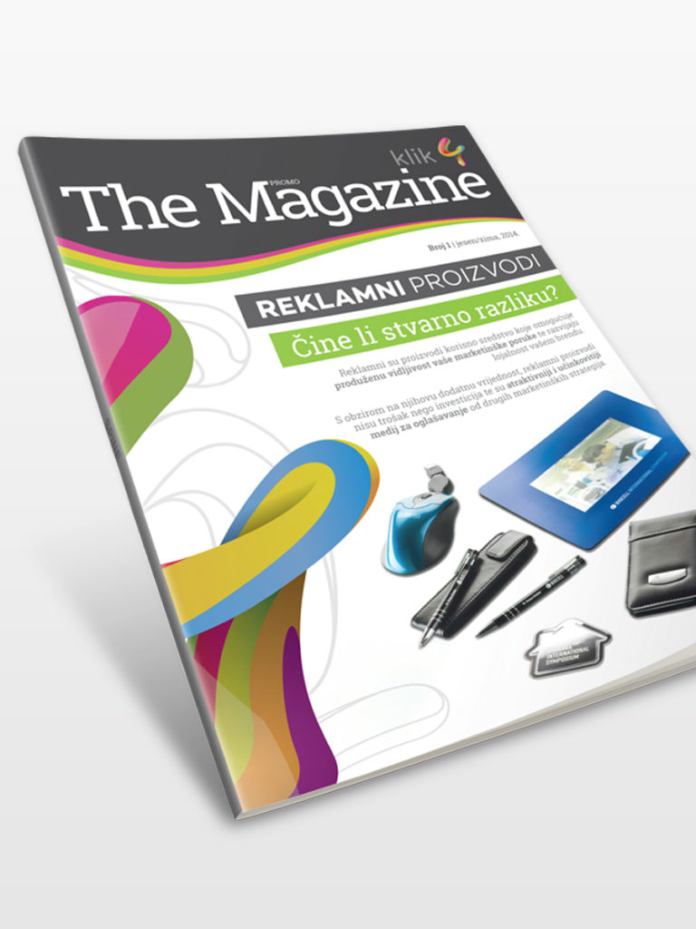
The motif of the design was the colorful and cheerful Klik4 logo. When we have such a distinctive design element, why not use it as a theme and strengthen the company’s brand recognition.
Rules for the design of magazines, books and catalogs
When we mention design, the well-known saying that we don’t judge a book by its cover falls flat. The design of the front page (cover) of a book, magazine, magazine or catalog is extremely important. The goal of every design is to get your product or service noticed, to attract potential new clients, to present yourself and the new product or service in the best possible way. All this should be taken into account when we talk about the design of the front page. Of course, the magazine design for every company will not be the same. Some companies want to make a more serious impression, some more relaxed. So the design should be adapted to the needs of each client, but there are some rules that should be respected anyway.
Most successful covers follow the same format. The main title, the first subheading that usually refers to specific content within the magazine, and one or two smaller subheadings that further clarify what is in the magazine. Also, don’t clutter the cover with too much text, images, or multiple types of fonts. You want the cover to be legible and it is immediately clear what the magazine is about.
Bright colors should not be avoided, in fact, sometimes a strong color can attract attention better than other design elements, but make sure that the color does not distract from what the client is selling. Color should be an accessory, not the main actor.
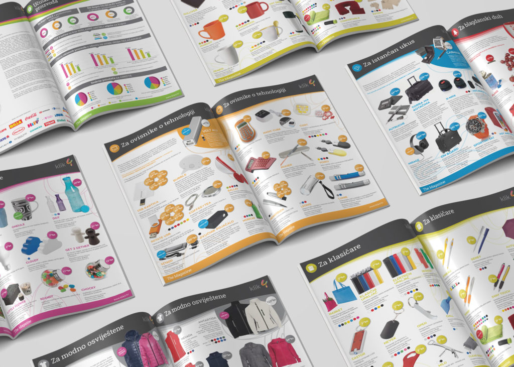
When we talk about the design of the interior part of the catalog, functionality should come first. The magazine should primarily be readable, reviewed and well organized. In order to break the monotony of text or many images, inserting infographics, graphs and similar design elements is desirable, but do not overdo it. Moderation is the key to good design.
The back is usually reserved for contact information, although it can also serve as an advertising spot for some future projects in the works.
Browse Klik4 Magazine:
See our other works from the Print category.
If you need a magazine design, contact us via the form or send us an email.
See our works from other categories in our portfolio.
If you want to know more about design, visit our blog, where articles on various design topics await you.
Zale Design Studio