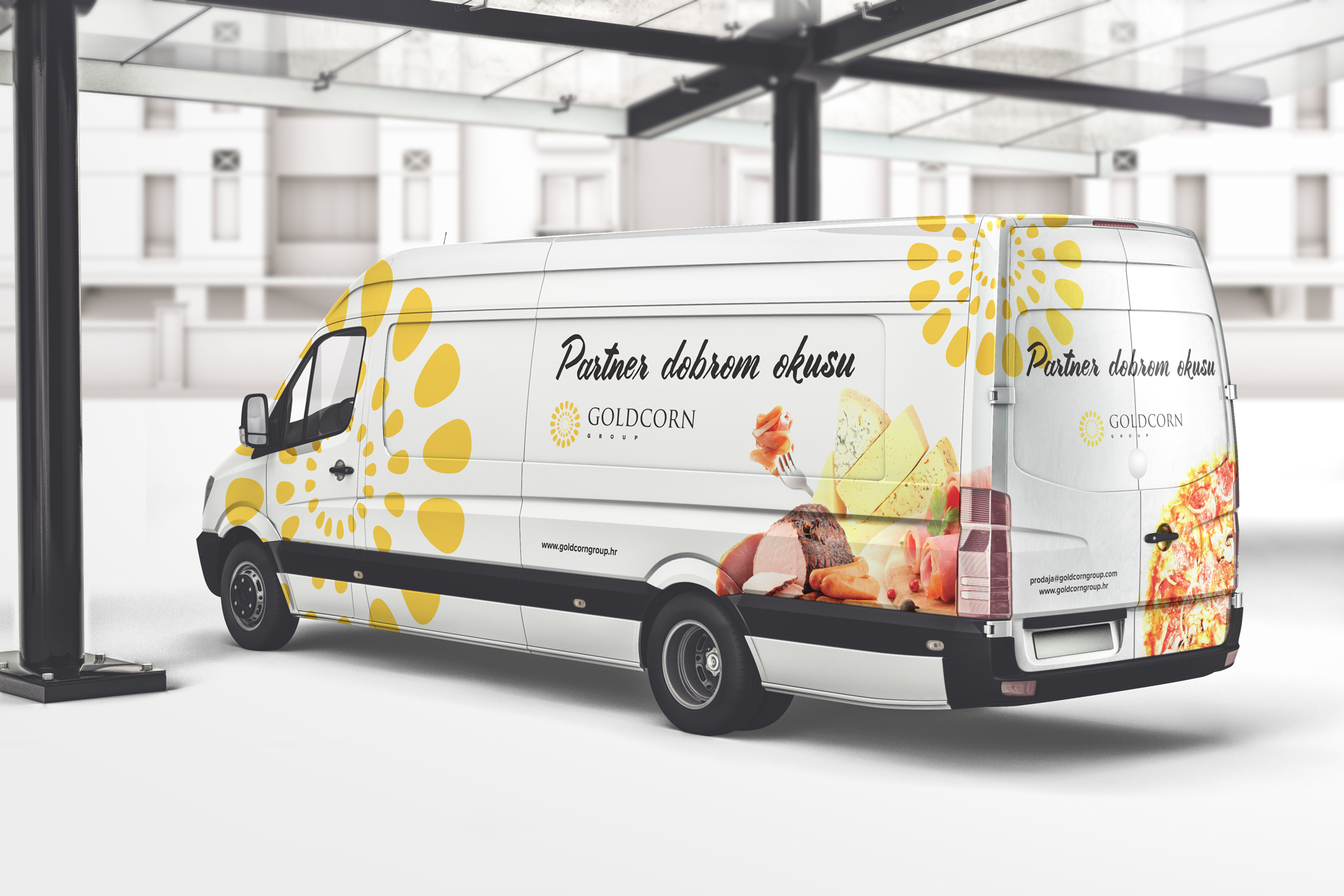
Goldcorn :: Vehicle Wrap Design
graphic design :: vehicle wrap design :: copywriting :: creating slogans
The company Goldcorn from Zagreb contacted us to come up with a design for their vehicles. Their main activity is the distribution of food products, which means that their vehicles are an essential part of their daily business. Vehicle wrap design is not only a good way to create a recognizable brand, but it is also one of the more effective types of advertising.
In addition, they wanted to strengthen their identity with a catchphrase (slogan), so they also asked us to do that part of the job for them.

A few rules for a good slogan
The slogan they chose is “Partner to good taste” as you can see on the design of the vehicle itself. How did we come up with that slogan and what should you pay attention to when coming up with catchphrases? Slogans should be short. Very short. The unofficial rule is that there should be no more than 5 words in a slogan. Of course, there are exceptions to this rule, but they are rare. Even more rare is that they are successful. Also, don’t use vague terms and empty phrases as catchphrases. Although we see it often nowadays, such catchphrases are not memorable. They do not convey any message and it is difficult to connect with them. A slogan should have a meaning that reflects the company’s mission or purpose. A good example of such a slogan is the slogan of Toyota – Let’s go places. The slogan should reflect the activity of the company or product, the value that the customer receives and evoke emotions.
“Partner to good taste”
Why “Partner to good taste”? As we said, Goldcorn is a distributor of food products, and their clients are many well-known bakeries and restaurants. Since we had the opportunity to try some of their products ourselves, we knew that the products were of top quality, and therefore of good taste. It was not difficult then to combine their activity as a partner of many catering establishments with their value: the quality and feeling of delicious food.
Vehicle wrap design
When designing the vehicle wrap, we used their logo as the main design motif. The logo, as can be seen in the picture, is a yellow circle representing wheat and the Sun. By using the logo as the main design element, we wanted to strengthen the recognition of the company and help strengthen their brand identity. In addition, we incorporated an image of food products so that the viewer immediately knows what the company does. The name, logo and slogan of the company is located in the middle of the vehicle and on the back.
Why is vehicle wrap design important and what should you pay attention to?
Every day we spend hours outdoors, either as road users or as pedestrians. Numerous vehicles pass us. Your vehicle advertisement can be seen by hundreds of people every day. This is one of the cheapest and most effective forms of advertising.
When designing vehicle wraps, especially larger ones for vans and trucks, you want to create a design that will draw attention but still convey a message about your company, product or service. Although the design of the vehicle is traditionally decorated with a strong design: the use of bright colors, illustrations and graphic elements, care must be taken not to distract attention from important information: such as the name of the company, the service offered and other important information. We usually see the vehicle in motion, so the design only has a few seconds to attract the audience’s attention. This is why strong color palettes, illustrations and images are used for vehicle wrap design. Once the design catches the audience’s attention, they only have a short time to read the message. Do not cram vehicles with too much text. Reduce your message to the most basic information, and a good designer will help you convey the rest of the message through the use of design elements.
If you need a slogan or vehicle painting, feel free to contact us via the contact form or send us an email.
For more of our designs, visit our portfolio, and for interesting design articles, visit our blog.


