

Billboards and posters for “Croatia Without Fur”
graphic design :: billboard design :: poster design
Design of Billboards
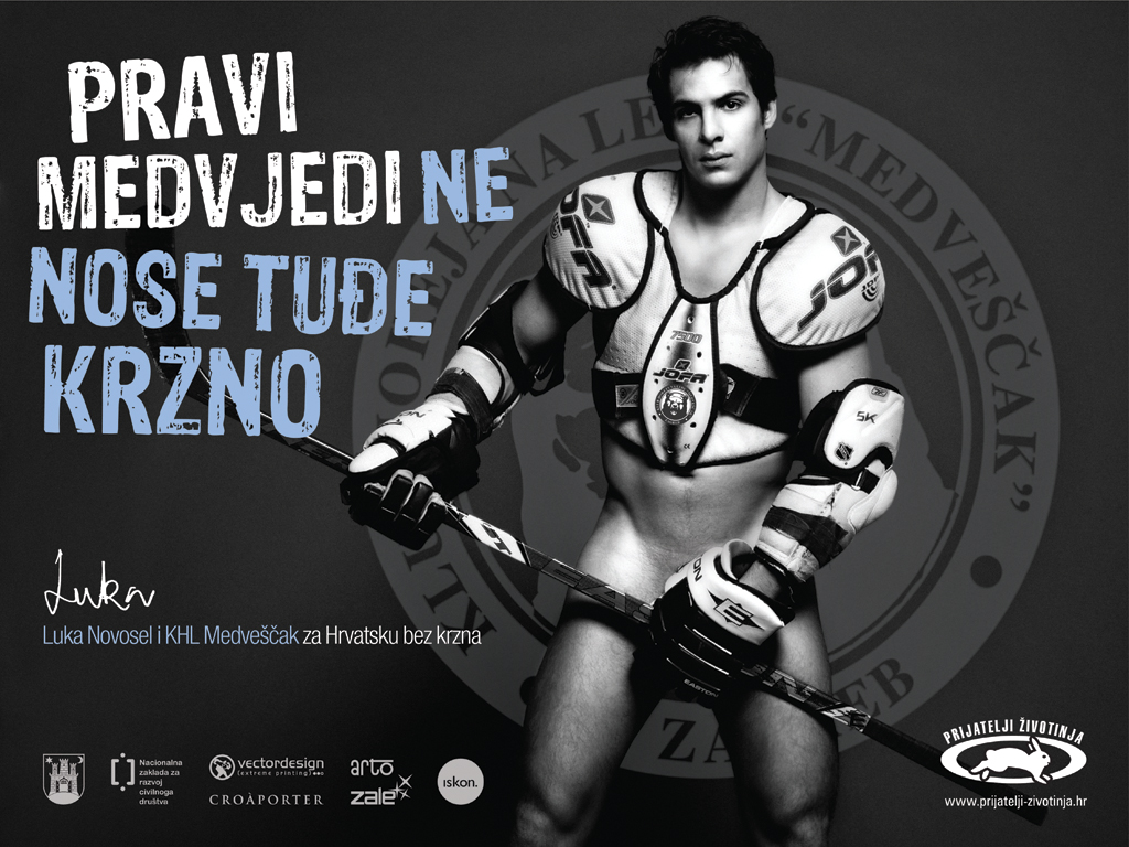
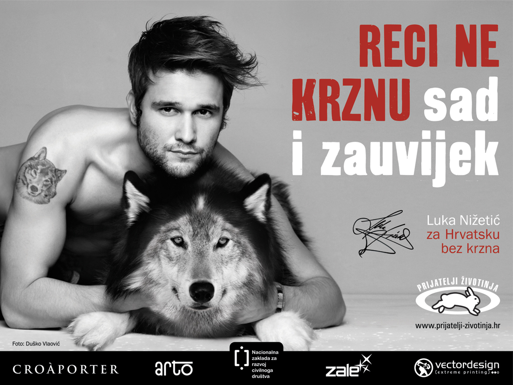
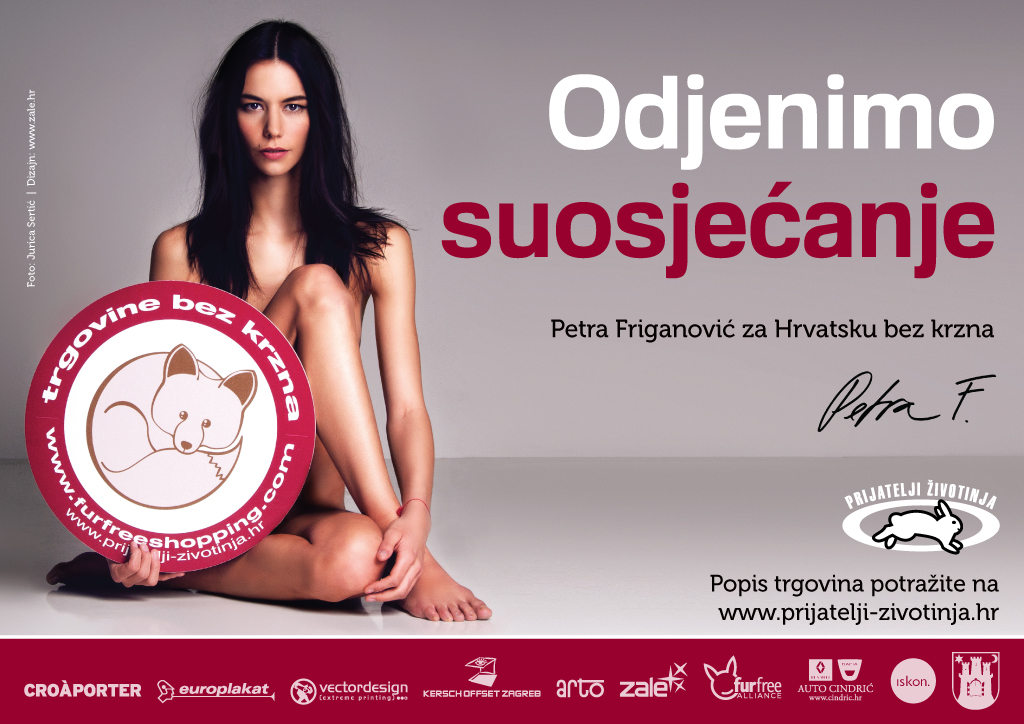
Design of billboards and posters for the Animal Friends of Croatia campaign called “Croatia Without Fur”. The aim of this campaign was to shed light on the problem of production and sale of real fur and to raise the level of awareness of citizens to help introduce a ban on the cultivation and sale of real fur. The campaign was successful with the help of many celebrities such as Luka Novosel, Luka Nižetić, Đurđica Vorkapić, Petra Friganović and many others, and our task was to graphically process and design each photo and prepare them for printing.
What is important in billboard design?
FONT
When designing billboards, one of the most important things is that the design is readable, because we know that billboards are most often viewed (and read) in motion from the vehicle and read from a great distance. The choice of font is also something that needs to be considered. It is best to use a thick font that is noticeable. Thin fonts for this type of advertising should be avoided. They will not attract attention and are difficult to read at speed or from a great distance. Thin lines, when viewed from a great distance, often fade or look broken up and because of that the message of the poster can be completely lost. Italic and decorative fonts should also be avoided. Follow the rule, that in this case, simplicity is the way to go.
Size
When it comes to billboard design, size does matter. Don’t be afraid to make the text, logo or any other design element, bigger. Even if your design looks great on your computer screen and you don’t want to change the size of the text because it could “spoil” the aesthetics of the design, you should always keep in mind that for designs of such large formats, the rule applies: how it looks on the screen is not the same as how it will look out in the open.
While the text and the logo get bigger, the content should get smaller. Don’t clutter billboards with too much text or photos. The audience only has a few seconds to read the text of the ad and see the pictures and to understand what the ad is about. Too much text or images can lead to the ad not fulfilling the task it was intended for, attracting the attention of customers. The message must be short, and a good rule of thumb is not to use more than 7 words for the main text.

COLORS
Don’t be afraid to use strong colors. For this type of design, it is better not to stick to complementary colors, but to work on contrast. Strong colors are more noticeable, easier to read, and with the addition of contrast, the billboard will surely be noticed. Just make sure the background doesn’t attract more attention than the message itself. It should be simple and not distract from the main purpose of the ad itself.
CONCLUSION
The rule in billboard design is to be bold, creative and noticeable. Always keep in mind that the goal of a billboard is not to convey the whole message. Its purpose is to get customers to visit your website, store or concert. The best billboard is the one that contains only the basic information, and for additional ones, clients will contact you directly if the billboard campaign was successful.
If you decide to design a billboard, these are some of the things you should pay attention to, and if you like our billboards, feel free to contact us via email or contact form. Also, contact us if you have any additional questions, and you can find more information about graphic design on our blog, where we touch on many interesting topics.
Zale Design Studio