Labels :: How to Design a Quality Label
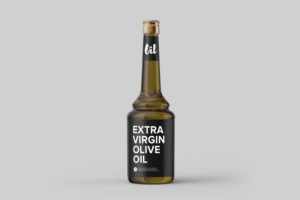
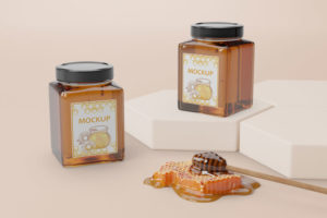
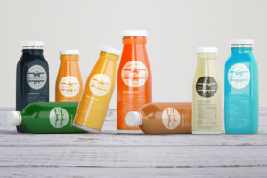
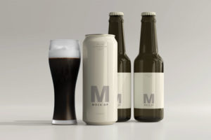
When we think of graphic design we will probably first think of logo, catalog or website design, however label design is just as important and sought after part of design as these “more famous” elements. When you think about it you realize that label and packaging design are probably the most common graphic designs in our homes and the ones we encounter the most in everyday life. Labels are everywhere, on cosmetics, cleaning products, beverages (labels on bottles of wine, beer or juices) and food (labels for honey, jams or oils). So, in this blog we will talk about label design: what labels are, how to design a quality label and what it should contain.
Let’s start with the definition.

What is a Label?
A label is a small piece of paper, fabric, plastic, or other material that is attached to an object and contains information about it.
Label Making and Design Process
1. Research
 While many skip this step, it is one of the most important and should really not be neglected. Good research is the key to high quality and successful design. Two types of research need to be conducted.
First, the target market for the product should be explored – who will use it, what is their age, gender, what are their interests, where do they live (country, city). All this information is extremely important when choosing the type of design will represent the product. The design of a label for a wine that is liked more by younger customers is not the same as the design of a label for a wine that is intended for more senior customers. It is also not the same to design a label for the market in Japan as in Croatia. Design elements are used to attract certain groups of people. Therefore, it is important to know in advance who the product is intended for.
Then the competition needs to be researched. We want to avoid that design resembling that of competitors. We also want it to stand out next to their products. Often products stand side by side in stores, so label design needs to be unique compared to the competition so that it attracts the attention of potential customers.
2. Client Communication
 Communication with the client before the label is made is one of the key elements in the process. As with creating a visual identity or logo, the label should represent not only the product but also the company or people behind that product. Talking with a client usually reveals features unique to them and their product. This information can be used in the design to make it more personal and to help the design stand out from the competition.
Information that should also be obtained from the client, is there a logo that needs to be added to the design, is this the first product made for the company or are there more products and then the design should match them. It is not the same to design a label for the first product in the line or for an already existing and well-known brand that has recognizable design elements that need to be incorporated into a new label.
After obtaining all the necessary information, proceed to the next step:
3. Dimension and shape of the label
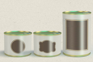 Not every label is the same size and shape. Some are in two or more parts (eg front and back as on many beer, wine or oil bottles). It can also be a larger label that is pasted on the packaging. The shape of the packaging is usually rectangular (horizontal or vertical). However, some labels can be of other geometric and even irregular shapes. Dimensions and shape are adapted to the packaging of the product.
After a client submits the data about the packaging, a designer agrees with a client on the exact dimensions and shape so the design of the label itself can begin.
4. Hierarchy of information
The first step in label design is to organize the information and design elements to the appropriate dimension of the label and with the appropriate hierarchy of information.
Labels are usually small in size and there is limited space for all the necessary information. That is why layout design is extremely important.
Each label must contain certain information. A good design will highlight the most important ones such as the name and description of the product, logo and slogan. The less important ones, such as nutritional values, ingredients, and other information required by law, will usually be placed on the least visible part of the label (usually the back of the product).
5. Visual and design elements, colors and fonts
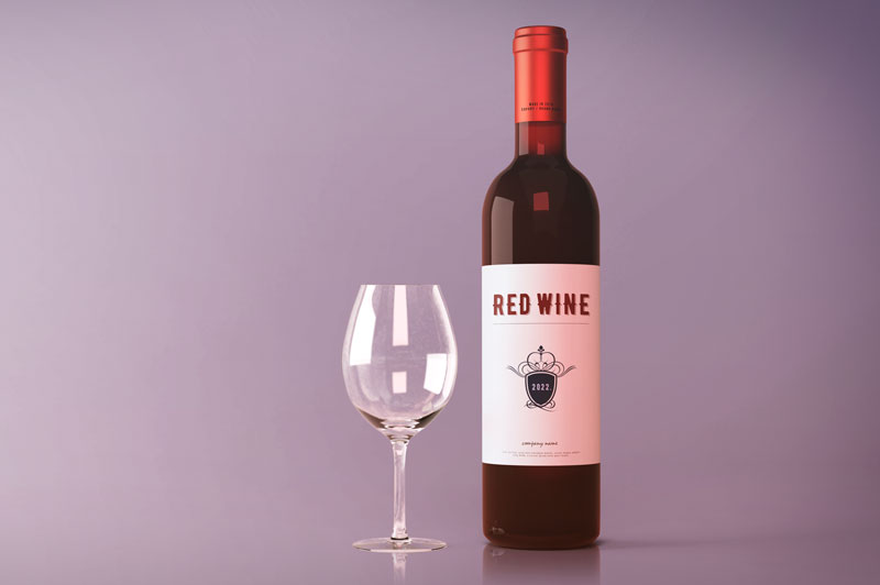
Visual elements are photographs or illustrations used in design. They are a particularly powerful tool for creating a certain atmosphere or provoking emotions in the client. The type of visual elements that will be used depends on the product for which the design is being created. Famous visual elements are photographs of vineyards or grapes on wine labels, interesting illustrations on beer labels (such as Staročeško beer decorated with bird illustrations) or olives and olive groves on olive oil labels.
COLOR and fonts
Color selection is a very important part of label design. The choice of color depends on the product for which the label is designed, its target audience, the colors used by the competition and their meaning. Colors are used to distinguish the product from the competition and attract the attention of customers. They must follow the content and purpose of the product itself.
As important as color is the choice of typography or fonts. As we said, the space on the label is limited and we want fonts that will be easy to read, noticeable, but also suitable for the product being sold.
It is also important to choose the design that matches the price of the product. If the lower priced product looks too expensive it can divert the customer from even looking at it. And vice versa. If you have a high quality product, it’s design has to communicate that.
When designing a label, a common mistake is to try to squeeze as much information, design elements and colors into a small area. A harmonious design will attract more attention than one that may be noticeable but vague. The goal is for the visual elements to be interesting and unique, for the colors to be harmonious and appropriate, and for the typography to be clear and legible. A label designed in this way will surely serve its purpose of attracting the attention of customers.
6. Print and Printers
The last part of the process is choosing the type of print to be used and printing company that will make the designed label with high quality print. Labels can be printed onto a paper which is then glued to a packaging or the print can go directly onto a packaging.
There are many types of print, as well as the types of paper and materials on which the label can be printed. From glossy, embossed, matte or metallic printing, the choice will come from agreement between the client, the designer and the printer. A good printer will know which types of printing are suitable for which materials and which combinations are best feasible for a particular product.
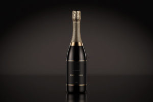
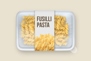
What information is legally required to include in labels in Croatia?
As mentioned earlier, when making labels, you should keep in mind that part of the space must be reserved for content that is legally regulated. Product labeling in the Republic of Croatia is determined by the Consumer Protection Act, more precisely by Article 6, which states:
(1) Products offered to consumers in the territory of the Republic of Croatia must contain on the packaging, pendants, labels or on the product itself:
- basic product characteristics to the extent necessary for the consumer to make a purchase decision, such as product name, product type and model, name under which the product is sold, product composition, properties and technical characteristics of the product
- the name and registered office of the manufacturer or importer established in the European Union.
(2) The information referred to in paragraph 1 of this Article must be clear, visible and legible and written in Croatian and Latin script, which does not exclude the possibility of simultaneous use of other languages, and may include signs and pictograms easily understood by consumers.
(3) If they are written in several languages, the data referred to in paragraph 1 of this Article must be written in the same manner.
(4) The directive of this Article shall not apply to products whose labeling is regulated by a special regulation.
Some products are subject to additional legal obligations such as cosmetics, food, etc., which you should keep in mind and conduct additional research as needed.
CONCLUSION
All necessary information should be gathered before proceeding with the label design and production process. The whole process of making a label is easier and will move faster if the designer has all the necessary elements before starting work. Since the space for label design is limited anyway, even the smallest modification can mean a change in the entire label layout for the designer. This will make the manufacturing process longer and therefore more expensive. So we recommend that before starting work, you review in detail with the designer all the elements that will go on the label itself so that nothing is left out.
We hope that we have explained to you the design of labels and that you understand the process a little better now.


