7 Types of Logos
In our blog, we have already written about logos, their history and importance in modern business, and in this article we will clarify their types. Although more logo types can be found than these seven, we have stuck to this figure as it covers the most commonly used types.
1. Pictorial Mark (Logo Symbols)
We put logo symbols at the top of this list because it is perhaps the most famous type of logo. When you think of a logo, you probably think of a bird symbol from Twitter or a bitten apple from Apple. These are a graphic icons that represent a company or product. Although icons are most often used in combination with the company name, as we will see below, this type of logo is one of the most effective.
Our brain remembers symbols more easily than words, so in that way it creates a stronger connection and recognition towards a brand. However, it is only recommended for companies that already have a recognizable brand identity. The ones that can discard the company name to keep only the icon as their visual representation.
Although the symbol can be used by new companies, there is a greater risk that the company will not be recognized by name but only by the symbol. So there is a danger that potential customers will not know who stand behind certain product or a service. But there are exceptions. The logo as a symbol is extremely popular in the design of mobile applications. Since only the application icon will be visible on the devices, many companies choose to just use the logo symbol instead of the text name on the icon. In this case, the company symbol can also serve new companies and products to stand out from the competition and create strong recognition from the very beginning.
Well-known examples of pictorial marks are: Apple, Snapchat, Shell and Twitter
2. Lettermarks and Monograms
Monograms are the oldest form of logo. They have been in use since ancient times till the present day and still remain one of the most popular forms of logos. A monogram is a symbol created from, most often, the initials of a person or a company name. It is made in a way that the letters are connected or overlapping each other. It usually contains two letters although it can contain three. In ancient Greek times, they were used on coins or stamped into objects to prove ownership. Nowadays, they are used as representatives of companies or products.
Lettermarks are as popular as monograms are. The difference between a lettermark and a monogram is in the connection. While in monograms the letters are connected or overlap, in lettermarks the initials form a separate word (examples are HBO, CNN, IBM, etc.).
WHO SHOULD USE THEM
Choosing these types of logos is a smart choice for companies and organizations whose names are long. Also for companies that have a presence in the global market and their name may be difficult to pronounce or be remembered for foreign speakers. Choosing such logos can be a choice for people who simply do not like logo icons and want a simpler and more classic aesthetic approach to their logo.
With monograms and lettermarks, the choice of typography is extremely important. Since they are composed of only a few letters, it is necessary that the typography is clear, legible and that it corresponds to the business it represents. The choice of color should remain simple. Monochrome monograms and lettermarks are the most popular, especially black ones, although it is not uncommon to see them in bright colors (like H&M, CNNa).
Some of the most famous monograms come from the fashion world. Fendi, Chanel, Guci, Louis Vuitton are just some of them. Well-known lettermark logos are: NASA, IBM and CNN.

3. Wordmarks
Typographic logos or wordmark, are very simple – text. They do not contain any symbols or interlaced letters. This is, simply put, a beautifully edited text. But this does not mean that such a logo will not be noticeable, interesting or recognizable. Some of the world’s most famous logos are of this type.
With a wordmark logo, typography or font selection is, of course, the most important part in the whole process. Although existing fonts are usually chosen, some companies want a unique look and choose to create their own original font that will represent only them. Although this is not necessary for the logo to be recognizable.
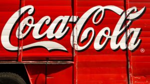
COCA-COLA LOGO
One of the most famous and recognizable typographic logos is the Coca-Cola logo. Created by a designer named Frank Mason Robinson in 1885. , the font used was known as the Spencerian font which was extremely popular from 1859. till 1925. in the United States of America, which did not diminish the longevity or popularity of this logo.
Another reason to use your own font is the fact that the wordmark logo in many cases cannot be protected by copyright as many do not exceed the threshold for originality. One of the better known examples of using their own font is Google. The font used for the current logo, as well as for the overall branding, is the Product Sans font that was created in 2015. by the Google team.

Apart from the choice of font, this typographic logo can also stand out with the correct use of colors. Toy’r’Us, a toy company, used the wordmark logo. In addition to the playful font selection, they also chose colorful colors that represented this cheerful business. While in the case of logos such as L’Oreal, we see a simple and thin font in classic black, which is more in line with the company’s cosmetics business.
The Wordmark type of logo is good for companies and products that have a unique name that customers will easily remember.
The most famous wordmark logos are: Google, L’oreal, Ebay, The New York Times and Netflix.

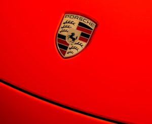
4. Emblems
Emblems are a type of logo where the name of a company or product is incorporated into a design, usually within a frame or border. This group includes badges and coats of arms. Emblems are a very old form of logo design. They have been used as representatives of royal houses, but nowadays they are most often found in sports clubs, the automotive industry and companies that want to give the impression of stability and strength or that strive for a more traditional look.
For emblems, it is important to use a simple and easy-to-read font. It must also be noticeable because the name of the company or product will be surrounded by other design elements and we want the name to stand out among them. Illustration, icons and other design elements should also be as simple as possible and their use should not be exaggerated. We want the logo design to be simple and harmonious. The problem with emblems is that if too many details are used, they can be difficult to apply to different sizes (especially smaller ones) and their use can be limited. Therefore, in this case, the real golden rule is: less is more.
Some of the more famous representatives of emblem logos are: Starbucks, BMW, Porsche, Warner Bros. and Harley-Davidson.
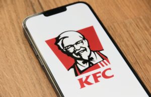
5. Mascots
A mascot is an illustration of a fictional character representing a company or product. Mascots are most often used for products and services intended for the younger population or families. In Croatia, a good example of a mascot would be Lino from Podravka and Medo from Ledo. Mascots are cheerful, interesting, easy to attract attention, especially for children, and it is good to use them as characters in video commercials and product packaging. However, they have limitations. Because the design is extremely detailed, mascots cannot be used on some materials.
The most famous logos with mascots are: KFC, Pringles, Bic and Michelin.
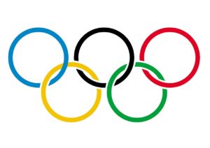
6. Abstract logo marks
An abstract logo is a type of pictogram logo, but in this case it does not use a recognizable image or icon (like an apple or a bird at Apple and Twitter) but an abstract geometric shape. It is a conceptual image that evokes a strong impression and emotion in the viewer, and is related to some specific part of the company’s activities or product characteristics. What makes this type of logo attractive to many companies is its versatility.
Although it doesn’t seem like logos like this are common, in fact this type is one of the more popular ones. If you pay attention, most of the logos you see are abstract. It can be an abstract flower, as with the Adidas logo, an abstract letter “A” with the Airbnb logo, or two circles with the Mastercard logo. They are just as recognizable as literal symbols, and are easier to apply to different products, making them a good choice for companies that have a larger range of products or more business orientations.
The most famous logos with abstract symbols are: Pepsi, Olympic Games, Nike, Adidas, Airbnb, Toyota, Mastercard and Mitsubishi.
7. The Combination Mark Logo
We put the combined logo at the bottom of our list, not because it is the least popular, on the contrary, this type of logo design is the most popular, but because, as the name suggests, it is a combination of all the previously listed types.
Such a combined logo is a combination of typographic logos (wordmark, lettermark or monogram) with an emblem, mascot, abstract logo or pictogram.
The design and production of such a logo is the standard of most design studios because it combines the name of the company and the symbol of the company which helps it to create a strong brand. The icon and text can stand side by side or can be joined together to create an image. An example of a blended logo design is Burger King or Lay’s, where the company name is contained within an abstract icon that can stand alone or with the company name.
Some of the most famous combined logos are: Amazon, Dove, PayPal, Samsung, Puma and Ikea.

CONCLUSION
There are many types of logos, and when we have many options, sometimes it is difficult to decide. If you don’t know which logo would best suit your company, feel free to contact the experts who will use their knowledge and experience to help you make the right choice.
If you liked this article, be sure to visit our blog where you will find many more articles on the topic of graphic design.
You can view our works, including logo design, on the portfolio page.
For information about creating a logo or about other services, feel free to contact us via the contact form, social networks or by email.
Thanks for reading! 🙂
Keywords: types of logos; logo design; graphic design