LING :: Visual identity and book of standards
graphic design :: visual identity :: branding :: logo design :: motion graphics :: book of standards :: brand book
Creating a visual identity: The design behind the LING logo

At the center of every company and brand is a symbol that reflects its values. Our recent collaboration included the creation of a visual identity and brand book for LING – legal engineering, where tradition meets innovation and creativity in a harmonious logo.
LING logo and its meaning
In the book of standards, LING introduced itself, so we will use their words to introduce them: “LING – Legal Engineering is a carefully crafted acronym and symbol that carries a deep meaning.
The first letter, “L”, proudly represents the word “Legal”, signifying the legal expertise that is the basis of the company’s operations, its strong connection with the legal aspect of business and dedication to the legal activity from which it originates. On the other hand, the suffix “ING” is not just a random combination of letters. This combination has a deep historical meaning, an homage to the company from which LING originated – Inženjerski biro. In this way, the connection with tradition is preserved and at the same time it creates a bridge to the future, where innovation plays a key role.
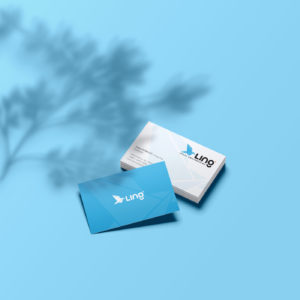
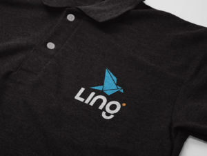
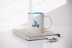
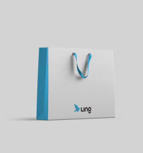
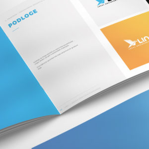
The logo is made of regular geometric shapes: triangle, cube, circle and their combinations. The shape of the bird, a stylized carrier pigeon, is made of triangles and symbolizes the transmission of information and freedom and perspective, key elements in legal engineering that require creative thinking and out-of-the-box solutions. The textual part of the logo, also made of regular geometric shapes, further emphasizes precision and attention to detail.”
Palette: a palette of meaningful colors
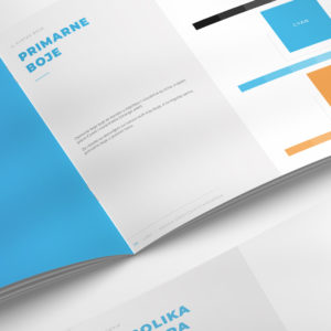
Black: Serves as a foundation, representing stability, professionalism and LING’s commitment to the reliability of their services.
Light Blue: Denoting trust and stability, this shade reflects their commitment to reliability in every aspect of their business.
Orange: a dynamic and energetic color, which symbolizes the warmth, interaction and vivid relationships that LING cultivates with its clients.
The combination of light blue and orange not only serves as an accent color, but also symbolizes the connection between LING and their parent company Inženjerski biro.
Book of graphic standards (brand book) for LING
The book of standards or as it is also called the brand book for LING – legal engineering serves as a comprehensive guide, describing in detail the visual identity that defines the essence of the organization. It is more than just a collection of guidelines. It is a strategic document created to ensure consistency, clarity and resonance across all brand touchpoints.
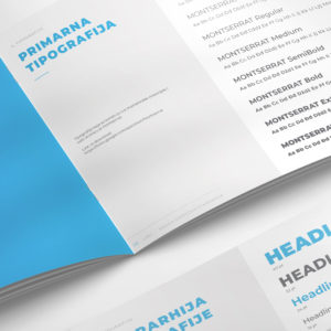
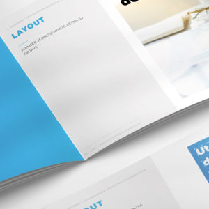
This detailed guide outlines the key elements that make up a brand’s visual language—from logo usage, color palette specifications, typography guidelines, image styles, to layout principles. Every page of the book of standards reflects a dedication to precision, attention to detail and a strategic intent to create a cohesive and compelling visual representation of LING’s ethos. It is a roadmap that empowers every individual involved in brand communication to effectively communicate the essence of the brand while maintaining its integrity and resonance.
Conclusion: a symbol of identity and innovation
The logo created for LING goes beyond a mere visual representation; sums up their journey, values and commitment to innovation. It is a testament to their heritage and commitment to developing in a legal environment, building trust and nurturing meaningful relationships.
Do you want to make a logo or a book of standards with us? Contact us at the email address or via the contact form. You can view our works in the portfolio.
If you want to know more about graphic design, feel free to take a look at our blog, where you will find many interesting articles, many of which are on the topic of logos.
Zale Design Studio


