

Dodir Duge :: Logo Design
graphic design :: visual identity :: branding :: logo design
Logo design for Dodir duge
Located in the historic town of Rovinj, Dodir Duge is a nonprofit for which we created a new logo design. This logo depicts the organization’s commitment to enriching the lives of individuals with neurodevelopmental disorders through the fusion of color and sound.
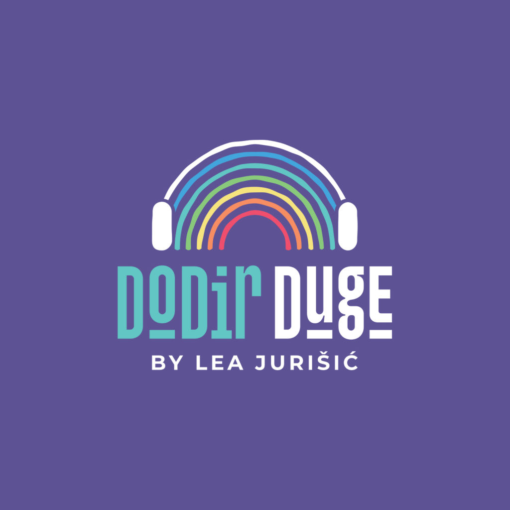
Visual of the logo
At the core of Dodir Duga’s visual identity is a lively logo, which summarizes the principles of acceptance and liveliness. The central motif skillfully interweaves a rainbow that flows into a set of headphones, creating a visual symphony that represents the organization’s strategic incorporation of music and sound for therapeutic purposes.
Deconstructed elements:
- Rainbow Headphones: Serving as a dual metaphor, the rainbow transforms into headphones, symbolizing not only the power of music, but also embodying the spectrum of support for those dealing with neurodevelopmental challenges.
- White details: The initial arc of the rainbow transforms into pristine white headphones, signifying clarity and purity in auditory perception. This underlines Dodir Duga’s mission to raise the quality of life for people on the autism spectrum.
- Typographic precision: the nuanced decision to change the size of the letters O, U and E with a connecting line below reflects a touch of sophistication and emphasizes the name of the association itself. It serves as a visual representation of the delicate balance and interconnectedness of each element. It also reminds one of playfulness, since the association deals primarily with the needs of children.
Sound of inclusion:
The Dodir Duga logo incorporates a nod to the Tomatis method, a therapeutic listening technique that uses music to stimulate the brain. This is represented by headphones that connect the visual and auditory components.

The symbolism of the rainbow
The logo design for Dodir duge not only embraces auditory integration, but also channels the vivid symbolism of the rainbow.
The rainbow, a permanent symbol of diversity, hope and promise, is skilfully integrated into the logo design. In addition to its chromatic appeal, the rainbow symbolizes the spectrum of support that Dodir duge provides to individuals facing neurodevelopmental challenges. This intentional choice of symbolism is perfectly aligned with the organization’s mission to improve the quality of life for those on the autism spectrum.
Design, especially for nonprofits and businesses dedicated to children, has a unique responsibility—the duty to visually represent compassion and accessibility. The Dodir duge logo embodies this philosophy, balancing sophistication with childlike playfulness. The decision to integrate playful elements such as shrinking the letters O, U and E with a connecting line below adds a touch of whimsy, ensuring the visual narrative remains accessible to a younger audience.
The rainbow motif, beyond its universal appeal, serves as a visual language that communicates inclusivity and joy, resonating deeply with the demographics Dodir duge serves. In the field of non-profit design, where sensitivity and resonance are paramount, the Dodir duge’s logo is an example of how visual elements can transcend aesthetics and become channels of understanding and support for those who need it most.
Do you want to make a logo with us? Contact us at the email address or via the contact form. You can view our works in the portfolio.
If you want to know more about graphic design, feel free to take a look at our blog, where you will find many interesting articles, many of which are on the topic of logos.
Zale Design Studio