Mobile Apps (UI/UX design) :: Little about history, little about theory and little about design
You have a company and you want to develop a mobile app for your services or products, or you have a new idea that requires a mobile application, but you don’t know where to start, who to contact or what a well-designed application looks like? In this blog we will give you the answers to all these questions and bring you closer to some terms that you may have heard but did not know exactly what they mean.
First little history
We can’t escape mobile apps today. Our favorite social networks, clothing stores and news portals have their own mobile apps. They have also become an indispensable learning tool so we can now learn foreign languages, cook, program and even get our body in shape just with the help of apps. How did apps become so popular? We had access to all this information before they existed through the websites. It all really started with the development and popularization of smartphones. We all remember games on older cell phone models, like the popular snake on Nokia phones. At that time, we did not call it applications, but features of a phone, and that included calculators, calendars, games and the like.
However, the applications we have today and the revolution in mobile applications came mostly thanks to one man, Steve Jobs, who changed the whole industry with his iPhone 3G. Although previous iPhone models came with many features such as maps, images, weather forecasts, etc., what had changed with the 3G model, which was introduced in 2008, is the ability for companies outside Apple to create mobile apps that would be available on iPhone devices. That same year, the AppStore was launched with 500 apps and 10 million of them downloaded in just the first few days. This has triggered an entire mobile app industry that has seen how big of a reach and importance apps have. Four years later, Google also launched its version of the Google Play app store, in which apps are made customized for Android phones.
Why do we love mobile apps?
Mobile applications are popular because we can quickly download them to our devices. They are available to us on smart devices, such as mobile phones, tablets, TVs or smart watches. They are also simple to use and satisfy our desire for quick information and entertainment in an easy way. What sets them apart from websites is the ability to scroll through content, custom menus, push notifications and fast loading. Also, the number of users of smart devices, especially mobile phones, is much higher than the daily users of computers, and thus websites.
Mobile apps have come a long way in their advancement from Steve Jobs ’3G iPhone, and their importance is undeniable today.
When we talk about the development and design of mobile apps, some terms are constantly repeated, such as UI/UX design, beta versions, bugs, backend, CRM, etc. We will talk more about these terms in a future blog where we will clarify the terminology. Not only mobile app development, but also graphic design, programming and marketing in general. In this blog, we will explain only some abbreviations and expressions that are directly related to the development and design of applications.
What are UI and UX design?
UI (user interface) is the user interface, in this context, of mobile applications. UI design in mobile applications means designing everything that the user interacts with and sees in the application. UX (user experience) or user experience is the optimization of the application for efficient and comfortable use. Although these two terms are often used together, they are two different processes. In other words, UI design is a part of UX design. Although UI and UX design are also used in web design, here we will only stay on the design of mobile applications.
UI design is the graphical design of the user interface of the application, from the selection of appropriate typography and colors, layout design, creating design elements such as icons and optimizing applications for different devices.
UX design is a process that has many elements, and as we said UI design is one of them.
Other elements are research:
- who are the users of the app
- how they will use the app
- what are their wishes
- brainstorming
- creating diagrams outlining the steps a user might take while using the application and creating a skeleton of what the UI should look like and what components it should contain
After this step, the UI design is usually created and completed; the last part is just testing the application on users to get a better idea of how users use the application, with which parts they have a greater interaction, how they react to individual elements, etc.
What to look for when designing mobile applications?
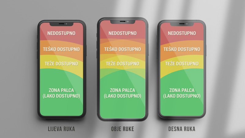
One of the most important things to keep in mind when creating mobile applications is accessibility. We want all the elements that the customer needs to use the application to be easily accessible, visible, well organized and designed. When using the application, there is something called “the thumb zone“, which means that the most important elements that we want users to interact the most, should be placed at the bottom and middle of the application where they are easily accessible to users.
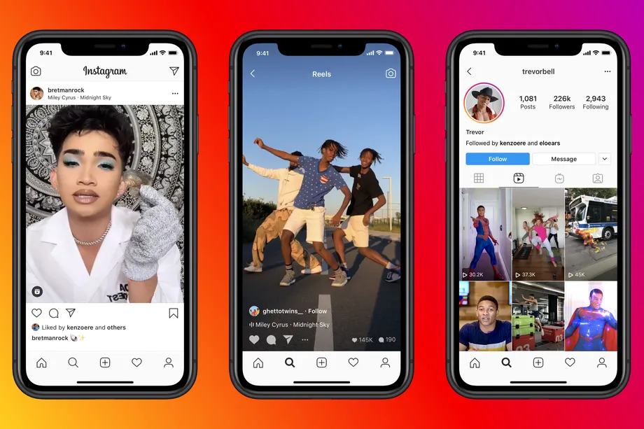
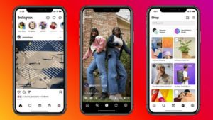
We can see how important this design element is with the recent change in the UI and UX design of Instagram.
Before the appearance and popularity of TikTok, Instagram had a plus icon at the bottom of the app, the task of which was to add content to the app, and a “like” icon where users saw app notifications. After the emergence of TikTok and the popularization of short video content, Instagram decided to change the entire user experience of its application in response to new competition. So these two icons were moved from the thumb area to the top of the app, and the main place was given to icons for viewing reels (video content like the one on TikTok), for shopping (Instagram wants influencers to use Instagram to sell their products directly to users), icon for search and direct link to user profile. In this example we can see the importance of good UX and UI design. With minor modifications, the entire app has been given a new focus and a new direction.
Navigation
The navigation bar, especially in that already mentioned lower part of the app, should be large enough to be easily usable for the thumb. The goal is to avoid a narrow bar and tiny icons where the user could click on one or more wrong icons. The use of the application should be a smooth experience, with as few distractions as possible, and such details significantly affect user satisfaction when using the application.
Navigation is extremely important when building mobile apps and refers to the act of moving between app screens to complete a task. The user can move around the application in three directions: lateral, forward and reversed. Also, there are many ways to create navigation bars that give the user access to their application content. Not every navigation is suitable for every content, so the choice of navigation type and its design is adapted to each application individually. It is important that the application is simple and clear. Since the topic of navigation within UI and UX design is extensive, we will deal with it in more detail in subsequent blogs.
Content organization
Applications are most often used on mobile phones whose screens are small and for this reason the readability of the same should be taken into account. It can be a challenge to put a lot of information on a small area without it looking crowded. Font selection, layout design and color selection can help. For colors, follow the rules 60-30-10: 60% of the content should be the same neutral color (dominant color), 30% should be a complementary color to the dominant and 10% accent color (usually bright color) for some small details on the page. The choice of colors and fonts will depend on the content of the application itself. For some applications, such as toy shops, we will choose cheerful bright colors and more rounded typography, for others, a more serious companies, we will stick to more neutral tones and fonts. A good design will always follow the content and type of the application and make it as simple and attractive as possible for its users.
You can read more about color theory and how to choose the best combination in our blog on this topic.
The most popular apps of 2021.
Finally, we bring you a list of the most popular applications in 2021. and by the number of downloads it is easy to conclude that the market for applications is large and their importance for business should not be underestimated:
1. TikTok :: 656 million downloads
2. Instagram :: 545 million downloads
3. Facebook :: 416 million downloads
4. WhatsApp : 395 million downloads
5. Telegram :: 329 million downloads
6. Snapchat :: 327 million downloads
7. Zoom :: 300 million downloads
8. Facebook Messenger :: 268 million downloads
9. CapCut :: 255 million downloads
10. Spotify :: 203 million downloads