Color Theory
All artists, and thus graphic designers, need to know not only how individual colors match each other, but also how our brain perceives them and what emotions they evoke. This is called color theory. Although this topic is extremely extensive and complex, in this blog we will focus on the basics.
History
The first known color theory was given to us by Aristotle. He believed that God sent colors from heaven through the divine ray of light and that all colors came from white and black. He divided colors according to 4 elements: air, water, earth and fire. These thoughts were followed in the 15th century by Leonardo da Vinci, who in his work “Treatise on Painting” arranged a hierarchy of six colors in this order: white, yellow (earth), green (water), blue (air), red (fire) and black.
Isaac Newton
However, a scientific understanding of colors and their classification came in 1666. when Isaac Newton, using two prisms, noticed that white light contains all the colors of the rainbow and that they can be identified and classified. The word “spectrum” comes from him. It is the name given to this series of colors produced by the prism. Newton assigned seven colors to the spectrum, modeled on the music scale, ROYGBIV (r = red, o = orange, y = yellow, g = green, b = blue, i = indigo and v = violet), which he organized in a circle.
Goethe
It is the first official scale of colors that are visible to the eye and the beginning of scientific research into colors. What is little known is that Johann Wolfgang von Goethe opposed Newton’s theory by arguing that colors are not just a scientific measurement of frequencies but that they have a psychological effect on every person who watches them. Goethe’s opinion was well received among artists. Although Goethe is better known for his prose and poetry, he considered the book Color Theory to be his most important work.

Credit: Rhododendrites, CC BY-SA 4.0 <https://creativecommons.org/licenses/by-sa/4.0>, via Wikimedia Commons
Color Wheel
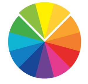
But let’s get back to the present day and how color theory can help us with design. We’ll start with the traditional color wheel made by Newton. You must have seen this wheel many times. Did you know that it is one of the most important tools for using and understanding colors? Before we start explaining color harmony, let’s go over some basic concepts and what the color wheel is for.
The traditional wheel, that we also call RBY (after the names of the colors in English: red, blue and yellow), contains 12 colors that we divide into primary colors: blue, yellow and red; secondary colors created by mixing primary colors: green (blue and yellow), orange (yellow and red) and purple (red and blue) and tertiary colors created by mixing primary and secondary colors: orange red, yellow orange, blue green (turquoise) , blue-violet (indigo) and red-violet (purple).

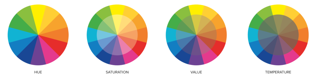
Each color on the circle contains 4 properties:
1. Hue
Hue in art is simply color in its strongest and purest form. Each of the 12 colors on the wheel is 1 hue, which contains all the other shades of that color.
2. Saturation
It indicates the intensity, purity and grayness of the color.
Take red for example. At its highest saturation we have a bright red color, but if we reduce the saturation we get a pale pink color and if we go further we can completely lose the color and end up in the shades of gray.
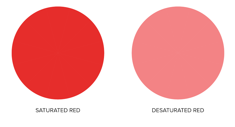
The misuse of saturation is one of the biggest culprits when we see failed color combinations. Designers use either too much or too little saturation, so the design often misses the mark. Color is a strong design element and should be used properly. The problem with color saturation is that many designers think that if they use “stronger” colors, the design will be more noticeable and more successful. This is not always the case. Highly saturated colors can take over an entire design and make it hard to look at.
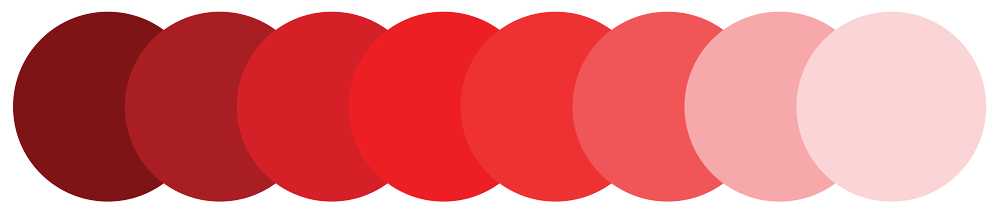
3. Value
It indicates how dark or light the shade is or, in other words, how much light is reflected in a particular shade. Let’s take the example of red again. In this case, unlike saturation, we do not lose color but only go to darker or lighter versions of each color.
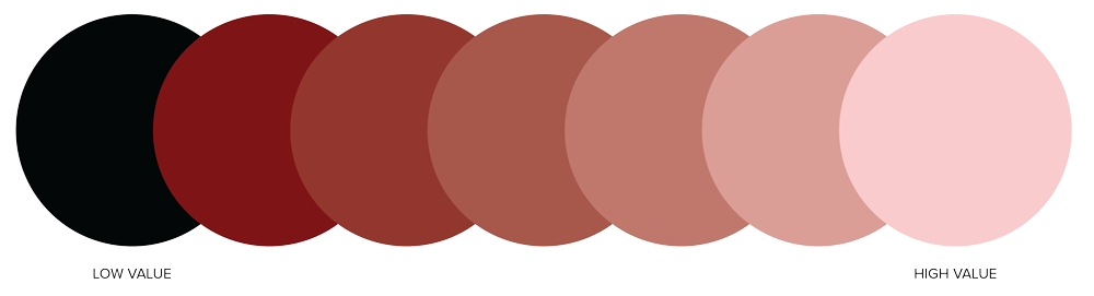
If we add white to the color we get a light shade (tint), if we add black we get a dark shade (shade) and if we add gray we get a tone of some hue (tone).
4. Temperature
The circle can be divided into two parts: cool and warm colors, but even within the shades themselves we have warmer or cooler versions of each color.
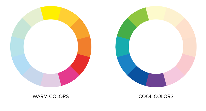
If we go back to our example of red, we will see that if we add yellow to red, we will get a warm shade of red, just as if we add blue, we will get a cool shade of red. So even though red is a warm color, its shades can also be cool.
Using these 4 properties we can get a large selection of variations for each of the 12 main colors. We have a wide range of options and possibilities, and now we are going to see how to use all these colors in the right way to get a harmonious design.
There are multiple color schemes (color harmonies), and they are used so that we can get the best combination for the goal we want to achieve. Each color combination evokes certain emotions, creates an atmosphere or gives context to your design. If you do not use any of these rules, the design may look chaotic, with too many strong colors, or it can look to plain, with insufficient contrast. These schemes will help you to stick by a harmonious design and to elevate it to a new level.
Color Scheme
1. Monochromatic Scheme
In a monochromatic scheme, only one color is used in all its properties and shades. This is one of the easiest combinations, with the monochrome design looking simple, organized and clear.
2. Analog scheme
An analog scheme uses two to four colors that are next to each other on the circle. This combination of colors is most often seen in nature. Because of that, it is used for a design that should be natural, relaxing and simple. It is best to choose one dominant color and use the others for accents.
3. Complementary Scheme
The complementary scheme uses two colors that are on a circle located opposite of each other. For example blue and orange are complementary colors. This is one of the most popular color combinations, and one of the reasons for that is that it is very pleasing to our eyes. When using this combination, it is best to use one color as the main one (the one that is softer) and use the other for details.
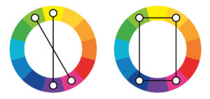
4. Split Complementary Sheme
A split complementary scheme is similar to a complementary one, but uses three colors instead of two. In this design you use one color (the one that will be a dominant one in a design) and combine it with two colors next to its complementary one. This choice of colors is a little more vivid and cheerful than the classic complementary ones, while still retaining the contrast offered by complementary colors.
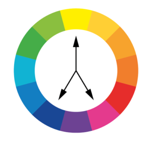
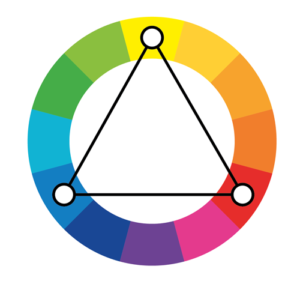
5. Triadic Scheme
The triadic scheme uses three colors that are on a color wheel of equal distance from each other, as if forming a triangle. Because this color combination is strong and doesn’t feel natural, it is often used in animated films to create that fictional look of artificial worlds.
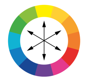
6. Double Complementary Scheme
The double complementary scheme uses two pairs of complementary colors. Colors do not have to be next to each other. Any pair combination can be used. This combination is best for backgrounds. As with other complementary combinations, the main color that will dominate the design is chosen, and the others are used only for accents.
These six color harmonies will give you plenty of color variations with which you don’t have to be afraid of making a mistake by choosing the wrong colors, but if you still have doubts about your choice, you can always find inspiration on social networks like Pinterest. You can find ready-made color palettes there, so if you are not sure, we suggest this option.
RGB i CMYK
We’ve now talked about the traditional color wheel (RBY), but if you’re already a designer or you’ve worked with graphic designers and printers, or just bought ink for your printer, you’ve heard of the terms RGB and CMY(K).
When it comes to mixing colors, artists have realized that they can’t get exactly what they want from traditional primary colors. For example, by mixing traditional colors (blue, yellow and red) you can’t get pink. Also, vivid colors, like strong green, cannot be obtained. So, the primary colors changed and new color wheels were created. In this case, for graphic design the most important, RGB and CMYK color wheels.
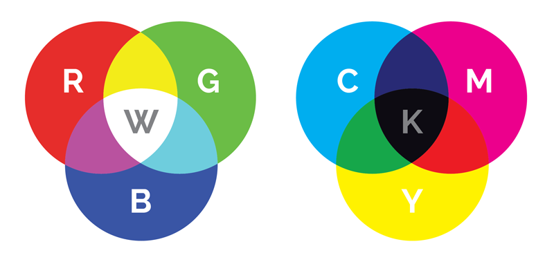
RGB
RGB uses white as a combination of all primary colors and black as the absence of light. CMYK, on the other hand, uses white as the natural background color of the print and black as the color ink combination.
RGB is an additive color model. In the RGB wheel, the primary colors are red, green, and blue. The RGB color palette with the addition of white (or light) creates a magenta, yellow and cyan color. For all digital content it is necessary to use RGB color wheel.
CMY(K)
In contrast in the CMY color palette, the primary colors are cyan, magenta and yellow, which become red, blue and green with the addition of black. K in CMYK comes from English and denotes the main printing plate (key printing plate) which is black and thus CMYK becomes cyan, magenta, yellow and black. The CMYK wheel is used in graphic design for all printed materials.
Since CMYK and RGB are different color systems, the graphic designer must emphasize to clients the difference between the colors they see on the device screen and those they will see on printed materials. There is often confusion and disappointment, but a good designer will know how to customize the colors for printing so that the client gets, if not the same color palette, then as similar as possible to what is presented to them.
We hope that we have clarified some basic elements and concepts of color theory, and in future blogs we will write about the meaning of colors, their influence on our feelings and how we can use this in our design to attract clients.