How to design print materials for your business
In today’s world full of information, how do you make your product or service stand out from the competition? Although digital formats are increasingly popular, there is no doubt that print materials – catalogs, brochures, flyers, posters and more – are still one of the most effective ways to reach your target audience. However, in a sea of opportunities and with a lot of competition, standing out from the crowd can be challenging. It is essential to plan and create a design that speaks directly to your audience.
In this blog, we will focus on that very topic: how to design catalogs, brochures, flyers and other printed media that look professional, but which also stand out from the crowd.
Why design is important when creating print materials
Design is key to the success of any print project. If you have well-designed material, it is more likely to interest and engage the audience. The quality of the design can have a big impact on the performance of the material. Since print materials are demanding to create (unlike digital formats, they also contain printing), we want all that time and financial effort to pay off. The goal is for potential customers to want to browse our materials, to get to know our products and services through them, and to turn potential customers into real and permanent users. This is exactly why the quality of design and production is very important.
Here are some things to think about when designing print materials:
- You should use the correct typeface(s) for your message. Make sure your text is easy to read and doesn’t strain your readers’ eyes.
- Also, use high-quality paper that is of good quality and will not be destroyed quickly.
- Keep things simple, use some color and graphics to help readers focus on the message you’re conveying.
- Use clear visuals such as pictures, diagrams, maps and charts.
Know your audience
While print media can go a long way in communicating your brand, it’s important to remember that these materials are not meant to be a one-size-fits-all solution.
The best way to design print materials that will appeal to your target audience is to first understand that audience. You can’t create something that will resonate with someone if you don’t know who they are and what motivates them. For example, if you want to attract millennials, it’s important to understand how that group differs from older and younger generations.
Let’s continue to take millennials as an example as a demonstration of how to think about certain target groups.
When designing printed materials, as for the example already provided, you should keep the following aspects in mind:
– Millennials are often characterized as socially conscious and interested in various goals. This group also grew up in a more digital world as technology was an important part of their childhood.
– Millennials often prefer fast communication, such as text messages, phone calls and email correspondence. They also like to have information at their fingertips and prefer quick facts to lengthy research.
– Millennials also have shorter attention spans and prefer shorter, more concise content.
According to all this, the graphic designer and marketer can make a decision to keep the printed materials simple and concise. That the focus be on environmental and social awareness (recycled paper, donation from the purchase of magazines to a social organization, etc.) in order to attract that group.
Of course, each generation (Baby Boomers, GenX, GenZ, etc.) has its own characteristics, with which you should be well acquainted and adapt the design of catalogs, brochures and other printed materials to the clients we want to attract.
The target groups differ not only according to generations, but also according to gender and some other economic and social characteristics as well as geographical location. All of this goes into deciding the type of design to use for each particular print material.
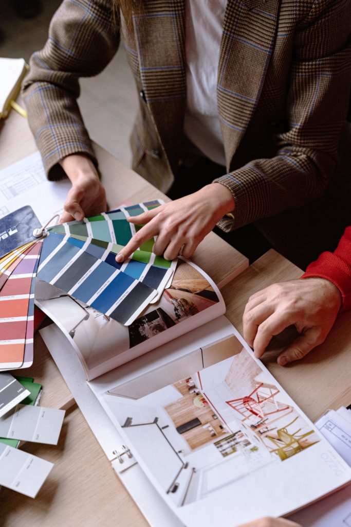
Choose colors based on your audience’s preferences
Generally speaking, color is one of the main aspects of design over which you have the most control. You can use color to direct your audience toward certain feelings or outcomes. Therefore, it is important to choose colors that are consistent with your goal and brand message. Additionally, you should consider the fact that color preferences vary from person to person — and even from culture to culture. That’s why it’s important to do a little research on color theory to find out what colors your audience prefers. There are several ways you can do this. First, you can conduct color psychology research to better understand how certain colors can affect people. You can also ask team members and clients which colors they like best. Finally, you can look at competitors’ materials to see what colors are being used.
Use space strategically
White space or empty space on a page is important. It helps readers focus on the most important elements within the page/site and gives the design a clean and cohesive look. It also creates the impression that the page is larger than it really is.
All good design relies on white space. This is what allows the eye to move easily around the page and prevents the design from becoming too crowded. Emptiness can also be used to create a sense of urgency. If you have a call to action on your page, you can increase its effectiveness by increasing the white space around it. Similarly, you can use white space to break up long stretches of text that might otherwise turn readers off.
Establish a visual hierarchy.
Visual hierarchy is a system for guiding your audience’s eyes to the most important parts within a design. If a reader were to glance at your brochure, for example, a visual hierarchy could help them focus their attention on the most important parts of the page – such as perhaps an action being promoted, a company/product name or a slogan. Visual hierarchy can also help break up large chunks of text and make your page more engaging to read.
To establish visual hierarchy in your design, consider the following:
– Where you place certain elements on the page
– How much space do you devote to each element
– The color of each element
– The font you use for each element.
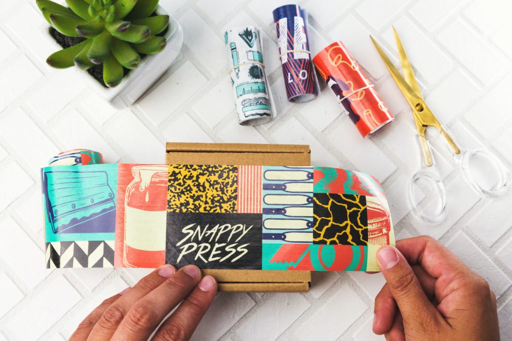
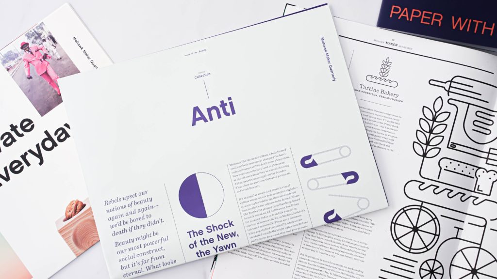
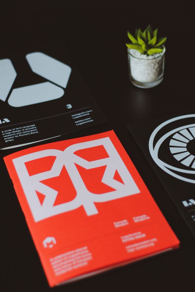
Don’t be afraid of photos – use high resolution images
Yes, we’ve all heard the horror stories of low-quality images turning off readers and causing them to lose interest in a product or service. But don’t let these stories make you think that all pictures are bad. Instead, use high-resolution images in your printed materials to attract readers. Images can help break up dense chunks of text and make your page more appealing. Using high-quality images can also be an effective way to highlight your brand’s personality and values.
Just make sure the images you use are professional and relevant. If you’re not sure what type of images to use, ask yourself what emotions you want your reader to feel when viewing your materials. Is your brand playful? Serious? Sophisticated? Choose images that help convey those values.
Types of print media
Although there are many types of print media, here we will focus on the most popular:
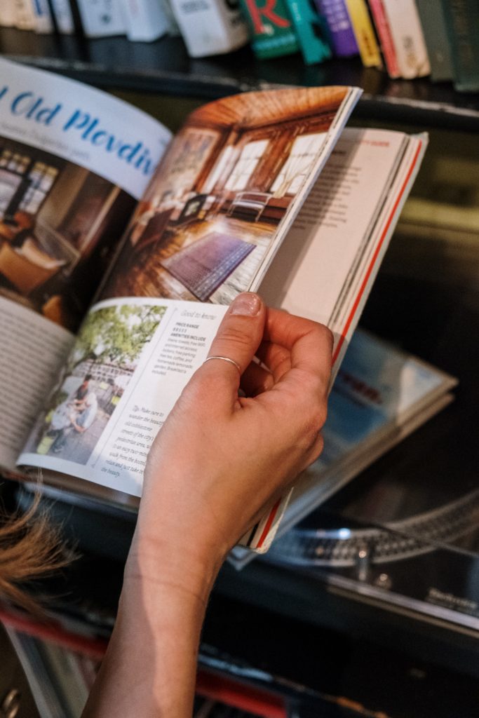
CATALOG DESIGN
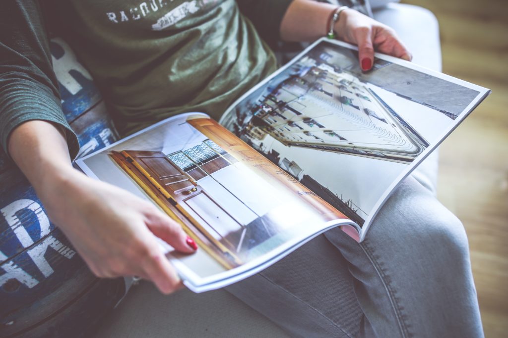
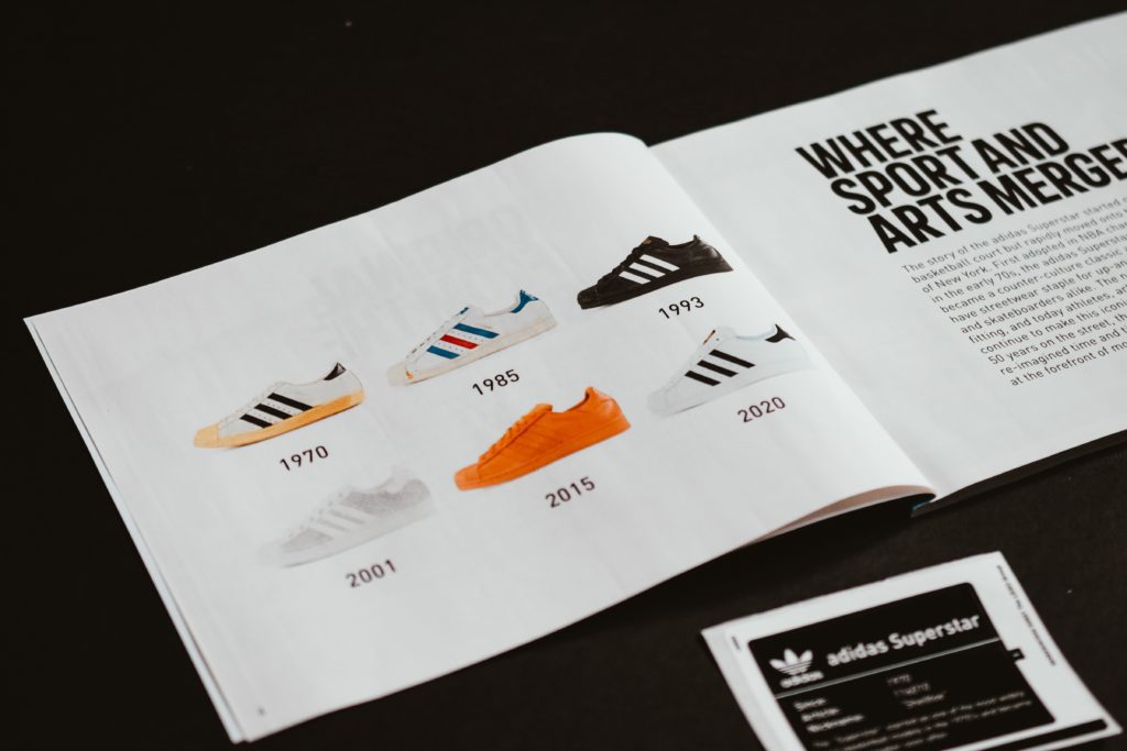
A catalog or list is a collection of information. It is used to promote products and services. Most catalogs include prices and other details about the items featured in them. Most often, they are large in volume (like books) with detailed descriptions of services and products.
The catalog can be organized in many different ways. For example, it may contain a list of all items that are available, or it may include only selected items that are on sale, seasonal, or most in demand. The content itself depends on the products being sold as well as the goals of the company.
It is used to help customers find what they need and to familiarize themselves with other company products. They can also be used to let customers know a little more about an item before they buy it. By looking at the information in the catalog, people can learn more about the features and history of the item. This can help them decide whether they want to buy the product or not.
Catalogs can also be used to generate revenue for businesses. They can be sold as books or on websites, and often have affiliate links that generate income when someone buys an item through that link.
Finally, catalogs can also be used as marketing tools for businesses. They are used to promote products and services to potential customers and can also be used to help people find stores that sell similar products.
BROCHURE DESIGN
Brochures are a great way to promote a company or event. They are attractive and informative. They can help potential clients learn more about your company, products or services. They can be used as advertising, distribution material or as invitations. The biggest difference between a brochure and a catalog is size. Catalogs are more detailed and comprehensive, while brochures are shorter and more concise.
There are several types of brochures:
- Advertising brochures are designed to attract attention. They are often colorful, eye-catching and designed for maximum impact. They are used primarily to attract new customers, but can also be distributed to existing customers.
- Prospectuses are designed to educate existing customers about products or services and encourage them to continue using them
- Invitations are designed specifically for an event such as anniversaries, weddings, birthdays or other special occasions. They should be attractive so that people want to respond to the event.
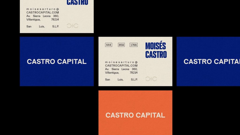
BUSINESS CARD DESIGN
A business card is a small piece of paper with your name and contact information. It is an important tool for maintaining contact with clients and colleagues.
A business card can be made of almost any material: paper, cardboard, plastic or even leather. The most important thing is that it is easy to read and wear.
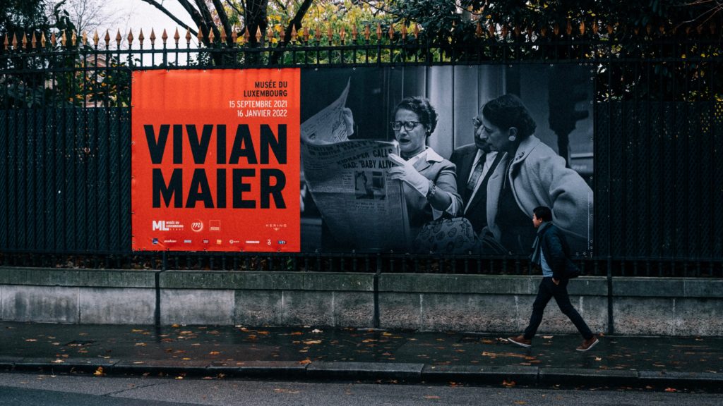
BILLBOARD DESIGN
Billboards are large outdoor advertisements. They are often located along the road or in an open public space, such as a shopping center or a sports field. They are usually made from large sheets of paper covered with printed text, pictures or other graphics.
These types of ads are also called “outdoor ads” or “out-of-home advertising.” Billboards can be seen from afar, so they are very effective in attracting attention and getting people to visit the company that put them up. They are also used for branding so that the company being advertised can be more recognizable to people who see them while driving.
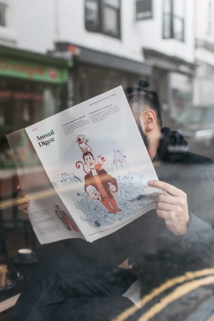
LEAFLET (FLYER) DESIGN
A flyer is a piece of paper that is printed with text and graphics to promote a product or service. Flyers can be used to promote a new product, upcoming event or charity. Flyers can also be used to advertise an upcoming sale or event.
They are usually distributed through door-to-door campaigns, handing out on the street or at fairs. Many companies use flyers as part of their marketing strategy because they are relatively cheap and easy to produce. They can also be distributed quickly and easily, making them ideal for last minute promotions. In addition, flyers can help increase brand awareness by attracting people’s attention.
In addition to promoting products or services, flyers can also be used to promote charities and causes. For example, a flyer can be handed out at the start of an event to encourage attendees to donate to the cause when they arrive at the venue. In the same way, flyers are used at cultural events to familiarize visitors with the content of plays or concerts and the rules of behavior at certain events.

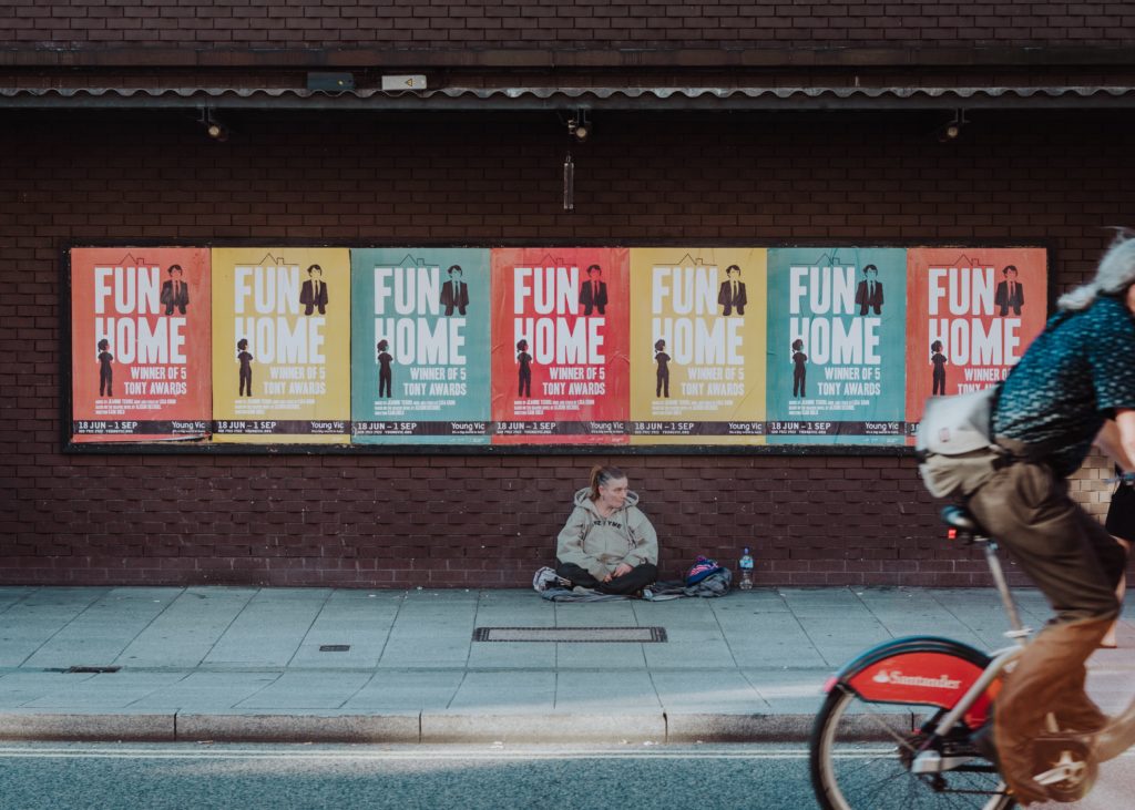
POSTER DESIGN
A poster is an image or design used to promote a product, event or cause. They are designed to attract attention and be easy to read.
Poster art has been around for centuries, but only recently has it become an important marketing tool. And it’s not just for businesses anymore — schools, nonprofits, and government agencies are increasingly using posters to attract audiences, promote events, and engage donors.
The main purpose of the poster is to attract attention. Because of this, they are often displayed in high-traffic areas such as entrances and lobbies. They are also effective in attracting the viewer’s attention because they are often colorful and visually striking. But beyond this simple goal, posters can also communicate company values and brand identity through the images they choose to display and the way they present them.
LABEL DESIGN
Labels are pieces of paper that are glued, sewn or hung from certain products. Marking a product with a label is conveying information about the product’s quality, features and benefits.
In order to create effective labels, manufacturers must consider a number of factors. In addition to being accurate, clear and informative, labels must also be legible and visually appealing. Finally, labels should be designed in a way that is consistent with the rest of the product packaging.
CARD DESIGN
We use cards every day. Whether it’s bank cards, gym and library membership cards, or cards for collecting points in certain stores. We often pay little attention to them, but everyone will know the exact look of each of the listed cards.
Card design is important for several reasons. It is important that the design follows the already existing visual (brand) identity of the company that issues it, so that the card strengthens the feeling of recognition, and thus loyalty to the brand.
Also, there are many cards, so it is important that the card stands out from the competition and that it is easily visible in our wallets.

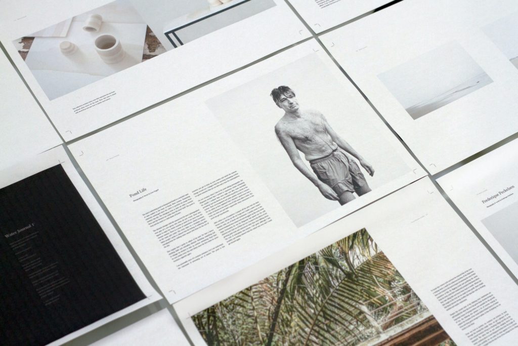
BOOK DESIGN
When we talk about book design, we mostly think of the design of the cover of the book. The cover is an image that represents the title and/or genre of the book. This means you want to make sure your cover stands out from the crowd.
One thing to keep in mind when designing a book is the target audience. Is your book aimed at children or an older audience? This will affect the way the cover will be designed.
The design will also be influenced by the genre of the book. Horror books will differ in design from, say, cookbooks. 🙂
CONCLUSION
Designing print materials is a challenge, but it’s also a lot of fun. With the right strategy and a little creativity, you can create amazing pieces that will help you achieve your marketing goals. However, in order to design print materials that look professional and stand out, you’ll need to know your target audience and choose colors based on their preferences, use white space strategically, establish a visual hierarchy, and choose the right medium for your products and services.
For more articles on graphic design and marketing, visit our blog.
If you need any of the design services, feel free to contact us via email or contact form.
Thank you for reading!