

Credo centar :: Ad Design
graphic design :: ad design
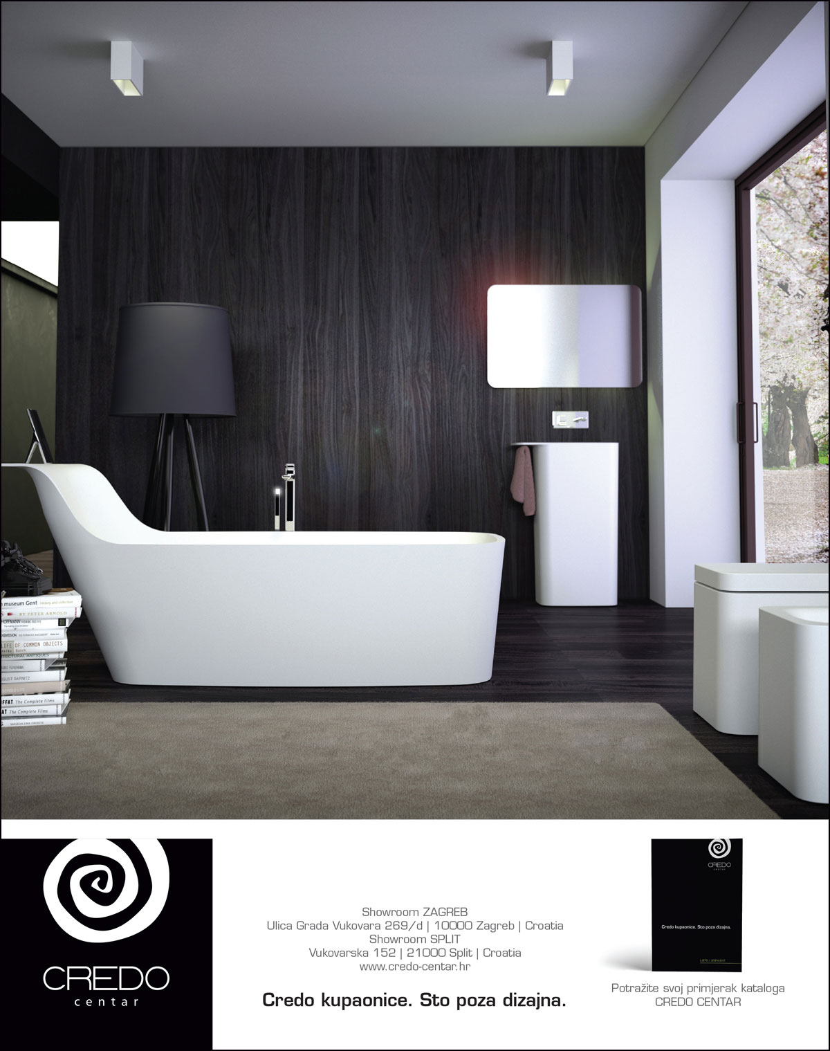
Credo Center is a distributor of some of the most famous manufacturers of bathroom furniture, tiles and sanitary equipment. They asked us to create a simple ad for them, which we gladly did.
Poster and ad design
A few things to pay attention to when designing posters and ads: Does the ad convey the message clearly? Although abstract posters can sometimes be visually interesting, will the client know what it is about? The first rule of any ad is to be functional. The purpose of an ad is to present a service or product, and any design must respect that.
With the Credo Center example, we see that the focus is on quality photography. That not only shows the products you can find and buy in the Credo Center, but also creates an image of the bathroom we can have: luxurious, sophisticated and high-quality. In this way, the customers not only connects with the product, but also with the feeling that they want to have that particular product or service. When a potential buyer looks at a photo like this, they may want to have an exactly identical bathroom. He will imagine himself bathing in just such a bathtub after a hard day at work. In that way, the ad not only conveys information, but also creates an atmosphere. This is best achieved with the use of photos, illustrations or colors.
Organization of design elements
The use of multiple types of fonts, too many design elements, colors and texts should be avoided on the ad. The text should be comprehensible, short and clear. The poster is used only to present the service or the product but for additional information we want clients to visit our websites or stores. Always remember that posters and other advertisements are read in passing.
In the Credo ad design example, most of the surface is taken up by a photo or a product being sold. The text is reserved for the bottom so as not to distract from the photo itself, in the standard Credo monochromatic tone. The ad is not crammed with too much text, too many design elements or colors. Using simplicity, we helped the product itself to stand out. After it attracts attention, the ad provides all the necessary information where the products can be viewed, either live or online.
See our other works from the Print category.
If you need an ad or poster, contact us via the contact form or send us an email.
See our works from other categories in our portfolio.
If you want to know more about design, visit our blog, where articles on various design topics await you.
Zale Design Studio