

Verklizan :: Flyer Design
graphic design :: flyer design
About the project
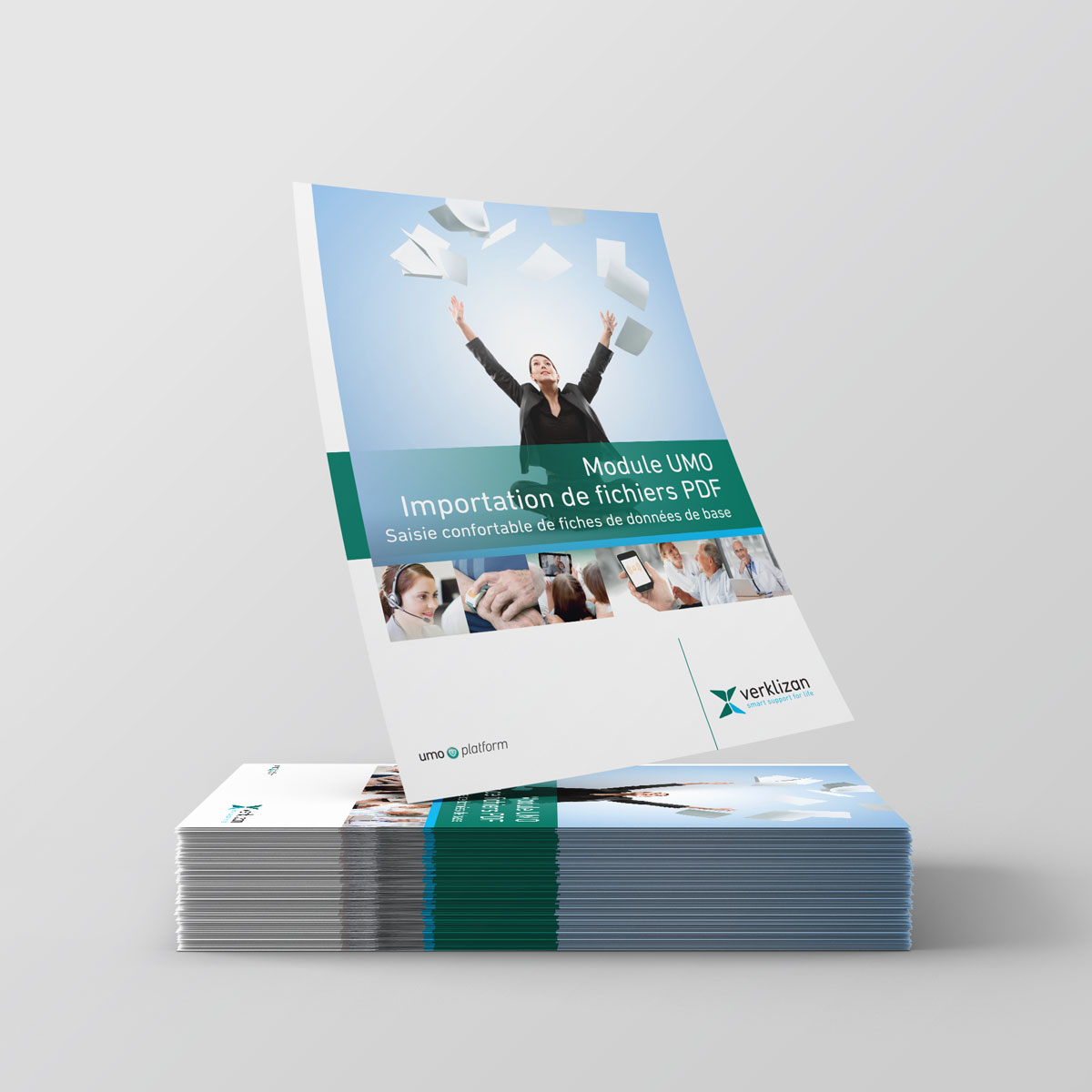
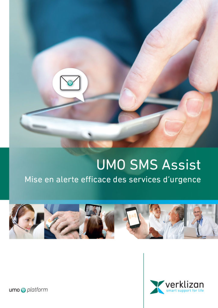
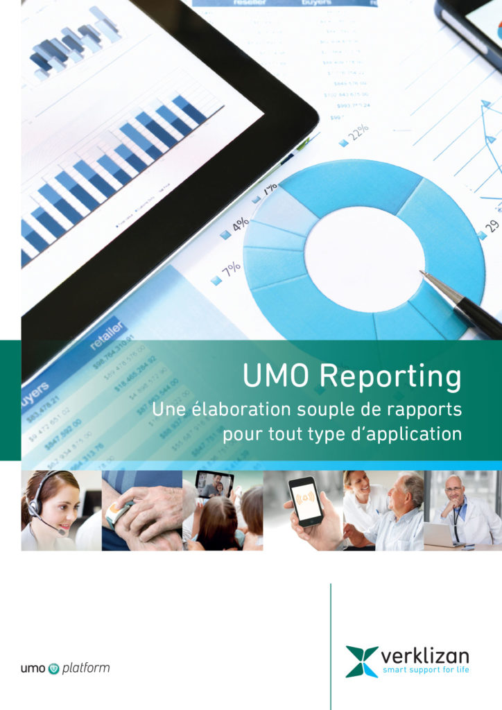
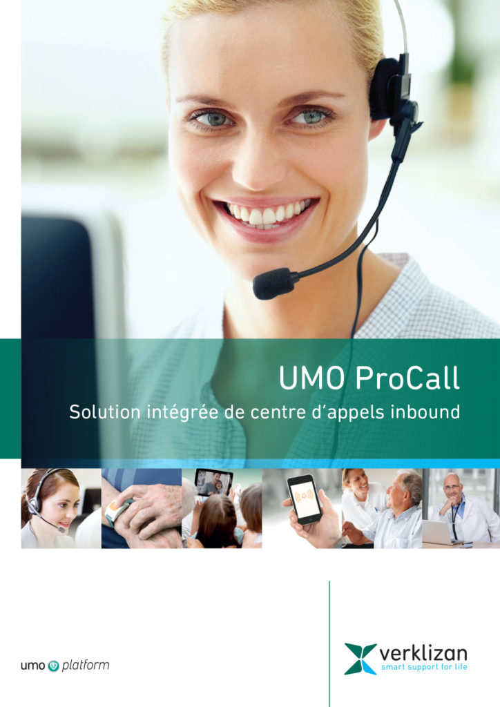
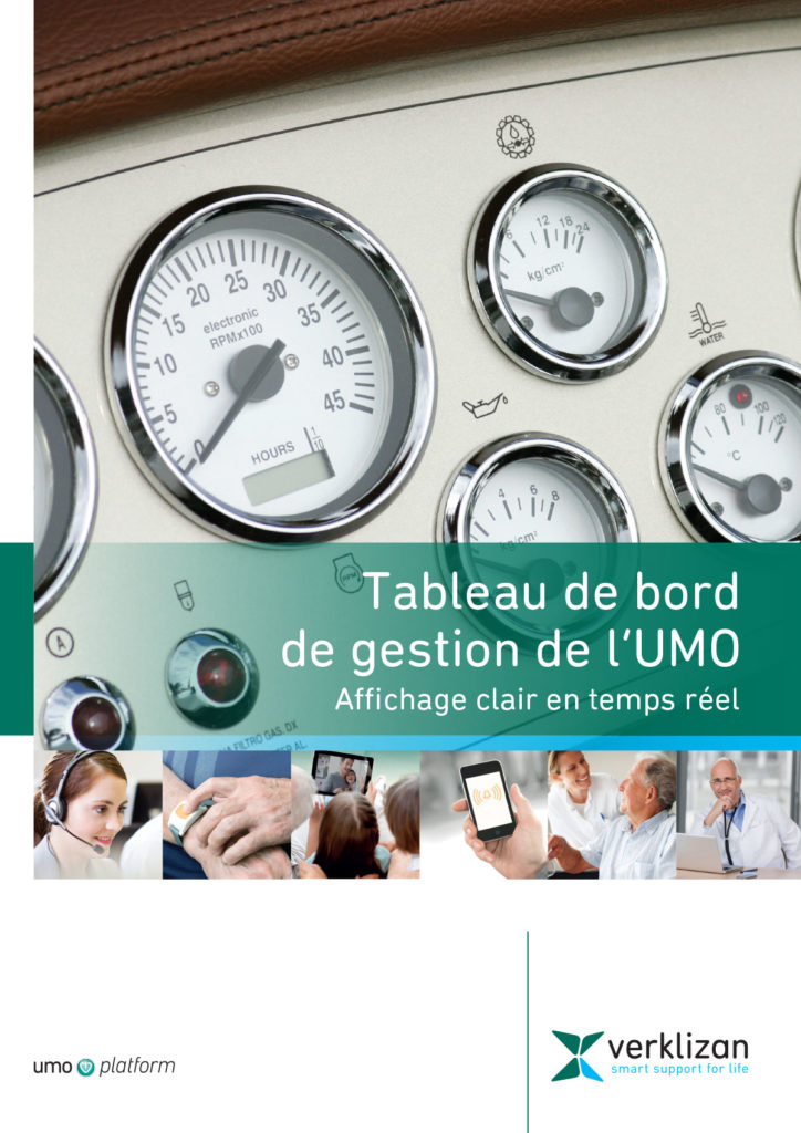
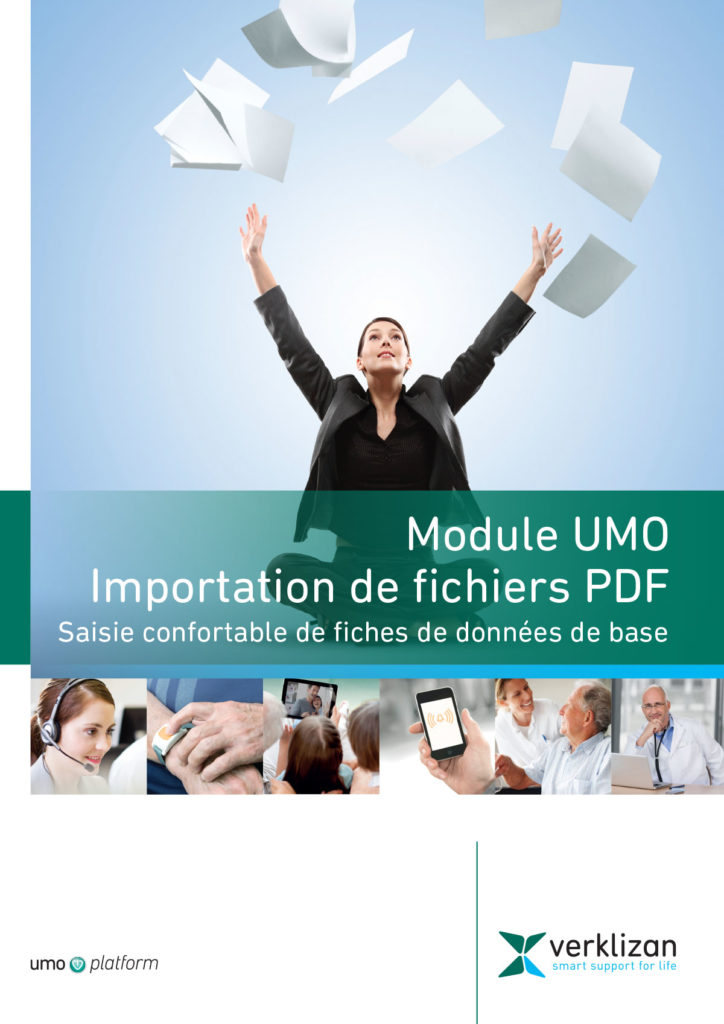
For our clients, the company Verklizan, we made several leaflets. Verklizan is an international software company with a base in the Netherlands. Their main activity is the creation of a health platform to help the elderly and infirm so that they can receive the necessary assistance such as remote care and assistance alarms.
Verklizan’s logo is in three colors: dark green, blue and dark gray for the font. Guided by their standard colors, we created a series of flyers using blue and green combinations. Verklizan wanted flyers that were professional, serious, but also simple. With the help of photos and the use of appropriate fonts (size and type) and the already mentioned colors, we managed to create that impression.

What is important when designing a flyer?
As with any other type of design, always keep in mind who you are creating the flyer for, who your audience is, who you want to attract. It is not the same to create a flyer for an amusement park, a clothing store or a financial company.
While for the amusement park we will choose cheerful bright colors, soft fonts, more text and photos, for corporate design it is better that the design is simple in order to leave a more professional and serious impression.
If you use photos, make sure they are high-quality photos so that the overall design is not spoiled by choosing a low-resolution image, uninteresting content or inappropriate subject matter.
If you are not using photos, but the flyer will be made of text and design elements, stick to the rule of not using too many types of fonts and sizes. Flyers are usually small format and too many fonts and sizes can look cluttered, disorganized and unprofessional. Also, use fonts that are easy to read. Flyers are read quickly and you don’t have much time to draw attention to the content.
The flyer is made to deliver essential information in a short time, to attract attention and to generate traffic. If you stick to the basic design rules, your flyer will surely fulfill its purpose.
See our other works from the Print category.
If you need a flyer design, contact us via the contact form or send us an email.
See our works from other categories in our portfolio.
If you want to know more about design, visit our blog, where articles on various design topics are waiting for you.
Zale Design Studio