

Hrvatska pošta :: Ad design
graphic design :: ad design
Ad subject
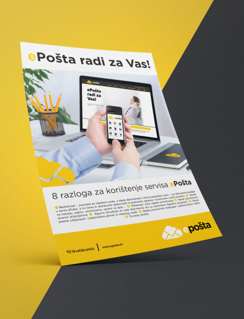
Hrvatska pošta has launched an ePost service intended for users to use their services more easily. Using ePost, users have been given easier access to many services, such as paying bills via the Internet, easier distribution of official documents, etc. In order to promote this new service, they launched the campaign “ePost works for you!” for which we designed the ad.
Book of standards when creating ads
Large companies like Croatian Post already have their books of graphic standards that contain colors, fonts and other information about the company itself and the brand so that designers know within which standards they should work. This is not unusual for many companies. In fact, Books of graphic standards are a very good tool for the visual identity of any company so that the design is always uniform, recognizable and of high quality. In this case, it meant that within the design we had to stick to the standard and recognizable yellow color of the Croatian Post with a gray contrast. The image of a person who is already using the service visually brought the future users closer to what the ad is about.
How to design a poster or an advertisement?
A few things to pay attention to when designing posters and ads: Does the ad convey the message clearly? Although abstract posters can sometimes be visually interesting, will the client know what it is about? The first rule of any ad is to be functional. The purpose of an ad is to present a service or product, and any design must respect that.
The use of multiple fonts, too many design elements, colors and texts should be avoided. The text should be comprehensible, short and clear. The poster is used only to present the service or the product but for additional information we want clients to visit our websites or stores. Always remember that posters and other advertisements are read in passing.
The use of images is therefore a good idea. A good example is this Croatian Post ad, where we were able to immediately convey the theme of the ad with the image. We don’t say that a picture is worth a thousand words without reason. A good choice of image, concise and specific text, harmonious choice of colors and fonts is all that is needed for a good ad.
That’s what we followed with this ad. A clear and recognizable design with the characteristic colors of Croatian Post, an image that evokes the service, the use of an easy-to-read font are all elements that helped make this ad, and so the campaign, a success.
See our other works from the Print category.
If you need an ad or poster, contact us via the contact formor send us an email.
If you want to know more about design, visit our blog, where articles on various design topics await you.