Credo centar :: Catalogs
graphic design :: catalog design

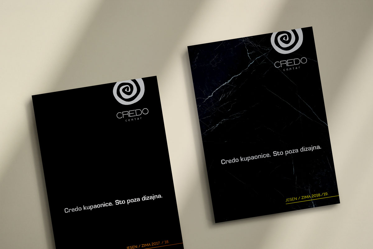
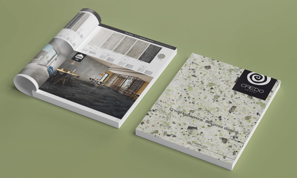
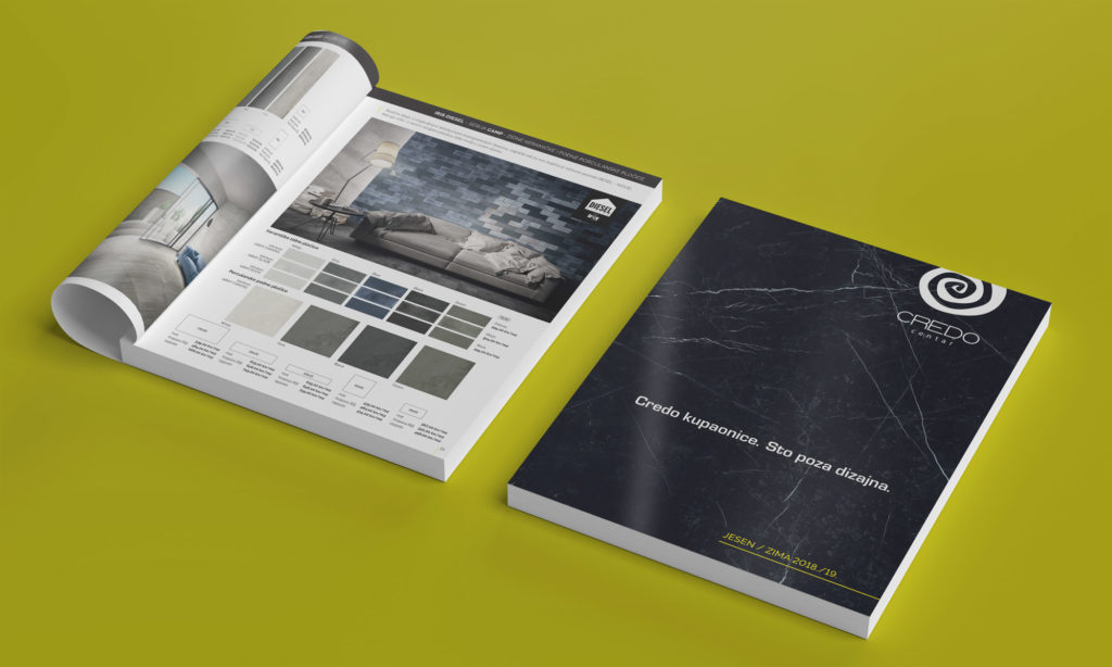
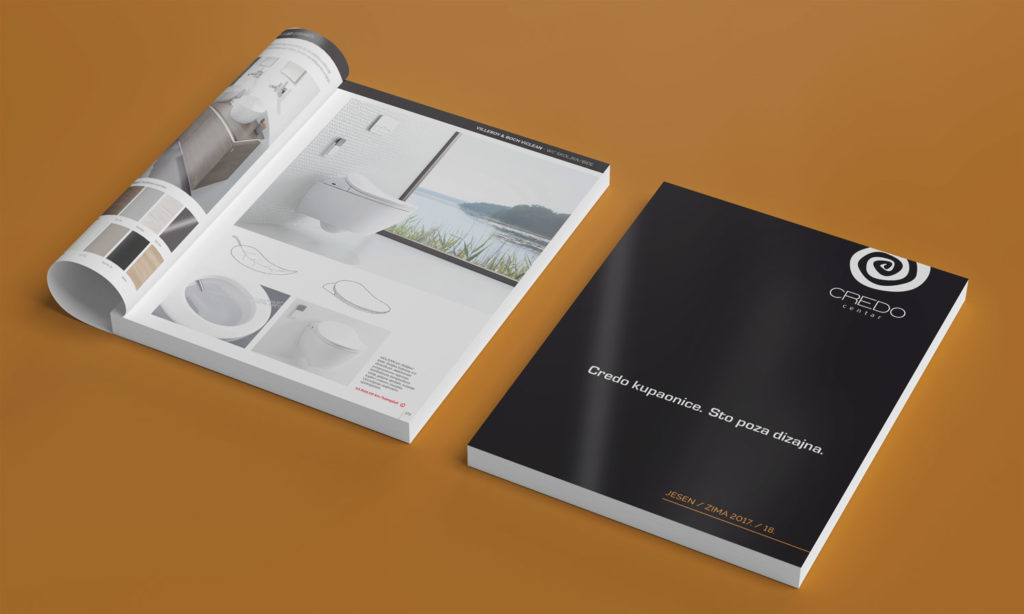
We designed catalogs for Credo centar from Zagreb, Croatia. Company that distributes bathroom and sanitary equipment from some of the most famous manufacturers. Every year, the Credo center publishes a catalog of its sales range, which is available to customers via an online version on their website or in printed form that can be obtained in their stores.
Such an extensive project usually requires a lot of time, good organization and precision.
Although recently catalogs are usually made in digital versions, many companies still prefer both versions.
What should you pay attention to when designing a catalog?
Not every catalog design is appropriate for every type of service or product. The design should follow the industry standards it represents and the customer needs it wants to attract. With the catalog, the size (format), the number of pages, and the layout are first decided. After that, the front and back pages are designed.
As with poster design, the front page of the catalog should not be cluttered with texts and design elements. The rule should be followed that only the most important information, such as the name of the company, the name of the catalog, or what it represents/sells with possibly a photo or illustration, should be on the front page. All contact information is placed on the back page of the catalog which is usually very simple. The choice of color and fonts depends solely on the activity the company is engaged in. For corporate catalogs, stick to colors and fonts that give a more professional and serious impression. But if, for example, we sell toys, the catalog can be more playful, colorful, and the fonts can have softer shapes.
When photos are used in the catalog, they must be of high quality and professionally done. If you use low-resolution images, the overall impression of the catalog will be diminished. Therefore it is better before deciding to create a catalog, to keep in mind that quality photos of the products must also be created for the catalog and have ready-made (preferably proofread) texts prepared.
Catalog design is a long process, especially when it comes to catalogs, as in the case of Credo Center, which have 100 or more pages. So we advise to prepare all the materials for the designer before starting work. In that way the process will be shorter and easier.
You can browse the Credo catalogs at the following links:
If you need a catalog, feel free to contact us via email or contact form.
For more of our work, see our portfolio, and for interesting texts about graphic design, jump to our blog.
Zale Design Studio


