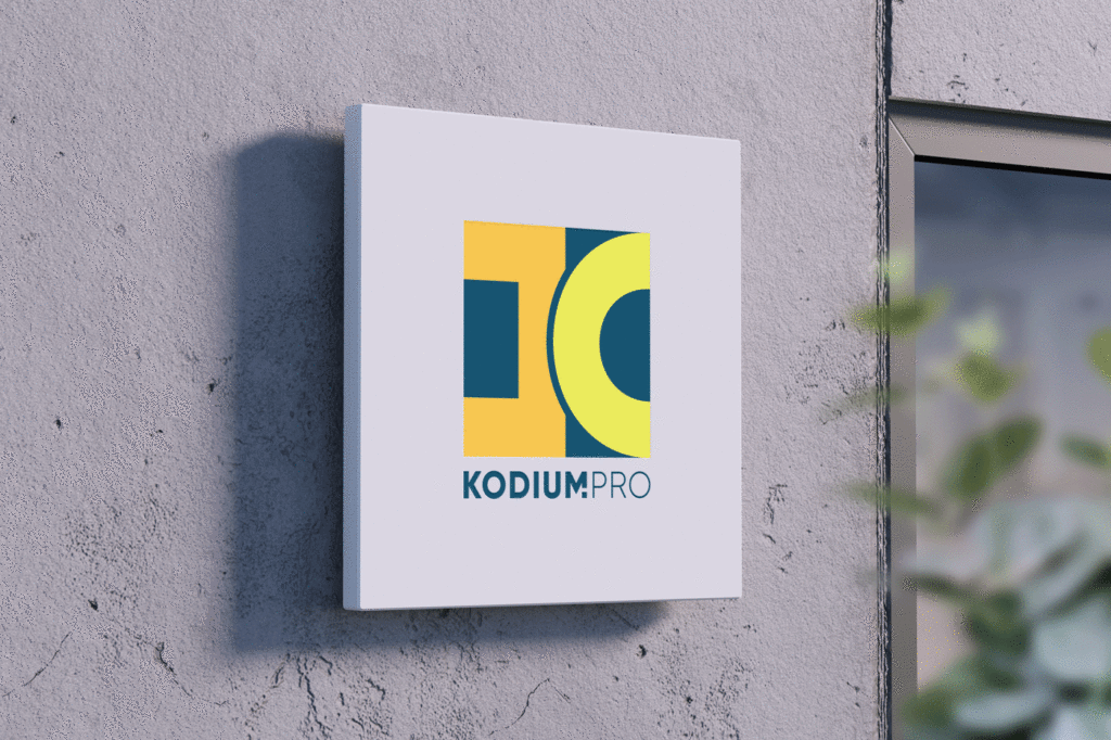
Kodium Pro :: Logo Design
graphic design :: branding :: visual identity :: logo creation :: motion graphics

The logo design for Kodium Pro is simple and minimalistic. The logo consists of simple geometric shapes such as two brackets, round and square, which form an abstract sign that is associated with the letter “K”. Also, those two brackets are a symbol of software business, that is, programming, which the company deals with. The colors used in the logo are orange and yellow, which on a dark green background give a fresh, bright, but still business look.
Designing logos for the IT industry
In general, logo design for software companies has some specifics compared to other types of companies. Software companies usually have an emphasis on technology and innovation, so it’s important that the logo design reflects these values. The role of the logo is to be recognizable and to distinguish the company from the competition. Therefore, a logo for a software company should be simple, modern looking and with strong visual identification.
It is important to emphasize that when designing a logo for a software company, scalability should be taken into account, i.e. that the logo looks good in different sizes. Since the logo is often used on websites, mobile apps and other digital media, it is important that it looks good in different resolutions.
Ultimately, designing a logo for a software company should be aimed at creating a simple, recognizable and modern look that reflects the company’s values and its specificity in the technological world.
Do you want to make a logo with us? Contact us at the email address or via the contact form. You can view our works in the portfolio.
If you want to know more about graphic design, feel free to take a look at our blog, where you will find many interesting articles, many of which are on the topic of logos.
Zale Design Studio


