

Dozen :: Logo Design
graphic design :: branding :: visual identity :: logo design
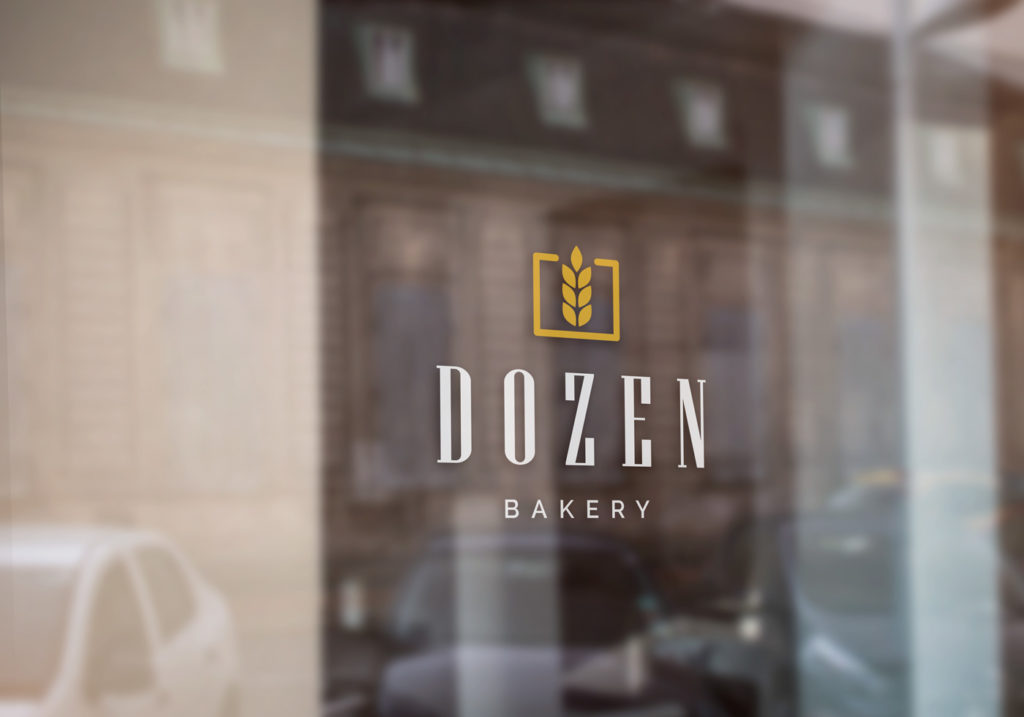
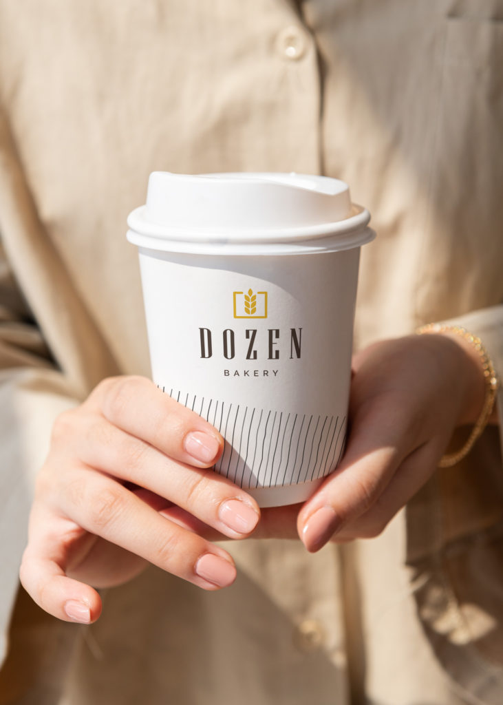
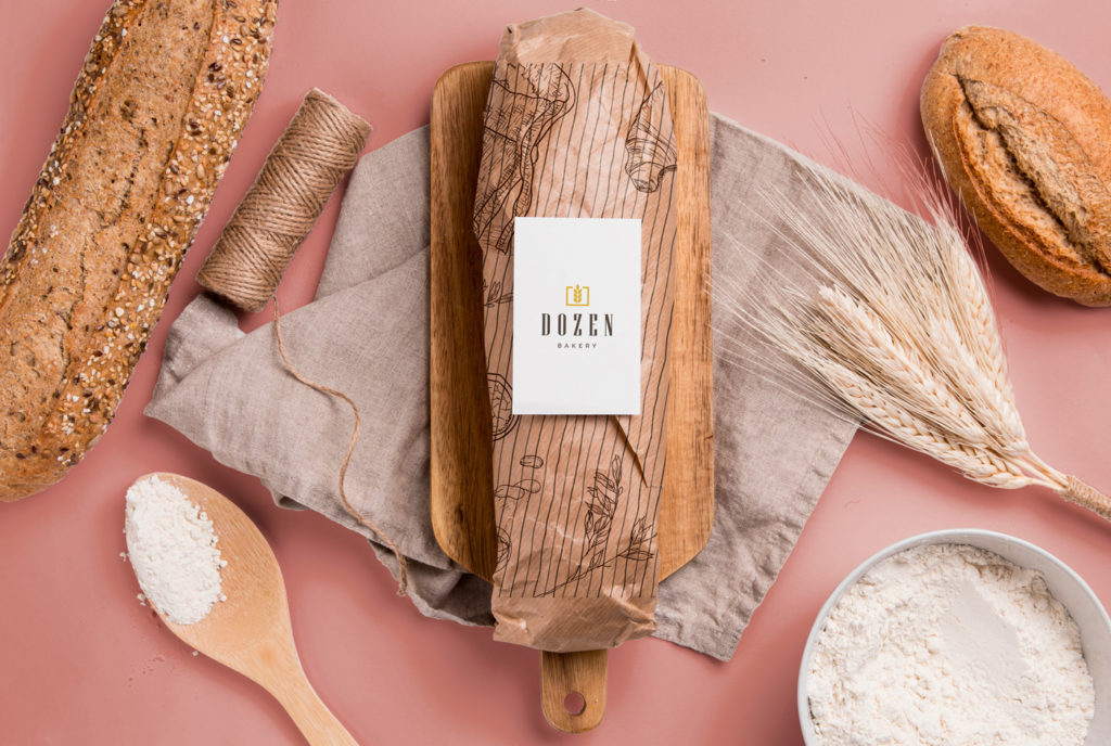
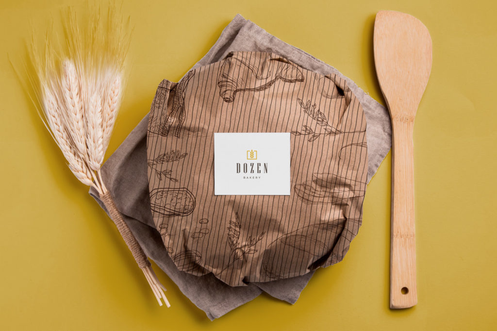
We created this beautiful traditional logo for the Dozen bakery. As befits a bakery, we chose wheat as the icon, which well represents the company’s business. Using a traditional font, we kept a modern but warm look.
Logo design for bakeries: Tradition, quality and authenticity
Logo design for bakeries is an important element of the visual identity of every bakery. The logo should convey the visual idea of the bakery and its focus on fresh and tasty bakery products, as well as emphasize tradition, quality and authenticity.
Logo design elements for bakeries
One of the most common elements used in bakery logo designs are images or symbols related to baking, such as bread, pastries, rolling pins, or fire. Images of these elements can be displayed in different ways – as individual elements, as part of a complete picture or as abstract forms. A font reminiscent of handwritten inscriptions can also be used, which emphasizes the feeling of traditional and authentic production.
Colors for the bakery logo
Colors often used in bakery logo designs are brown, gold, red and white, which symbolize warmth, tradition and quality. In addition, the color green can be used to emphasize the focus of the bakery on natural and fresh products. It is important that the colors are natural and do not stand out too much, in order to emphasize the authenticity and natural quality of the product.
Do you want to make a logo with us? Contact us at the email address or via the contact form. You can view our works in the portfolio.
If you want to know more about graphic design, feel free to take a look at our blog, where you will find many interesting articles, many of which are on the topic of logos.
Zale Design Studio