

Shermans :: Logo Design
graphic design :: visual identity :: branding :: logo design
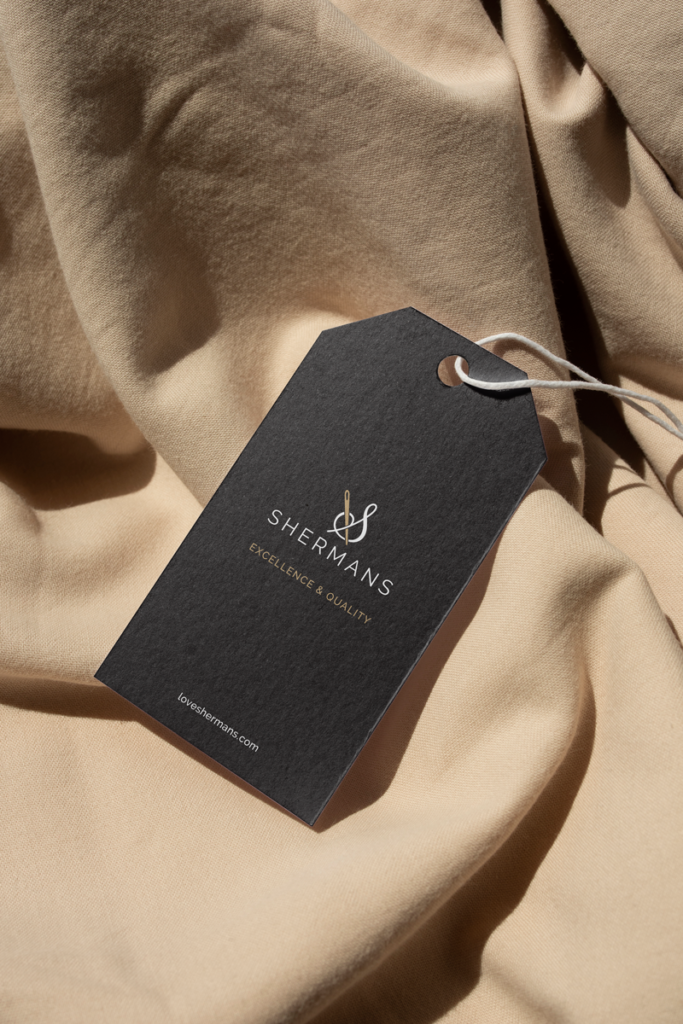
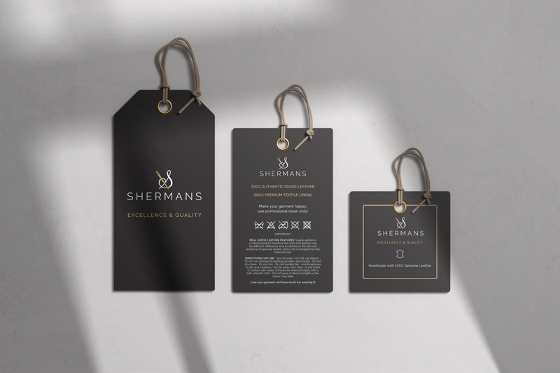
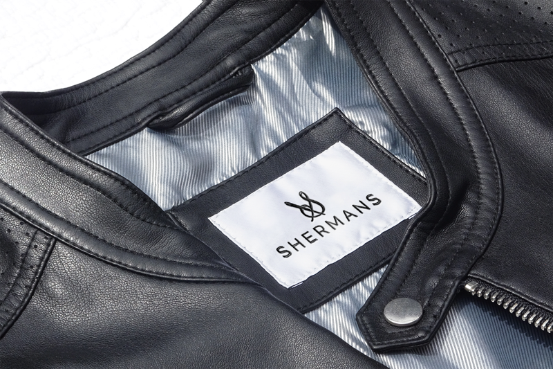
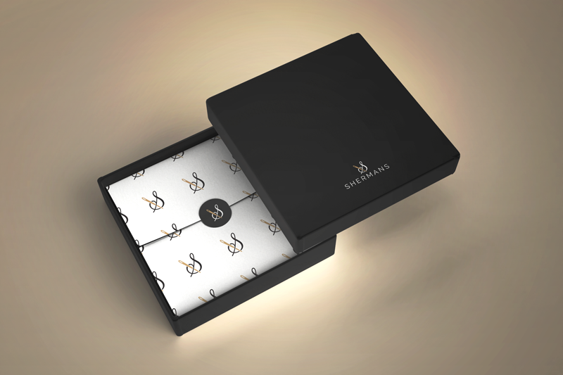
We created this elegant logo design for Shermans. The Shermans company are our clients from Ukraine who started a fashion line and needed a suitable logo. What is more suitable for a sewing activity than a needle and thread, but a logo made like this, which resembles the sign &, not only evokes the activity but also gives us a touch of real elegance and modernity.
As a detail that will stand out, we chose a sewing needle, which in this context is a symbol of work and creation. The gold color adds to the elegant look of the logo, but we also know that the color gold signifies prosperity and wealth. All that glitters is not gold, but this pin really is. 🙂
Do you like this logo? Then take a look at our other works from the Logo category.
How to create an elegant logo?
There are a few key things to keep in mind when designing a logo to help it look elegant. First, the shapes in the logo should be simple and clean. Second, the colors should be subdued and sophisticated. And third, the overall design should be well balanced.
Tips for creating an elegant logo:
1. Use clean, simple shapes
The shapes in your logo should be simple and easy to understand. Complex shapes can be confusing and make the logo look messy. Stick to basic shapes like circles, squares and triangles. In this case, less is better.
2. The choice of colors is important
Use subtle colors. Bright colors should be avoided when designing an elegant logo. Although some bright colors can look elegant in a certain design, this is more the exception than the rule. So it is better to stick to duller tones, neutral colors and earthy tones. If you want to add a touch of color, it is better to choose a rich shade like burgundy or dark blue.
It’s a good idea to add some gold or silver for an added sense of sophistication and elegance.
Also, it is important that the logo looks as good in black and white as it does in color.
3. Make sure the logo is well balanced
A well-balanced logo is pleasing to the eye. Make sure the different elements in your logo are evenly spaced. For example, if you have a lot of text, make sure the graphics are scaled appropriately.
4. Choose a classic font
The fonts you use in your logo should be easy to read. Avoid using ornate fonts that are difficult to decipher. Stick to simple, clean fonts that are easy on the eyes.
5. Keep the overall design clean and uncluttered
A cluttered logo can be confusing. Stick to a clean, simple design that’s easy to understand. Too many elements in one place make the design chaotic and harder to notice and remember.
Also, you should stick to only one concept. Too many ideas in one logo can make it even more difficult for clients to understand the message the logo is meant to convey.
You can view our other works in the portfolio.
Do you want to make a logo with us? Contact us at the email address or via the contact form.
If you want to know more about graphic design, feel free to take a look at our blog, where you will find many interesting articles, one of which is about logo.
Zale Design Studio