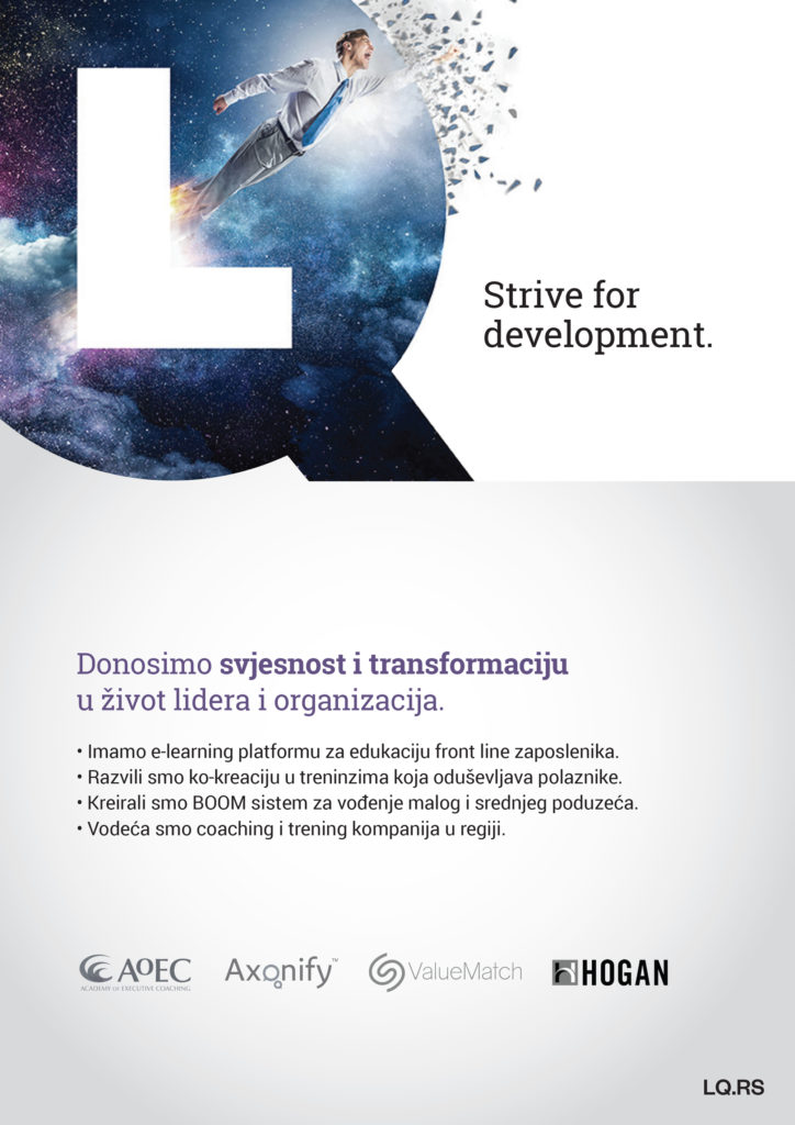
LQ :: Ad
graphic design :: ad design
We designed an ad for the company LQ from Zagreb, Croatia. LQ is a leading company for business and managerial training in Croatia, which has also developed an e-platform for education. In order to reach new potential clients, they needed an ad that we were happy to create.

Ad Design
A few things to pay attention to when designing posters and ads: Does your ad convey a clear message? Although abstract posters can sometimes be visually interesting, will the client know what it is about? The first rule of any ad is to be functional. The purpose of an ad is to present a service or product, and any design must respect that.
The use of multiple types of fonts, too many design elements, colors and texts should be avoided on the ad. The text should be comprehensible, short and clear. The poster is used only to present the service or the product but for additional information we want clients to visit our websites or stores. Always remember that posters and other advertisements are read in passing.
See our other works from the Print category.
If you need an ad or poster, contact us via the contact form or send us an email.
See our works from other categories in our portfolio.
If you want to know more about design, visit our blog, where articles on various design topics await you.
Zale Design Studio


