

Liora :: Ad and booklet
graphic design :: ad design :: poster design :: exhibition stand design :: point booklet design
Design of Display and Promotional Materials for Liora
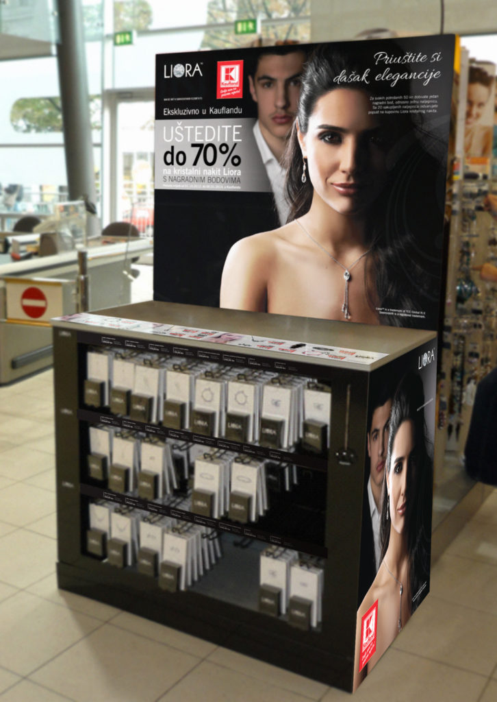
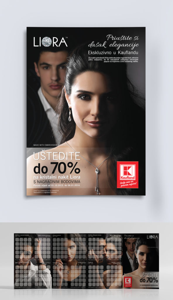
The company TCC from Switzerland contacted us to create a design for the Liora company campaign in cooperation with Kaufland in Croatia. It was about a prize game, collecting points with each purchase in Kaufland, in order to achieve a more favorable purchase of Liora’s crystal jewelry. For the campaign, they needed the design of an advertisement, a poster, a booklet for collecting points, and an exhibition stand (display) on which the jewelry will stand in Kaufland stores.
As it was about jewelry, it was important for the design to maintain a sophisticated look, and to follow the already existing design standards of Liora and Kaufland. For this reason, we stuck to a monochromatic selection of colors and elegant fonts. We transferred the design to the exhibition stand, booklet and advertisement, in order to create uniformity of design.
Rules for good poster design
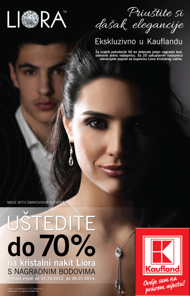
There are several rules to follow when designing a poster. As with other types of design, don’t cram the poster with too much text. Focus on the main message and basic information such as: company name, contact information (website) and tagline. A good rule to follow is that the text does not take up more than 1/3 of the total area of the poster.
You can see this on the example of the Liora poster. The text is subtle, only the basic information that is important to the potential buyer is emphasized. The main focus is on a photo representing the product being sold and information about the prize draw.
PHOTOGRAPHS OR ILLUSTRATIONS
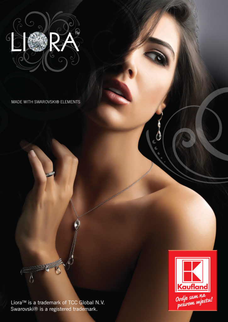
This brings us to the importance of a photograph or illustration on a poster. A picture leaves a much stronger impression than text, and we notice it sooner and remember it more easily. Therefore, every photo we choose for the poster must reflect the message we want to convey. In this case, it is jewelry, but it can also be a car ride, a concert experience, or some other topic. We want the customer to want to buy a product or service, and the best way to convey that is through the use of an image. In Liora’s photo, we don’t just see jewelry, but a woman getting ready for (perhaps) going out. It makes us feel like we want to wear that jewelry and feel more dressed up.
FONTS
A common mistake we also see with posters is the use of too many types of fonts and too many font sizes. If too many fonts and sizes are used, the poster becomes difficult to read. The impression is of a disorganized design and the design loses harmony. You should stick to about two font types and 3-4 sizes. More than that will spoil the harmonious look.
So we also used only two fonts on Liora’s poster (a special one was used only for the slogan) and 4 sizes.
COLORS
Do not exaggerate the use of colors either. You can use bright colors, indeed, but you should limit how many colors will be on the poster, and make sure that the colors do not swallow the text and information. The message should always come first, and colors can help to create contrast and make the message stand out even more. Of course, different services and products will also need different color palettes that create special atmospheres and impressions, but always make sure that colors are not the main actor, but only a support.
With Liora, a sophisticated impression was achieved with the monochromatic selection of colors, exactly what this type of product needs.
See more of our work in the portfolio and our other works from the print category.
If you need a poster or advertisement design, feel free to contact us via email or contact form.
For more interesting graphic design topics, check out our blog.