Typography :: Why is it important?
Typography around the world plays a major role in communicating and presenting ideas, services or products. We see typography more than any other design element. It is everywhere. In the newspapers and books we read, on cell phone and computer screens as we scroll through the Internet, on the packaging of the products we use and even traffic signs as we drive down the road.
So what exactly is typography and why is it so important in design?
WHAT IS TYPOGRAPHY?
Typography is a technique of arranging letters and words to make them more readable and visually appealing. Simply put, it is the use of different types of fonts in writing or designing something, in order to create a certain effect. However, typography is not just about choosing a font. It is also the art of balancing font styles, their sizes, weights, spaces and other design elements such as color and layout layout. It all involves a lot of creativity and knowledge to make the final product attractive, memorable and successful.
WHY IS TYPOGRAPHY IMPORTANT?
You must be wondering what makes typography so important. Typography helps to create a visual style in the text that helps the reader to quickly understand the content. The clever use of typography attracts the attention of users, creates a well-organized and attractive product, and ultimately increases sales and brand identity.
Font or letter type can say a lot about your company or your brand, depending on which fonts you use. It’s not just about the size of the text and other elements of decoration, but also about the space between the letters, the chosen color palette and how it all fits into your design.
TYPES OF FONTS
There are thousands of fonts, but most of them can be stylistically grouped into a couple of categories.
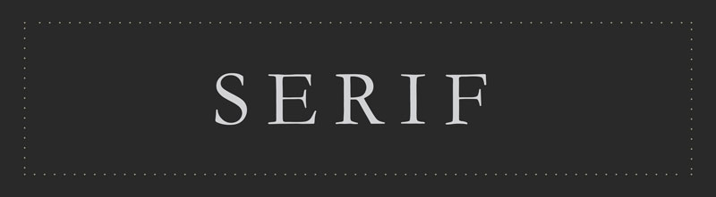
SERIF
Serif font type is characterized by the fact that the main part of the letter ends with gentle strokes (dashes) which we call serif (from the Dutch word schreef which means line) and after which this typeface is named. This is the oldest type of font. Their history is long, dating back to the 16th century and they have maintained their popularity to this day. Due to their classic look, they are a good choice for more traditional projects as well as print materials, such as magazines and newspapers. Serif fonts are divided into four types: old-style serif, transitional serif, didone serif and slab serif. The most famous sherif is certainly the Times New Roman.
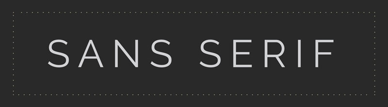
SANS SERIF
Sans serif is a type of font, as the name suggests (in french sans means without), without serif. Since they don’t have serifs, they look more modern, simpler and cleaner. This version of the font is extremely popular nowadays, but first appeared in the 19th century when it was not very popular. The reason for the current popularity is that this type of font is easier to read on monitors than serif fonts, and aesthetically they fit better into today’s minimalist and simple design trends. Sans serif fonts are divided into four types: grotesque sans serif, neo-grotesque san serif, geometric san serif, and humanist sans serif. The most famous sans sarif font is certainly Helvetica.
Serif and Sans Serif fonts are basic types that can be used for titles, but are the only ones recommended for other text because of their readability.
The following two types of fonts are more difficult to read in longer texts, and are recommended only for titles and shorter texts.
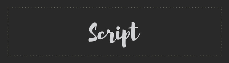
SCRIPT
Script fonts imitate handwriting, ie calligraphy. They look like they were written in pencil or brush. Because they are extremely decorative, their use is limited. They are not suitable for text, but can be used for titles, slogans, phrases, logos, etc.
Their appearance is extremely elegant which is why we can often see them on wine labels, price lists in expensive restaurants and cosmetics. Some of the more famous types are Liesel, Amarone and Bayamo.
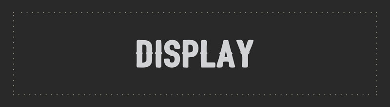
DISPLAY
This group of fonts contains very different types within it. While in other types we can see the connection between fonts, their appearance and style, this group includes all fonts that are decorative. Which does not necessarily mean that they are similar.
Here we can find fonts that look like handwriting but are not calligraphy as is the case with script fonts, fonts with shadows and engravings, mixed font sizes inside the same font (some letters are small, some are large), distorted fonts, very thin or bold fonts and many others. This group of fonts is used, like script fonts, for titles, details, logos, slogans, etc. It is not recommended for use in longer texts as they are difficult to read. Also, the design may seem excessive so the font may distract from the message of the design. Some of the better known fonts within this category are: Brandon Grotesque, Bourton, Spock, and Gilroy.
Some fonts are considered obsolete and should be avoided in design, such as the Comic Sans font. Which doesn’t mean you should avoid the style that the font is representing, just don’t use this specific font. There are many fonts that are more modern versions of such fonts and are a good replacement for them.
HOW TO CREATE A SUCCESSFUL DESIGN USING TYPOGRAPHY
Typography is a big part of graphic design and digital marketing. It is difficult to imagine many marketing campaigns without typography: they are used everywhere, and the goal is to convey the message or content to the audience in an efficient way.
Choosing the right font is key to a successful typography. There are a number of factors to consider when choosing a font, such as the tone of the message you want to convey, the audience you are trying to reach, and the overall look and feel of the design.
Examples of typography in use for the logo, you can read in our blog about the types of logos.
Hierarchy
Hierarchy is another important aspect of typography. Using different letters, sizes and thicknesses, you can create a hierarchy that will help guide the eyes of your audience through your design in an desired manner. For example, let’s say you want to create a poster for a concert. You may want to use a large, bold font for the title page, and then a smaller, less intrusive font for the rest of the text. Or when designing a website, you can use different heading sizes to separate the content and make it more organized and easier to read. No matter what design you are working on, thinking about hierarchy will help you create a smoother and more professional end product.
Leading
Leading or spacing between lines of text is another important concept for the appearance of typography. If you’re not sure how much spacing you should use, most programs have default settings designed to give optimal spacing, and professional designers will adjust the spacing to the vision they have for the look, always keeping in mind legibility. Too much or too little white space can make a design feel crowded or cramped, so it’s important to find a balance that works naturally and is pleasing to the eye.
Kerning
Kerning and tracking are similar concepts. Tracking is the addng or removing the space between letters in an entire word. So we can lengthen words (increase the space between letters, everywhere evenly) or narrow them (reduce the space between letters, everywhere evenly). Kerning is a similar concept, it is about adding and subtracting space between letters, however unlike tracking, here the spacing between individual letters within the same word can be different.
In our previous blog about online games for designers, you can find a couple of games related to typography and one specifically for kerning.
CONCLUSION
Typography is an essential element of design that can help you create a smoother and more professional end product. By paying attention to hierarchy, spacing, and other details, you can ensure that your design is eye-catching and conveys the right message to your audience. With a little practice, you will quickly become a master of typography!