

Error Free :: Logo Design
graphic design :: branding :: visual identity :: logo design
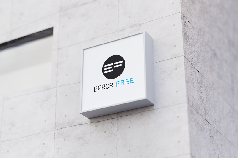
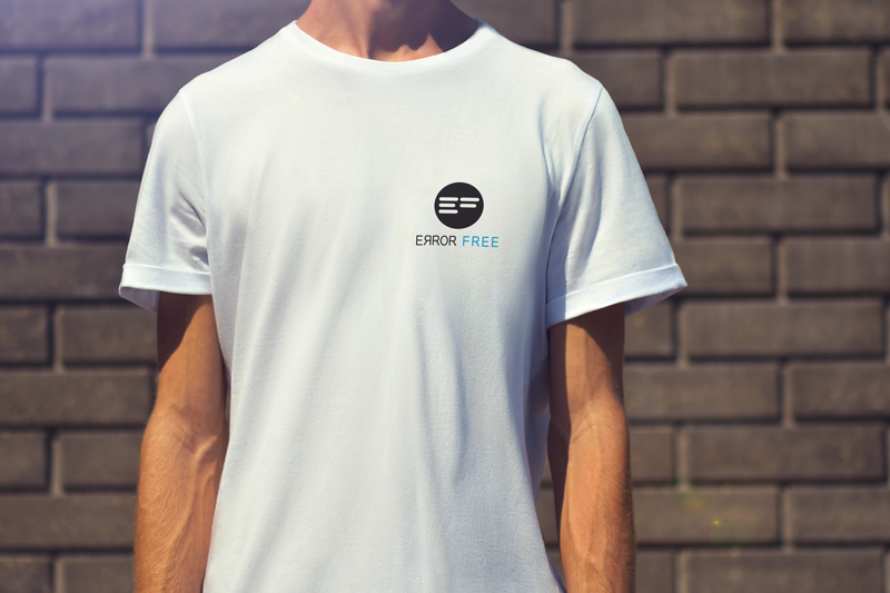
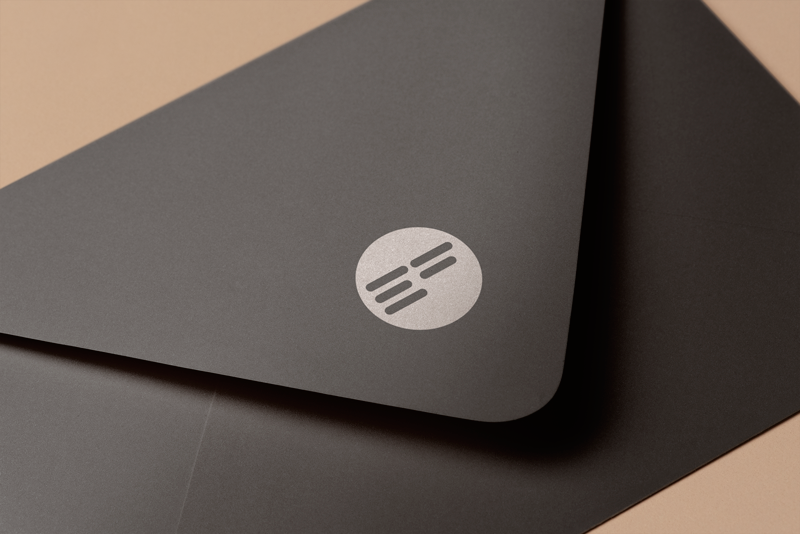
We designed the logo for the company Error Free. It’s business is in audio production and professional lighting design for concerts and other events. In fact, even though the name of the company is Error Free, we sneaked in intentional one. 🙂
Logo Design: The idea behind the Error Free logo
The client wanted a logo that was professional and that invoked a feeling of trust. Creating a logo of this kind is quite a common request, and we already had an idea of how we would achieve it. This is the reason why we chose a very light blue color as a contrast to the strong black. The light blue color is one that most people will say is their favorite. One of the reasons for this is certainly that, according to psychology, it leaves us with a feeling of trust and reliability, and it also calms us down. For a company dealing with such a dynamic business, this color gives a good balance to it.
As an icon, we chose a circle with the symbols of the letters E and F. We wanted them to be associated with the graphics for the music equalizer. Since these strips are quite symbolic for production (which is what our client does), we wanted to somehow include them in the design. We achieved this by turning the initials into music bars. To balance those straight lines, we put them in a circle. This monochromatic sign is striking and unique.
Now we will return to our deliberate mistake. The name Error Free is a strong and serious name. Since our client is not like that, in the contrast of the strong name and monochromatic icon, we wanted to break that seriousness and monotony a bit, and we played with the letters. A small detail like this, turning the letter R to the wrong side, gives a good balance to the look of the logo, but also to the meaning of the company itself. Although the impression of the logo is still professional and strong, our eye will notice this small interesting detail and that detail, which jumps out of the ordinary, will be what we will notice and remember.
Do you like this logo? Then take a look at our other works from the Logo category.
WHAT DO YOU NEED TO KNOW ABOUT LOGO DESIGN?
You’ve decided you need a logo. Whether it’s a brand new logo or a redesign of an existing one, here are some things you need to know.
1. THE LOGO SHOULD BE SIMPLE
The logo should be legible, memorable and easy to apply. The best logos are often the simplest. A complex logo may look great on a website or business card, but if it can’t be boiled down to a single color or made small enough to fit on a key chain, it won’t be of much use.
2. THINK ABOUT TYPOGRAPHY
The words in the logo are just as important as the image. The right font can make a big difference in how a logo is perceived. Serif fonts (like Times New Roman) are traditional and classic, while sans serif fonts (like Arial) are modern and clean. There are also script fonts (such as Italic) and decorative fonts (such as Comic Sans), but these should be used sparingly, if at all.
3. COLORS MATTER
Color is an important part of any logo. It can convey mood, emotions and feelings. It can also be used to convey certain messages. For example, red is often used to represent energy, while blue is often used to represent calmness. Yellow is often used to represent happiness, while black is often used to represent power.
4. SYMMETRY
The logo should be balanced and pleasing to the eye. This does not mean that it has to be perfectly symmetrical, but it should have a sense of visual stability. An unbalanced logo can look chaotic and off-putting.
5. CLASSIC IS BETTER
A logo should be designed to last. Excessively modern elements that will make the logo look outdated in a few years should be avoided. A timeless logo will be just as relevant and effective in 10 or 20 years as it is today.
6. UNIQUENESS
The logo should be recognizable and be an ideal representative of the brand. It should be different from any other logo in the industry. If it looks like everyone else, it will be very difficult for customers to remember it.
7. GET FEEDBACK
Before you finalize your logo, it’s important to get feedback from others. Show it to your family and friends and see what they think. Ask customers and clients what they think. ask for feedback from people in your target market. The more feedback you can get, the better.
8. HIRE A PROFESSIONAL
Designing a logo is not a DIY project. It is important to hire a professional logo designer who can help you create a logo that meets all of the above criteria. A professional designer will have the knowledge, experience and skills to create a logo that is perfect for your brand.
Logo design is an important part of any business. By keeping these things in mind, you can ensure that the logo is effective and represents your company in the best possible way.
You can view our other works in the portfolio.
For logo design, you can contact us at the email address or via the contact form.
If you want to know more about graphic design, feel free to take a look at our blog, where you will find many interesting articles, one of which is about logo.
Zale Design Studio