Vicious Delicious :: Logo Design
graphic design :: visual identity :: branding :: logo design

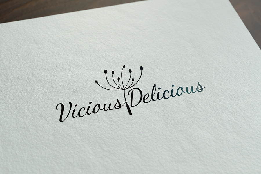
The Vicious Delicious logo was made for a client from Dubrovnik. The client is an artist and wanted a logo that is not corporate, flat, strict and serious. She wanted a logo that was more relaxed, playful, but still elegant and businesslike. Therefore, we decided on a handwritten font, which is more relaxed and more appropriate for an art business, in this case jewelry making.
We put a dandelion as an icon. Dandelion, the flower itself, carries a lot of symbolism and has multiple meanings. While researching the meanings of the symbols of individual flowers on the Internet, we came across a page that explains the meaning of dandelions like this:
“The dandelion is a symbol of hope, love and happiness. Its yellow petals represent the sun that illuminates all the good deeds in your life. The black seeds of this plant are said to carry with them wishes for prosperity and new beginnings as they fly into the sky.” We all remember when we were children picking dandelions, imagining wishes and blowing them out with the hope of making them come true. That idea was our guiding thread in choosing this particular icon to represent Vicious Delicious. The client symbolically blew away all her wishes, which will now come true.
We decided not to add additional colors to the logo. The black logo gives an additional dose of elegance and artistic impression. In this way, the logo leaves a stronger impression, while maintaining its simplicity.
Do you like this logo? Then take a look at our other works from the Logo category.
Black and white logos: where to use them and what are their advantages over color logos
Black and white logos are present everywhere. They are used in almost all fields such as art, photography, fashion, etc. Their use is not limited to a specific area, they can be used in any industry.
People perceive them differently than those of color. Color ones are perceived as more fun and relaxed, while black and white logos are usually perceived as more serious, professional and credible.
What products should you use a black and white logo for?
Black and white logos are a good choice for companies that want to look professional. Because they are simple, timeless and universal. They look serious. In fact, you can use them in most industries as they will take on the characteristics of your business to give it that strong, professional look. Many brands prefer black and white over a color logo. The main reason for this is that they are more modern, memorable and versatile.
Also, black and white logos are easier to read than color ones, which helps the viewer understand your message more quickly. This is because color can become difficult to read at small sizes and in low light, while black and white logos do not have this problem. The contrast between the two colors makes it easier to read, even in smaller sizes.
Black and white logos can also be used in any medium, from print to digital. Because of their versatility, they can work well for any business or organization that wants their logo to have longevity.
You can view our other works in the portfolio.
Do you want to make a logo with us? Contact us at the email address or via the contact form. We are waiting for you!
If you want to know more about graphic design, feel free to take a look at our blog, where you will find many interesting articles, one of which is about logo.
Zale Design Studio


