

Logo redesign and slogan :: Euro Projekt Scriptum
graphic design :: visual identity :: branding :: logo design :: motion graphics
In the field of EU project development, a convincing and visually appealing identity is paramount to attracting clients and establishing credibility. In our agency, we recently had the opportunity to cooperate with Euro Projekt Scriptum, a company specialized in creating EU projects for its clients. Today, we are pleased to reveal the result of our creative partnership—a renewed logo that encapsulates the expertise, professionalism and commitment of the organization.
Symbolism and meaning:
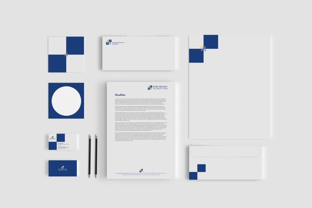
The symbolism of the logo is key to conveying the brand’s values and aspirations. The redesigned Euro Projekt Scriptum logo achieves this by incorporating carefully selected elements. The initials EPS represent the company name, projecting a sense of authority and expertise. The three yellow stars inside the square symbolize the exceptional quality, excellence and success that Euro Projekt Scriptum wants to provide to its clients. Combining these elements, the logo sums up the organization’s commitment to providing superior solutions for EU projects and driving client success.
Aesthetics and design:
The redesigned Euro Projekt Scriptum logo exudes a harmonious blend of professionalism and visual appeal. The elegant and modern typography of the initials EPS signifies the company’s modern approach and expertise in its field. Three vivid yellow stars, set within a square, immediately attract attention, underscoring Euro Projekt Scriptum’s commitment to excellence. Including the full company name below the logo ensures clarity and brand recognition, while maintaining a cohesive visual presence across different marketing channels.
Strengthening brand identity:
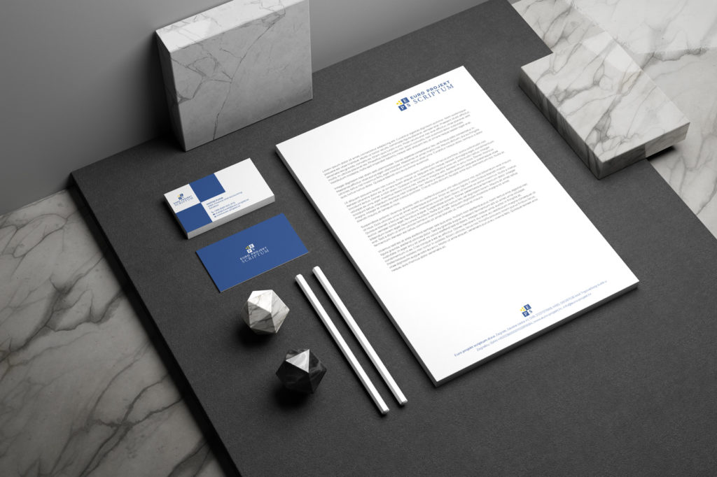
A strong logo is crucial in building and strengthening brand identity. The renewed Euro Projekt Scriptum logo is a visual anchor for the company’s brand. By integrating this distinctive emblem into marketing collateral, such as websites, business cards and presentations, Euro Projekt Scriptum ensures a consistent and recognizable brand. The logo becomes a strong symbol of the company’s professionalism, expertise and ability to provide exceptional EU project solutions.
Advantages of the redesign:
The decision to revise an existing logo is not taken lightly, but the benefits can be substantial. In the case of Euro Projekt Scriptum, the logo redesign breathes new life into the company’s visual identity. By embracing a more contemporary and sleek design, Euro Projekt Scriptum is positioning itself as a modern, forward-thinking company. The redesigned logo serves as a catalyst for re-engagement with existing clients while simultaneously attracting new ones, improving Euro Projekt Scriptum’s market position and competitiveness.
The power of slogans:
In addition to the renewed logo, our marketing agency for Euro Projekt Scriptum also developed a slogan: “The art of success to EU funds”. This carefully crafted phrase encapsulates the essence of the company’s mission and expertise. Combining creativity and strategic thinking, Euro Projekt Scriptum has mastered the intricate process of securing EU funds, making it an art form in itself. This slogan reinforces the company’s commitment to helping clients navigate the complex landscape of EU projects with finesse, expertise and a track record of success.
With a harmonized logo and slogan, Euro Projekt Scriptum establishes a strong brand presence that captures the attention and trust of potential clients, consolidating its position as a leader in the field of EU project development. By synergizing a captivating tagline with a redesigned logo, Euro Projekt Scriptum not only creates a visually appealing identity, but also delivers a powerful message that resonates with its target audience. This winning combination sets the stage for continued success and positions the company as a partner for unlocking the full potential of EU funds.
Conclusion:
The redesigned Euro Projekt Scriptum logo represents a turning point in the company’s branding journey. With its symbolism, contemporary design and strong visual impression, this emblem embodies the expertise, professionalism and commitment to excellence of Euro Projekt Scriptum. As Euro Projekt Scriptum continues to thrive in the EU project development landscape, their revitalized logo will serve as a symbol of trust and security, distinguishing the company in a highly competitive market.
Do you want to make a logo with us? Contact us at the email address or via the contact form. You can view our works in the portfolio.
If you want to know more about graphic design, feel free to take a look at our blog, where you will find many interesting articles, many of which are on the topic of logos.
Zale Design Studio