Web design :: How to design a great website?
Good websites mean a lot more to a company than just a place where one goes for some basic information. It is your virtual office. The place where visitors will make a decision whether they want to use your service or buy a product. It is often the first contact with potential clients, and you certainly don’t want it to be the last. A site that stands out as dynamic and engaging will benefit you and your business in many ways. Increasing website traffic from search engines such as Google, attracting potential new clients, introducing regular clients to business news, are just some of the benefits that a good website provides.
In this blog we cover some essential principles of good website design. Whether you’re an experienced designer working on a new project or just getting started with design, these tips can help you create a website that effectively communicates your message with a strong visual impact—something that every website visitor will appreciate as they navigate your site.
Responsive design is critical
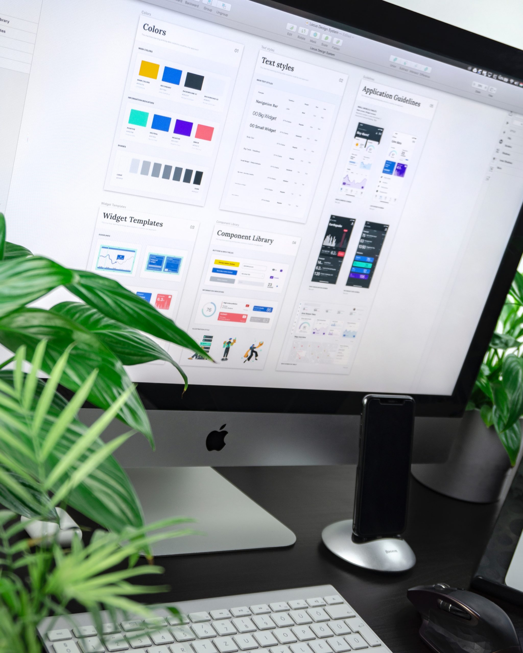
If your website is not available on a wide variety of devices and screen sizes, you are missing out on a large percentage of Internet users. From the beginning of 2018. more than two-thirds of people who regularly use the Internet accessed it through a device other than a personal computer, according to Internet Live Stats. That’s a huge number of people who would miss your site if it wasn’t designed and built to suit their device type. Imagine that 66% of people can’t come to your office because the front door is too narrow. This is essentially what happens when you don’t design your website to be responsive. People looking for your website will find it, but only after searching on another device. Don’t let this happen to your business – make sure your website is responsive on all devices.

Don’t ignore typography
Many web designers neglect this important aspect of creating a pleasant site experience. When faced with a design decision, such as which typeface to use, many designers fall back on whatever default font their software uses or go to the safety of the font everyone uses. When choosing a font, keep in mind that people will read your content on screen, not on paper, and this has consequences for how you’ll want to use typography.
Readability is important. You want your readers to be able to read your content easily and quickly. When choosing a font, pay attention to things like font size, line length, letter spacing, and font thickness. You will keep your readers more easily. People spend a lot of time looking at the screens of their devices. Your site’s typography is one of the things that will make that experience enjoyable or frustrating.
Don’t forget the color
Color is an often overlooked element of website design. However, color is one of the first elements that visitors see on a page. Depending on how you use it, it can help convey your brand’s message, draw attention to important parts of the page, and add some vibrancy. When choosing colors, focus on colors that match the existing visual identity of the brand or company so that the website fits into the overall strategy. For a brand identity, it is important to create a cohesive look, so the website should be in line with that.
Be sure to think about how your site will look on different devices, and in different lighting conditions. This can have a big impact on how your colors are perceived.

Photos are important
Photos are one of the most powerful elements of a website. With their help, website visitors can quickly see what service or product you sell and promote, and get a general impression of the company. When creating new websites, try to choose photos that will best convey who you are as a company: what impression do you want to leave on visitors? Do you want visitors to feel that you are a stable and serious company, or do you strive for a more playful and cheerful look? Of course, it will depend on the type of business the company is in, its previous activity and already built brand, as well as what kind of clients you want to attract.
If you are going to redesign the website, choose photos that will fit in with the old photos that were already present on the web. This will help your website maintain its visual continuity and remind your audience that it’s the same website they’ve already visited. Keep in mind that the photos you use on your page don’t have to be new. You can easily use images from your organization’s archive or images from the public domain.
And finally, pay attention to the quality of the photos. Make sure all the photos you use are of high quality. A photo of poor quality can drastically damage the appearance of a newly created website, and this should definitely be avoided.
Navigation
The biggest reason why websites are visited is to get information: working hours, contact information, price list, services, etc. The last thing you want is for your visitors to be unhappy because they can’t find the information they need. Navigation is key to making it easy for site visitors to find what they want. Allow website visitors to quickly get where they want without even realizing they’re using navigation.
A few options for website navigation design:
- The most common is to place the navigation at the top of the page, down the left or right side
- You can also use drop-down menus and a combination of menus and submenus.
The key is to keep navigation simple and obvious. Avoid posting in a way that makes it difficult for visitors to find essential information.
Organization of content
Hand in hand with navigation, as part of it, goes the organization of the pages themselves and their content in order to make it even easier for visitors to use.
When creating web pages, pay attention to how you will organize the content. As in the case of the navigation itself, you want the visitors to get all the necessary information very quickly and to be familiar with all the content on the page.
One way to do this is to organize pages by topic. For example, if you are designing a website for a yoga studio, you might have a page with general information about yoga, a page with information about different types of yoga, an information page about yoga classes, an information page about yoga workshops, and so on.
The structure of your site’s content can make it easier for visitors to navigate your site. It can also help with search engine optimization. If your website pages are properly optimized, they can help your website rank higher in search engine results.
Conclusion
Designing and building a good website involves much more than choosing a pretty template. The right colors, images and fonts can go a long way in establishing a company’s image and creating a positive experience for website visitors. When designing a website, make sure you choose colors and images that are appropriate for your brand. Make your content easy to understand and organized so your visitors can easily find the information they are looking for. A website can be an extremely valuable tool for interacting with your target audience and promoting your business, so it is important to ensure that it is well designed. With the tips provided in this article, you are well on your way to designing and building a good website.
If you liked this article, visit our blog where you will find many articles on the topic of graphic design.
If you need a website design, feel free to contact us via the contact form, email or social networks.
See our other services and works in the portfolio.
Thanks for reading! 🙂
Keywords: creation of web pages; website design; graphic design


