Logo and colors :: How to choose the right color for a logo
It is already well known that colors can affect our emotions and with that our mood. Graphic designers are also well aware of this. The choice of color has a strong influence on customer behavior. They activate emotions and influence our behavior. When used correctly, color can help achieve a desired mood or reaction, and make a design better and more successful.
In this blog we will explore the psychology of color and how designers use it when creating logos.
Color psychology
Color psychology studies the influence of colors on human perception and behavior. Different colors have different psychological effects on us. This depends on many factors including the culture we come from and personal preference. Color theory is also included in color psychology, which we have already written about in detail. It refers to the practical application of mixing and harmonizing different colors.
In marketing, color psychology is focused on what impression colors leave on potential clients and whether a certain color will help us more easily convince them to buy our product or service.
Here are some tips for choosing the right colors for logo design:
• Blue is associated with trust and reliability, making it an excellent choice for financial institutions and other businesses that want to appear credible and reliable.
• Yellow is associated with happiness and optimism, which makes it an excellent choice for brands that want to appear cheerful and optimistic.
• Red is associated with excitement and energy, making it an excellent choice for brands that want to appear vibrant and energetic.
• Green is associated with nature and health, making it an excellent choice for environmental brands or brands that want to represent health.
When using colors in logo design and creation, the first thing you need to think about is your company. Each color evokes certain emotions, so you want to choose a color that best represents what you do. Also consider what are the standards within the industry your company is in? You want to stand out from the competition, but you also don’t want to jump too far out. The standard colors of individual industries help in recognition, as well as in the feeling of security and professionalism. And finally, who is your target audience and what mood and emotions do you want to evoke in them?
Color is an incredibly powerful tool that can be used to influence human emotions and perception. When choosing a color for your logo, be sure to consider the psychology of color.
What colors should you use for your logo?
There is no one “right” way to use color in graphic design, let alone logo creation, but there are a few guidelines you can follow to get the most out of this powerful tool.
To begin with, think about the psychology of colors and what each shade represents. Then what do you want your logo to communicate to your target audience. Once you have a clear idea of both, use colors that will support your message and visually appeal to your target market.
When it comes to color combinations, try to stick to just a few colors so that your logo doesn’t become too busy and mismatched.
And remember, less is often more!
Some tips for choosing the right colors for your logo:
1. Think about your company’s values and mission. What colors represent these values? Also think about the “personality” of your company? Are you fun and playful or more serious and professional?
2. Consider your potential clients. What colors will appeal to your target audience?
3. Make sure the colors are complementary. Colors that are harmoniously different from each other will create a more visually striking logo.
4. Think about what you want your logo to communicate. Do you want it to be exciting and energetic, or soothing and relaxing?
5. Stick to the chosen color palette. Harmonious colors help the logo stand out better. Our eyes gravitate towards harmony, so colors should not be overdone and should be used meaningfully.
6. Choose the colors that will stand out against the background. If you are using a color as a background, choose a color that will stand out against it. For example, if you’re using a dark green background, choose a bright yellow or orange for your text and logo.
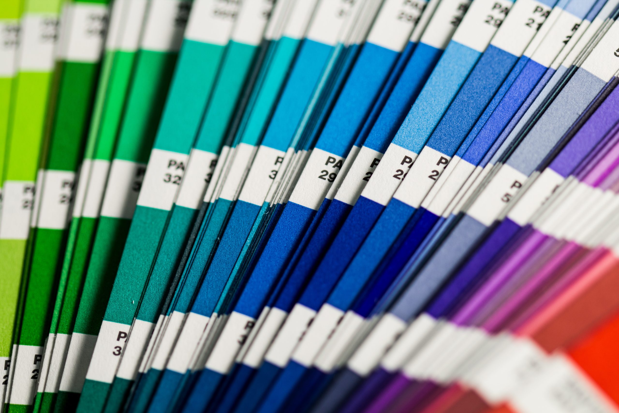
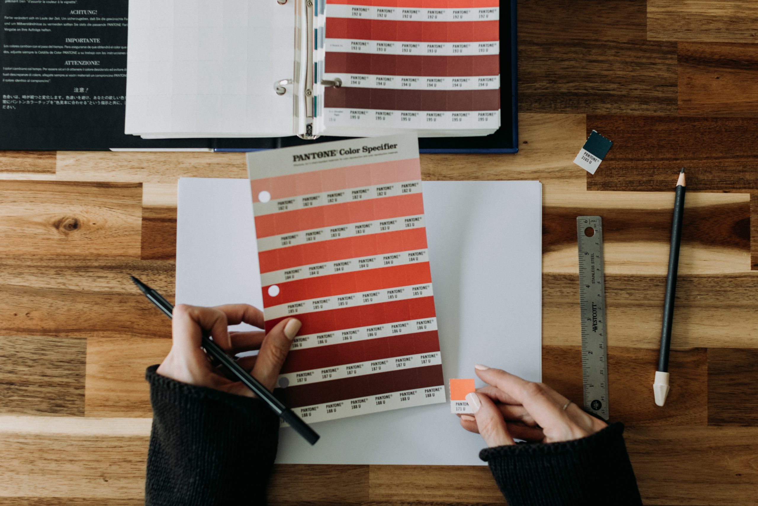
What colors work best together?
When it comes to choosing colors for your logo, it’s important to keep in mind which colors go well together. One way to achieve color harmony is to use some of the color schemes as a selection of your palette. We will list some of the most popular, and you can find more schemes and a more detailed explanation in our blog about color theory:
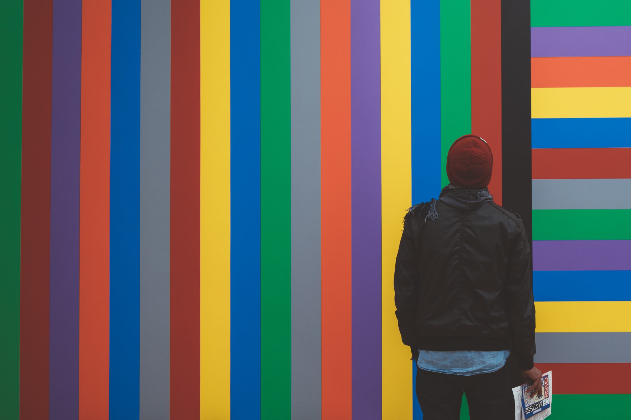
1. Contrasting colors: Colors that are opposite each other on the color wheel (eg red and green, blue and orange) work well together and create a high level of contrast. This can be useful for attracting attention and creating a strong visual impression.
2. Analogous colors: Colors that are next to each other on the color wheel (eg blue and purple, red and orange) work well together and create a harmonious effect. This can be helpful to create a more subtle visual impression.
3. Monochromatic colors: The use of one color in its different shades. Such a design is simple and clear, and gives a feeling of calmness and harmony.
Additional advice when choosing a color for the logo
1. Use bright colors to create a fun and upbeat mood
2. Use muted colors to create a more calm and relaxing mood or to reflect the timelessness of your brand.
3. Use contrasting colors to create visual interest and draw attention.
4. Use the same color palette in all branding materials to create a cohesive look.
5. Experiment with different color combinations until you find the one that suits you.
CONCLUSION
When it comes to using color in your graphic design, it’s important to consider the psychology of color and what message you want your logo to send. Each color has its own set of emotions and meanings that you can use to your advantage when designing your logo. By understanding the meaning behind different colors, you can create a logo that not only looks great, but also sends the right message to your target audience.
A well-designed logo is an important part of your branding and can help customers remember your business. If you’re not sure where to start, enlist the help of a professional graphic designer to create a logo that reflects your business and its values.
For more articles on graphic design, visit our blog.
If you need a design of logo or visual identity, feel free to contact us via the contact form,e-mail or social networks.
See more of our works in the portfolio.
Thanks for reading! 🙂
Keywords: color theory; logo creation; logo creation; logo design; logo design; graphic design