Zoom :: Logo design
graphic design :: branding :: logo design :: visual identity

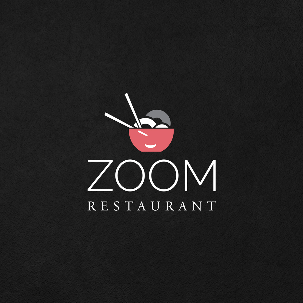
Restaurant Zoom approached us to create their logo. Zoom specializes in Asian cuisine, so we wanted to create a logo that would represent that.
As an icon, we have chosen an Asian bowl full of pasta with ready-to-use Chinese chopsticks. The red color was easy to choose, since it is said that the red color causes an increased appetite, and in contrast with the white letters and gray details we get this cheerful logo.
Do you like this logo? Then take a look at our other works from the Logo category.
How to design a great logo for a restaurant?
As a restaurant owner, you want it to have a great logo that will represent it well. But how do you create a logo that will make your restaurant stand out from the crowd?
When we talk about creating a logo for a restaurant, the first thing you want is for potential clients to immediately know what type of restaurant it is and what kind of experience it offers (eg. fast-food, casual or posh for a fine dining experience) and what kind of food they can expect. A logo for all industries should always represent the company or product/service offered, so restaurants are no exception.
Here are some tips for logo design:
1. Keep it simple
A logo should be easy to remember and recognize, so simplicity is key. Customers will have a hard time remembering a complicated logo and may not even bother to understand it. A simple logo, on the other hand, will be easily remembered and associated with the restaurant by clients.
2. Is it legible?
The logo should be easy to read, even from a distance. Avoid using complicated fonts. And while we’re on the subject of text, make sure the logo is legible in both small and large sizes. Remember that you may be applying it to small items like glasses, so it must be clear. Likewise, when it is enlarged to, for example, a restaurant window, it should be equally effective.
3. Colors
You want your customers to be able to see the logo from a distance, so use colors that will make it stand out. Bright, bold colors are always a good choice, and you can even use different colors for different parts of your logo. Contrast in the choice of colors is a good idea in this case. Although you want the logo to be attractive, you don’t want to use too many colors. A logo with too many colors will look cluttered and confusing. Stick to two or three colors and use them judiciously.
Read more about the use of colors on our blog about logos and colors, and we wrote about color combinations in the article about color theory.
4. Use appropriate images
The logo should be relevant to the theme and cuisine of the restaurant. For example, if you are a seafood restaurant, you might want to use a picture of a fish or the ocean. But avoid using images that are too common or generic, like fork and knife. Such motifs appear often and will not help the logo to stand out.
5. Timeless is better
A logo should be something you can use for years to come. Avoid using current trends or fads as they will quickly become outdated. Instead, focus on creating a classic logo that will stand the test of time.
Colors in graphic design that are great for food
When coming up with a color scheme for a restaurant logo, think about what types of food you will be serving. Colors can evoke certain feelings and emotions, so you’ll want to use colors that accurately represent what you’re offering.
For example, green is often associated with healthy food, while brown and red can convey a heartier and more filling atmosphere. Blue and purple can also be great options for food-related logos, as they can represent royalty and luxury. You can also use multiple colors in your logo to create a more complex design. Just make sure the colors you choose work well together and accurately represent what you’re selling.
You can view our other works in the portfolio.
Do you want to make a logo with us? Contact us at the email address or via the contact form. We are waiting for you!
If you want to know more about graphic design, feel free to take a look at our blog, where you will find many interesting articles, one of which is about logo.
Zale Design Studio


