Artistic Gaps: How White Space Shapes Graphic Design
When we think about graphic design, the first thing that comes to mind are colors, fonts, images and other design elements. However, there is an unsung hero in the world of design, an element that holds everything together while maintaining clarity and elegance and helping other elements stand out. That hero is white (or negative/empty) space. We think little about it, we place even less importance on that element, but it is an extremely important part of the overall design. That is why we dedicate this article to it.
What is white space?
Very simply, white space, also known as negative space, is space within a design that is intentionally left empty or unmarked by design elements such as text, images, or graphics. It is a fundamental concept in design (not just graphics, but in any art) that plays a key role in achieving balance between elements, clarity of design and visual continuity.
Although it is called white space, in Croatian, a better translation would be empty space because that is what it is. However, it does not have to be white or empty. White space can be any color, texture or background. It is a lack of content in certain areas of the design work, but it is a conscious and strategic choice that involves the deliberate use of empty areas in the design.
There are two primary types:
Macro white space:
The space between major design elements, such as blocks of text, images, and headings.
Micro white space:
Smaller details, including spacing between letters, lines or padding around images.
Why is white space important to design?
1. Visual clarity
Visual clarity refers to the degree to which a design effectively conveys its message or content to the viewer in a clear and understandable manner. This includes ensuring that the design is easy to understand and that the viewer can quickly grasp the information presented without extra effort.
White space contributes to visual clarity by:
Reducing visual clutter:
White space separates design elements and thus gives space for “breathing” and highlighting of individual elements, and with that their messages as well. When there is adequate space between text, images and other components, the viewer’s eye can more easily distinguish between them. Without white space, the design can appear cluttered, leading to reduced clarity of the message you want to convey. Visual clutter is one of the most common mistakes in design. There is an opinion that there should be as little empty space as possible in order for the design to be more striking, but this is the exact opposite of the truth. Less is more.
Improving readability
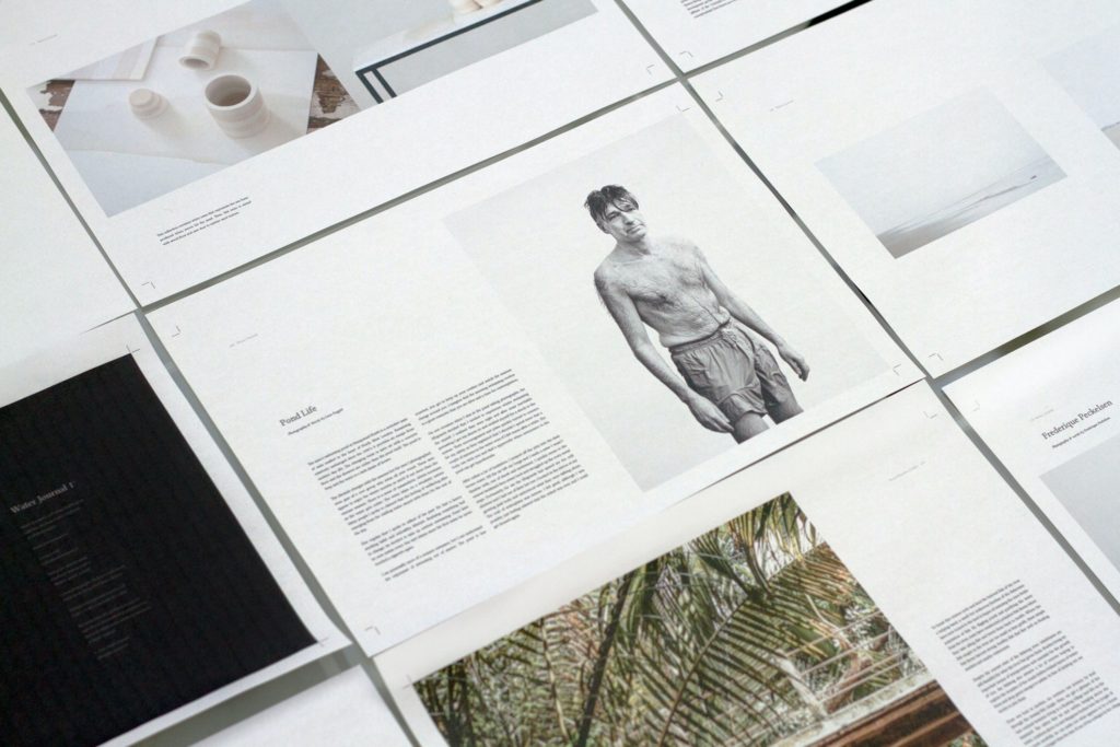
In designs with a lot of text, such as books, magazines or websites, readability is of great importance. White space can be used to create clear margins, padding and borders around text. This makes the text easier to read, ensuring that the viewer does not strain while viewing the content and that it is absorbed more easily and quickly.
Highlighting key elements:
White space can be strategically placed around key elements, such as headlines, taglines or call-to-action buttons. By isolating these elements with white space, they become more prominent and easier for the viewer to identify, ensuring that the most critical information is not overlooked.
Organization and structure:
Well-placed white space helps organize content. For example, in a product catalog, white space can separate individual items or product descriptions, making it easier for the viewer to navigate and compare different offerings.
Visualization of complex data:
In the case of visualizing complex data, such as charts and graphs, white space can be used to separate data points and labels. This separation ensures that viewers can clearly distinguish between different data elements, facilitating a better understanding of the information presented

2. Visual hierarchy:
White space is an essential tool for establishing visual hierarchy because it provides the necessary separation between elements.
Here’s how white space contributes to visual hierarchy:
Main design elements: Placing white space around important elements emphasizes their importance. For example, using a lot of white space around a headline can draw the viewer’s attention to it.
Grouping and Separation: Space can be used to group related elements and separate them from unrelated content. By creating visual distinctions with white space, viewers can quickly identify which elements belong together and which don’t.
Structural organization: White space is key in structuring the layout of a design. It provides the necessary spacing between sections or blocks of content, helping to create a sense of order and hierarchy.
Examples of visual hierarchy:
- On a website, the logo and main navigation menu are often placed at the top, using larger fonts and enough white space to establish their importance.
- In poster design, a strong headline, placed at the top and using bold typography, immediately grabs the viewer’s attention.
- In a product catalog, each product entry can use blank space to separate one item from another, allowing viewers to focus on individual products while maintaining overall cohesion.
Visual hierarchy is a tool that designers use to control the flow of information and guide the viewer through the design. White space, along with other design elements, helps create this hierarchy by providing separation and emphasis, ensuring that the most critical information is easily perceived and understood.
We will soon write a blog on the topic of visual hierarchy where we will explain in more detail its importance in graphic design.
3. Aesthetic appeal:
Aesthetic appeal in the context of white space refers to how the strategic use of empty surfaces can enhance the visual beauty, elegance and overall appeal of a design.
1. Simplicity and elegance:
White space, when used reasonably, creates a sense of simplicity and elegance in design. The absence of clutter and the presence of well-balanced white space make the design clean and refined. This aesthetic quality is especially valuable in fields such as branding and luxury product design, where conveying sophistication and elegance is paramount.
2. Balance and proportion:
White space is essential for achieving balance and proportion in design. It allows designers to distribute space evenly and harmoniously, ensuring that no single element overwhelms the composition. This sense of balance contributes to the overall aesthetic appeal by making the design more visually pleasing and well structured.
3. Design that “breathes”:
White space gives elements room to “breathe”. When the content is not cramped or tightly packed, the design appears more open and attractive. This can be especially effective in web and mobile app design, where it improves user experience and engagement.
4. Minimalism:
Many contemporary design trends emphasize minimalism, and white space is a fundamental component of this aesthetic. Minimalist designs often use a generous amount of white space to convey a sense of simplicity, cleanliness and modernity.
5. Uncluttered aesthetics:
The uncluttered design aesthetic is closely related to the strategic use of white space. As with minimalism, by removing unnecessary elements and creating space between content, design can exude a sense of clarity, calm and organization. An uncluttered aesthetic is often preferred in user interface (UI) and user experience (UX) design to improve usability and appeal.
6. It’s all in the details:
White space can be an indicator of a designer’s attention to detail. The precision in the distribution of space between the elements shows a high level of professionalism and knowledge of the designer. This meticulousness can be an attractive quality in industries where quality and attention to detail are valued.

4. Balance and harmony:
Balance and harmony are fundamental principles in design, and white space plays a key role in achieving them.
Balance in white space:
Balance in design is a visual balance achieved by the arrangement of elements and white space. It ensures that no single component dominates the composition.
There are two basic types of balance:
- Symmetrical balance: In symmetrical balance, the elements on one side of the central axis mirror or are similar to those on the other side. The white space is evenly distributed, creating a harmonious and formal impression. It is often used in classic and traditional designs, such as formal invitations or some corporate logos.
- Asymmetrical Balance: Asymmetrical balance is achieved when elements on either side of a central axis differ in size, shape, or other attributes. White space is used creatively to cancel out asymmetry, ensuring that the composition remains visually balanced. This type of balance is more dynamic and is often used in contemporary and artistic design.
White space is essential in both types of balance because it defines the spatial relationship between elements. It prevents one side of the composition from appearing heavier or more dominant than the other, creating a sense of balance.
Harmony in white space:
Harmony in design refers to the coherence and unity achieved by the arrangement of elements and white space. It ensures that the design appears uniform, organized and visually pleasing.
White space contributes to harmony in several ways:
- Structural harmony: white space gives structure to the design, helping to organize and align elements. For example, in a magazine layout, white space between columns, text and images ensures a structured and harmonious arrangement of content.
- Visual cohesion: White space can be used to unify different elements within a composition. By consistently applying whiteness between elements, a cohesive visual rhythm is established. This visual consistency contributes to the overall harmony.
- Content separation: In designs with multiple content, such as web pages or brochures, white space helps separate different sections or pieces of content. This separation helps clarify the organization of information, making the design more cohesive and easier to navigate.
- Focal point emphasis: White space can draw attention to a focal point, creating harmony by directing the viewer’s eye to the most critical element. This emphasis on a particular element increases the overall unity and cohesiveness of the design.

5. Emphasis and contrast:
Emphasis and contrast are vital design principles, and white space plays a significant role in helping designers achieve these effects.
Emphasis with white space:
Emphasis is the art of highlighting certain elements within a design, capturing the attention of the viewer and making them focus on certain content. White space is an essential tool in creating emphasis.
Here’s how it works:
- Isolation: By placing white space around an element, that element is isolated from the surrounding content. This isolation draws the viewer’s eye and emphasizes the significance of the isolated element. For example, a call-to-action button with enough white space around it stands out more, encouraging user interaction.
- Proximity: Space can be used to create proximity to related elements, emphasizing their connection and importance. For example, a product image with white space around it placed next to the description shows that they are related and should be viewed together.
- Contrast: Contrast between white space and other elements, such as text or images, creates emphasis. Dark text on a white background, for example, is an example of a high-contrast design that emphasizes the text.
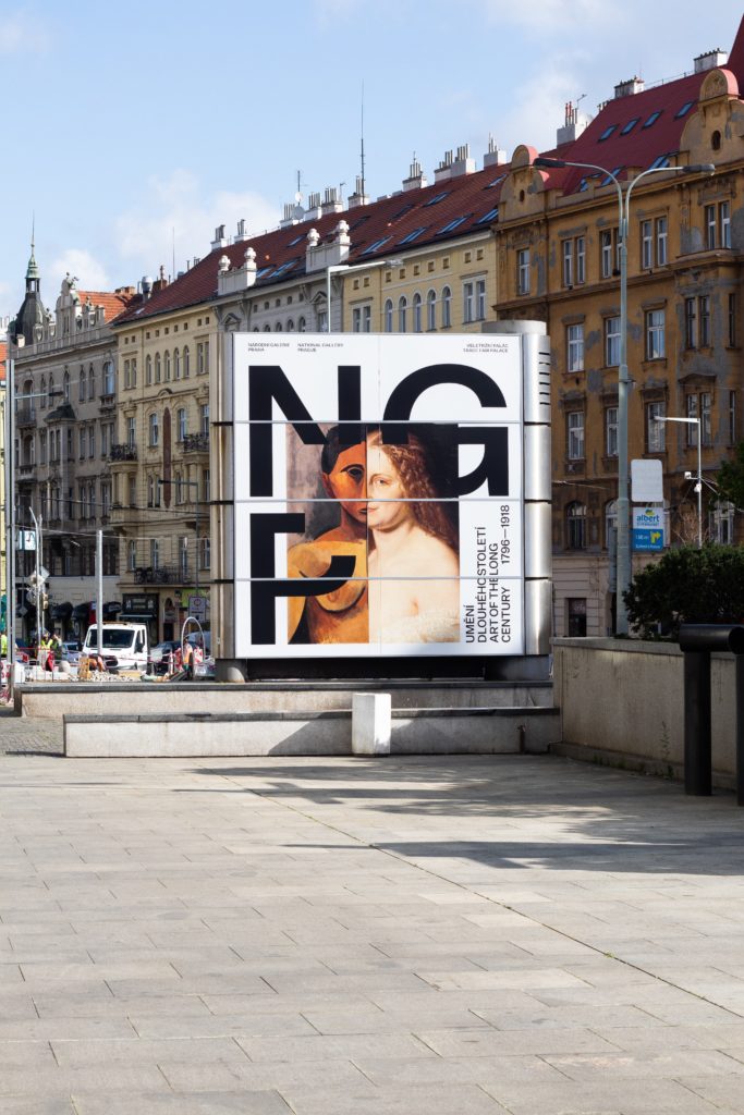
- Size and Scale: Space can be used to increase the size and scale of an element. Surrounding it with enough white space makes it appear more substantial. A logo with a lot of white space around it is likely to appear more prominent.
- Visual Focal Point: White space can direct the viewer’s eye to a focal point within the design. By creating “breathing space” around a central element, emphasis is placed on that element, making it the visual center.
Contrast with white space:
Contrast is a fundamental design principle that involves creating a difference between elements to make certain content or objects stand out.
- Color Contrast: White space can be used to create high color contrast. For example, white text on a dark background stands out because of the high contrast created by the white space surrounding the text.
- Size Contrast: White space can be used strategically to create size contrast. Surrounding a small element with enough white space makes it appear larger and more prominent compared to the surrounding space.
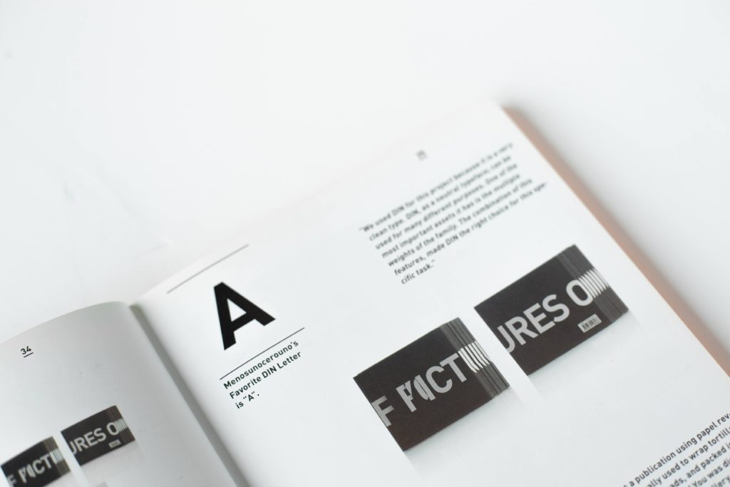
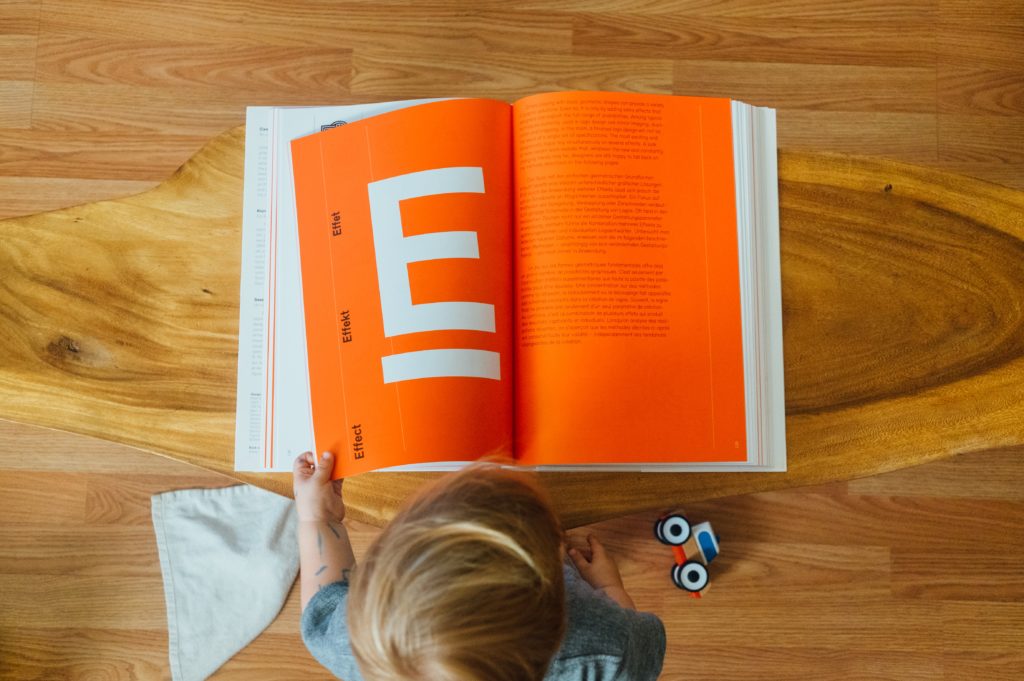
- Typography Contrast: White space can increase the contrast between different typography styles. For example, headings in bold fonts surrounded by white space create contrast with the main text.
- Form and Form Contrast: White space can be used to create contrast between form and form. A uniquely shaped element, surrounded by white space, contrasts with the background or other elements.
Examples of highlighting and contrast in white space:
- In a magazine layout, a bold, colorful headline with plenty of white space around it emphasizes the main article.
- In web design, a clickable button surrounded by white space creates a high-contrast element that stands out as a call to action.
- In a product catalog, white space between images and product descriptions creates proximity and emphasizes the relationship between the images and the accompanying text.
6. Psychological impact:
White space psychology is an aspect of design that delves into how viewers perceive, process, and respond to the strategic use of empty areas within the design itself. Understanding this can help designers create designs that resonate more effectively with their audience.
Reduced cognitive load:
One of the key psychological benefits of white space is its ability to reduce cognitive load. When viewers encounter a design with adequate white space, their brains aren’t overwhelmed by visual clutter. This reduction in cognitive load allows viewers to process information more easily and efficiently. This makes the overall viewing experience more enjoyable and less tiring.
Visual clarity and understanding:
As we wrote in more detail above, white space contributes to the visual clarity and understanding of the design. When content is well organized with sufficient spacing, viewers can more easily spot individual elements. The space establishes a visual hierarchy, guiding the eye through the content, ensuring viewers understand the intended message.
Feeling calm and focused:
Psychologically, white space can induce feelings of calmness and focus. Viewers tend to feel more relaxed when presented with a clean and organized design. This sense of calm can enhance the overall user experience, making it a valuable concept in web and user interface (UI) design.
Aesthetic assessment:
Viewers often respond positively to designs with plenty of white space. This positive response is rooted in the psychology of aesthetics. Clean, well-structured designs are more likely to be seen as visually pleasing and sophisticated, evoking positive emotional responses.
Perceived quality and professionalism:
White space can affect the viewer’s perception of quality and professionalism. Designs with adequate white space are often associated with attention to detail and a high level of craftsmanship. This can improve the perceived design quality and professionalism of the brand or entity it represents.
Influence on decision-making:
In marketing and advertising, the psychology of white space can play a role in decision making. By creating a clean and simple design, brands can convey a sense of simplicity, reliability and professionalism. This in turn can positively influence consumer behavior and decision making.
Psychological comfort in navigation:
In user experience (UX) design, white space is critical for navigation. Providing users with well-organized interfaces can lead to feelings of psychological comfort and ease of use. This contributes to a positive user experience, which is valuable for website and app design.
Emotional impact:
The psychology of white space also extends to emotional impact. A simple and aesthetically pleasing design can evoke positive emotions in the viewer, such as joy, calm or trust. These emotions can significantly influence how viewers perceive and react to content and the brand associated with it.

Common mistakes to avoid
Effective use of white space in design is an art, and as with any other art form, there are common mistakes that designers can make.
Some of these errors are:
- Not enough white space: One of the most common mistakes is not using enough white space. Overcrowding a design with too many elements, such as text, images or graphics, can lead to a poor design.
- Inconsistent Spacing: Inconsistent spacing between elements can disrupt the visual flow of a design. Ensure that spacing is even and consistent throughout the design to maintain balance and cohesion.
- Ignoring visual hierarchy: Failure to establish a clear visual hierarchy through white space can result in a design where important elements are not emphasized. Important content should have more white space to grab the viewer’s attention.
- Inadequate Margins: Neglecting to provide adequate margins around the edges of a design can make it appear cramped and unprofessional. Margins create a frame for the content and allow the design to “breathe”.
- Overuse of white space: While white space is essential, overusing it can lead to a design that feels sparse and devoid of substance. Striking the right balance between content and white space is crucial.
- Bad text and line spacing: In text-based design, neglecting to use proper spacing or kerning can make text less readable and aesthetically pleasing. Appropriate spacing improves readability.
- Ineffective use of grouping: Failing to use white to group related elements or separate unrelated content is another common mistake. Grouping and separation are key to organizing information in design.
- Mobile and Responsive Design Not Considered: For digital design, not considering how white space adapts to different screen sizes and devices can lead to responsive design issues. It is essential to ensure that white space remains effective across platforms.
- Ignoring User Experience (UX): In UX design, ignoring how white space affects the overall user experience can lead to difficulty navigating and less engagement. The space should be used to improve user interaction.
- Misalignment and inconsistent grids: Inconsistent alignment and grids can disrupt the visual harmony of a design. Elements should be properly aligned and adhere to a consistent grid system for a cleaner look.
- Ignoring brand guidelines: In branding, not following established brand guidelines regarding the use of white space can lead to inconsistencies in design materials and a weakened brand identity.
- Forgetting bleed: In print design, neglecting bleed (the extra space around the edges of a printed document that gets trimmed) can result in content being cut off during printing.
CONCLUSION
In conclusion, white space is not empty space; it’s a strategic design choice that can improve your work. By understanding its principles and benefits, you can create designs that are not only visually appealing, but also more communicative and memorable. As you embark on your next design project, remember the power of white space and use it to your advantage.
For more articles on the topic of graphic design, take a look at our blog.
If you need any of the graphic design services, feel free to contact us via the contact form, social networks or email.
You can view our works in the portfolio.
Thanks for reading!🙂