Graphic design for people with color blindness
Graphic design is a visual art and as such relies on color as one of the most important design elements. However, for more than 180,000 people in Croatia and over 300 million people in the world, this creates an obstacle in understanding the design itself and in enjoying it.
Color blindness is a vision impairment that affects an individual’s ability to distinguish certain colors. This is why it is crucial that graphic designers take into account the needs of colorblind people when creating designs, especially with products such as mobile applications and websites (UI design).
What is color blindness?
As we have already mentioned, color blindness is a condition that affects a person’s ability to distinguish certain colors. Although it is common to think that colorblind people see the world monochromatically, this form of colorblindness is extremely rare. People with this disorder usually do not distinguish certain shades of colors. This condition is hereditary and affects men (8%) much more than women (0.5%).
Each eye has three types of photoreceptors that are activated in different combinations to enable color perception: red, green, and blue receptors. In the case of color blindness, one or more of these receptors do not work properly, leading to problems distinguishing certain colors.
Types of color blindness
There are different types of color blindness, depending on which photoreceptor is malfunctioning.

Deuteranopia:
This is the most common form of color blindness. People with this form have problems recognizing the color green and can confuse it with red.


Protanopia:
This is the second most common form of color blindness. People with this form have problems recognizing the color red and can confuse it with green.


Tritanopia:
This is the rarest form of color blindness. People with this form have problems recognizing the color blue and can confuse it with yellow.


Monochromacy:
Or total achromatopsia is a rare condition in which a person does not have the ability to recognize colors, but sees the world in gray tones.

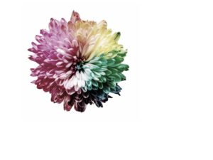
On the Color Blindness page, you can upload photos yourself and see what they look like to people with a certain disorder.
The impact of color blindness on graphic design
Color blindness can significantly affect graphic design, especially in cases where colors are used as an important element in conveying information. Using colors that are difficult for colorblind people to distinguish can result in certain parts of the design being indistinguishable to them, resulting in the loss of important details and messages.
In addition, in some cases, colorblind people may experience visual fatigue or have difficulty focusing on certain parts of a design that use certain colors. This can negatively affect the user experience, especially when it comes to mobile apps and websites that are frequently used in everyday life.
Therefore, it is important for graphic designers to consider the needs of colorblind people when designing, especially when it comes to products such as mobile apps, websites, or any other user interface tool. This includes using colors that comply with color accessibility guidelines and ensure that content is accessible and understandable for all users, including those with color blindness.
How to design for people with color recognition disorder?
Designing for people with color vision impairment can be challenging, but there are some steps designers can take to ensure their designs are accessible and understandable for everyone.
-
Use contrasting colors
Use strong contrasts between colors to allow for easier differentiation. For example, use a dark color on a light background or a light color on a dark background. This will help people with color vision disorders to distinguish between different design elements.
-
Avoid color combinations that cause difficulty in distinguishing
Avoid using color combinations that may cause difficulty in distinguishing. Avoid red-green color schemes. Red-green color blindness is the most common type of color blindness, so it is important to avoid using color schemes that rely heavily on these colors. Instead, try using colors that are easily distinguishable, such as blue and orange or yellow and purple.
Check how your design looks in black and white. This can help you determine whether the information is sufficiently understandable without the use of color.
-
Use other elements to convey information
If colors are used to convey information, such as red to indicate something important or green to indicate something that is allowed, you should use other ways to convey that information. For example, you can use symbols, icons or text to convey a message or important information. This will ensure that the message is accessible to everyone, regardless of their difficulty in distinguishing colors.
Also, using patterns and textures in your design can help differentiate elements without relying solely on color. For example, using a dotted or striped pattern may indicate a different element than a solid color.
-
Test your design
After you finish the design, test it on people with color vision disorders. This will help you know if your color combinations are appropriate and clear for all users.
There are several online tools and plugins that can simulate how a design would look to someone with color blindness. Use these tools to test your designs and make sure they’re accessible to everyone.
-
Educate yourself about color vision disorder
As a designer, it’s important to educate yourself about color vision disorder and understand how it can affect your designs. This will help you better understand the needs of your users and ensure that your design is accessible to everyone.
Design that is accessible to everyone
Designing for the colorblind is just one aspect of creating design that is accessible to everyone.
Use alt text
Alt text is an image description that is read aloud by screen readers for the visually impaired. Be sure to include alt text for all images in your design.
Avoid small text
Small text can be difficult to read for visually impaired people. Use a legible font and make sure the text is large enough to read easily.
Use headings and subheadings
Headings and subheadings can help break up long blocks of text and make it easier to scan and understand. Be sure to use semantic headings (such as H1, H2, etc.) for optimal accessibility.
CONCLUSION
Graphic design can be challenging for people with color vision disorders, but by following a few simple rules, designers can ensure that their designs are accessible and understandable for everyone. Using contrasting colors, avoiding combinations that cause difficulty in distinguishing, using other elements to convey information, testing designs, and educating about color vision disorder are key steps in making design accessible. Designers should always keep in mind the needs of all their users to ensure that their designs are understandable and accessible to all.
For more articles on the topic of graphic design, take a look at our blog.
If you need any of the graphic design services, feel free to contact us via the contact form, social networks or email.
You can view our works in the portfolio.
Thanks for reading!🙂