10 most common mistakes when designing a logo
In previous blogs, we have already discussed the importance of logo design as a visual representative of a company, product or service. We talked about what a logo is, we touched on its history, the creation of a quality logo and the use of colors in its creation.
In this blog, we write about another very important topic when creating logos: mistakes. When designing a logo, some mistakes can be easily avoided if we know what to pay attention to, so that there is no need to redesign the logo shortly after we have just created a new one. Mistakes in logo design can damage a company’s image, misrepresent the company, its services and products.
There are many mistakes, but here we will focus on the most common ones.
1. Insufficient research before creating a logo
Research, as we wrote in the blog about how to design a logo, is one of the most important steps for obtaining a quality design that will fully match the purpose that the logo should fulfill.
Research is not just about looking for inspiration on the Internet, but the process of getting as much information as possible so that the logo best represents the company. It can provide valuable insight into the preferences, needs and behaviors of the audience you want to attract, as well as competitors and industry trends. This information can help make design decisions and ensure that the logo stands out and represents the company effectively.

Why is research important?
Without proper research, a logo can completely miss its purpose and at the very least become an ineffective brand tool, but in the worst case it can harm the image of the brand itself.
Reasons why it is important to do proper research before designing a logo:
UNDERSTANDING THE BRAND
Communication is the first real step in logo design. Understanding the needs of the client and their brand is incredibly important. Logo should accurately represent the company. That’s the only way to be successful.
What does the company do? What is its mission? What is the personality of the company? What is the target audience? Is there already a logo? Was that logo successful in attracting clients? Does the company have its own distinctive colors? What type of logo do you want?
These are just some of the questions that need to be discussed with clients before moving into logo design. Understanding the client’s needs helps ensure that the logo appeals to its intended audience.

ANALYZING THE COMPETITION
Competitive analysis is an important part of logo design. By studying other logos in the industry, you can gain valuable insight into current trends and popular styles. Additionally, studying your competition can help identify weaknesses in their designs, allowing you to exploit them and create a logo that looks better than the others.
FOLLOWING TRENDS
While researching trends within graphic design itself can help keep a logo modern, fresh and relevant, there is also a balance to be found between following trends and creating a timeless design.
Trends come and go. A logo can take inspiration from an existing trend, but it should still retain a more classic style and feel in order to survive future trend changes. The logo doesn’t change every now and then. It can be redesigned every couple of years, but again following in the original style. Big and frequent changes are not good for the stability and recognition of the visual identity among clients. If you create logos based on current design trends, then the logo will not last long because the trend will pass before anyone notices it.
Also, trendy logos are not memorable or recognizable enough. A good logo is something that can be easily remembered with just one glance, but trending designs are often not unique enough to stand out from other designs of the same genre that you may see elsewhere in print or online media.
AVOIDING LEGAL PROBLEMS
The logo design belongs to the copyright category. Most logos are legally protected. Researching existing logos and trademarks can help avoid legal problems associated with intellectual property infringement. It is important to ensure that the logo is unique and does not infringe on existing trademarks or copyrights.
Stealing someone else’s design should never be an option. Copying other people’s logos is not only unethical, but can also damage the company’s reputation. It can only cost you dearly. The design can inspire you, but it must not be identical or very similar to another company’s design.
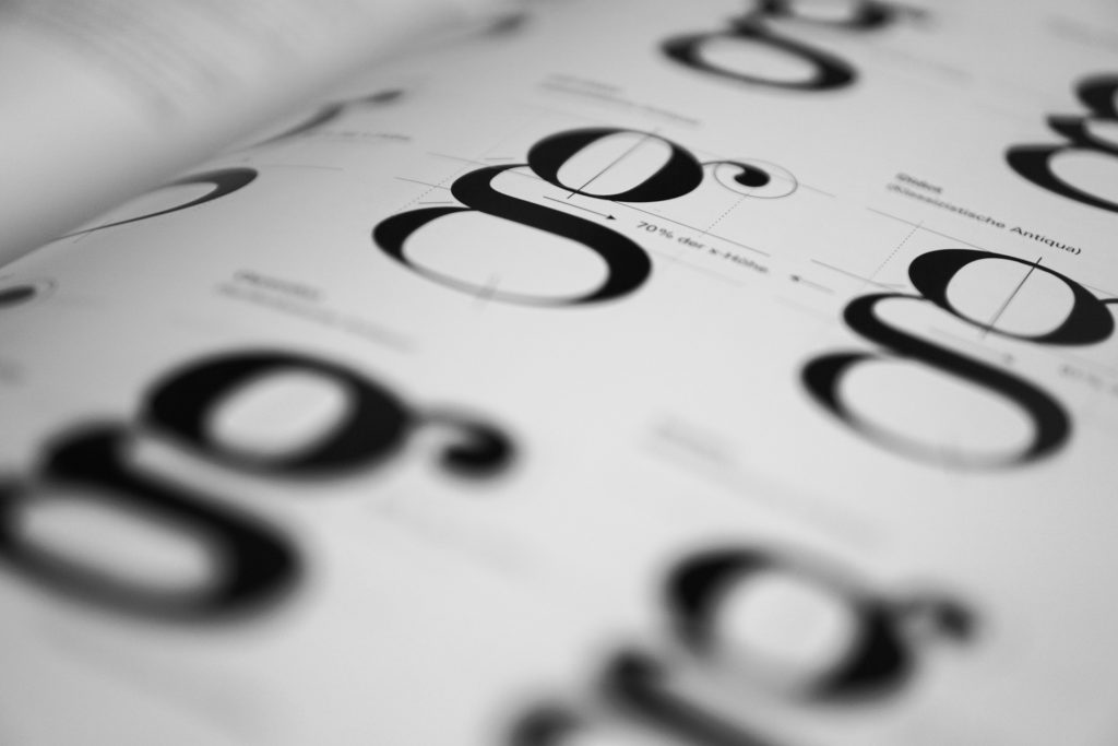
2. Wrong use of typography
We have already written about typography, as a key part of graphic design, but we did not touch on how the wrong use of typography can have a great impact on the overall design, and in this case also on the logo design.
Choosing the wrong font can make a logo look unprofessional, illegible, or even send the wrong brand image. Take for example choosing a classic serif font for a modern, playful toy company. Such a choice can make the logo look outdated and unattractive to that company’s target audience. Maybe potential customers won’t even know it’s a toy company because of the choice to use the wrong font. On the other hand, using an unusual, childish font for a serious financial institution can present that company as untrustworthy and unprofessional.
By carefully choosing the right font, you can create a logo that effectively communicates your company’s identity and helps it stand out from the competition.
Using too many types of fonts
Also, one of the common mistakes in typography is using too many types of fonts in logo design. Although it seems that more font types would make the logo more interesting and visually appealing, it will have the exact opposite effect. Such a logo looks cluttered and confusing. It is difficult to read and even more difficult to remember.
Instead of using too many fonts, opt for a maximum of two that complement each other and so leave a better impression. By keeping typography simple and consistent, designers create a strong and memorable logo that accurately represents the company.
3. Lack of scalability
Scalability refers to the ability of a logo to maintain its quality and readability when resized. A logo that lacks scalability may appear blurry, pixelated, or illegible when scaled up or down. This can be a problem when the logo needs to be reproduced in different sizes, such as on a website, promotional materials or business cards.
So when designing a logo, it’s important to keep scalability in mind. This means taking into account the size of the logo, the amount of detail and the thickness of the lines and shapes. A logo with too much detail or fine lines can lose legibility when scaled down, while a logo with too little detail can look too plain or unremarkable when scaled down.
By keeping scalability in mind and testing the logo in different contexts, designers can ensure that the logo is versatile, effective and memorable, regardless of its size.
4. Design that is too complex
A complex design is one that contains too many elements. A common mistake is to try to convey too many ideas or meanings into the design itself. Sometimes designers don’t know how to convey an idea, so they use too many elements, or they have more good ideas and want to use them all. Design elements that can be overdone include everything from using multiple colors, fonts, shapes and symbols.
Such a decision, however, will result in the logo being difficult to understand, read or reproduce. Also, an overcrowded design, no matter how high-quality individual elements are, leads to visual disorder and confusion. All this harms the effectiveness of the logo itself.
Simplicity and clarity should be prioritized in logo design, taking into account the context in which the logo will be used. Do not forget that the logo is only one part of the overall visual identity. Although important, it is not the only one. Other design elements can be used on other parts of the visual identity.
5. Using too many colors
As with an overly complex design and too many types of fonts, using multiple colors on a logo is not recommended. Such a design leads to visual clutter. It can then be difficult to determine which elements are the most important, and the overall design can appear chaotic and disorganized. In addition, the more colors in a logo, the more difficult it is to reproduce it consistently in different media and formats, which can further reduce the logo’s effectiveness.
Now you might be thinking, “But what about all the successful colorful logos?” The most famous such is certainly the Google logo. Of course some colorful logos can be successful. The key to creating a successful logo that has multiple different colors is to use them in a thoughtful and intentional way. In the case of the Google logo, colors are used to create a playful and vibrant aesthetic that reflects the company’s brand values of innovation and creativity.
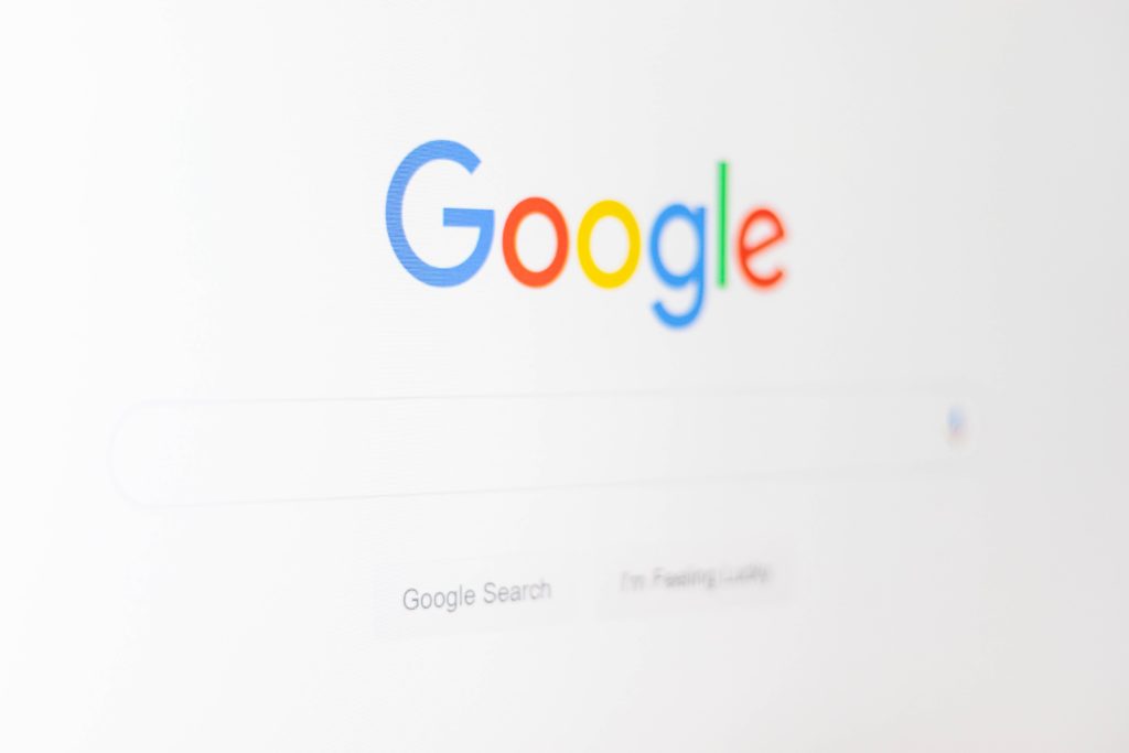
Another reason why the Google logo is successful despite the use of many colors is that the design is simple and easily recognizable. Each letter in the logo is clearly defined, making it easy to read and understand, even at small sizes. From this we see that if we “overdo it” with one design element, the others must remain completely simple. So, a more complex choice of colors does not leave the impression of confusion and the logo remains recognizable and easy to remember.
You can read more about colors in the blog about color theory and in the blog about choosing the right colors for a logo.
6. Use of outdated design elements
Design elements such as shadow effect, emboss and outline were popular design techniques in the past, but are not used as often anymore. Because of this, the use of such design elements can look outdated or less professional.
Design should be simple, and elements like this, when overused, can add unnecessary visual complexity to the design, making it difficult for the viewer to understand. Also, the design may not translate well to different media or sizes. A design with a lot of shadows may not look as clear or sharp when printed at a small size.
While these design elements can be used effectively in some cases, it’s important to use them thoughtfully and sparingly to ensure they enhance, not detract from, the overall design.
7. Lack of contrast
Lack of contrast in logo design refers to a design where there is not enough visual difference between elements, resulting in a logo that is hard to read or visually unattractive.
Illegibility: When a logo design lacks enough contrast, it can become difficult to read, especially from a distance or at a small size. This is especially true for logos that contain text, where the contrast between the text and the background is important for readability. If the text blends in too much with the background or other design elements, it can be difficult to read and make the logo less effective.
Lack of visual appeal: A logo without enough contrast can look boring or uninteresting. A lack of contrast can also make a logo look flat and two-dimensional.
Ineffectiveness in different contexts: A logo without sufficient contrast can lose its effectiveness when displayed in different contexts, such as on a dark background or in grayscale. This can limit the versatility and functionality of the logo.
Difficult to distinguish from competitors: lack of contrast can make the logo blend in with similar competitor logos, making it difficult to stand out and recognize the brand.
To avoid a lack of contrast in your logo design, consider using color, typography, and design elements to create a design that is visually appealing and easy to read. It is also important to test the logo in different contexts to ensure its effectiveness and versatility.
8. Lack of originality
A logo that is too similar to other logos or does not have unique design elements that distinguish it is a logo that lacks originality.
When the logo is not original, then it will have:
Inability to stand out: A logo without original elements can make it difficult for a brand to stand out from its competitors. A lack of originality can cause a logo to blend in with others in the same industry or market, making it less memorable or recognizable.
Weak brand identity: A logo that lacks originality may not effectively communicate the brand’s unique identity, values or personality. This can weaken the brand’s positioning in the market and hinder its ability to connect with customers.
Potential Legal Issues: A logo that is too similar to other logos can lead to legal issues, such as copyright infringement. This can be costly and damaging to the company’s reputation.
9. Poor use of symbolism
Bad use of symbolism in logo design refers to the use of symbols or images that are inappropriate or confusing, which can make a company look unprofessional or untrustworthy.
Cultural Insensitivity: Using symbols or images from a culture with which the company is not associated, without proper research or respect, can be considered culturally insensitive. This can lead to negative reactions and damage to the brand’s reputation.
Offensive symbols: Using symbols that are offensive or insensitive can create a negative association with the company. It is important to be aware of the connotations and meanings associated with symbols and ensure that they are appropriate for the company and its values.
Overused symbols: Using overused symbols or clichés can make a logo look unoriginal or lack creativity. It is important to create a design that is unique and stands out from the competition.
Symbolic inconsistency: Using symbols or images that are inconsistent with a company’s message or values can create a disconnect between it and its audience. It is important to use symbolism that accurately represents the company’s personality and values.
Confusing Symbolism: Using symbols or images that are unclear or confusing can make the logo difficult to understand and remember. It is important to use symbolism that effectively communicates the company’s message and identity.
To avoid bad use of symbolism in your logo design, it’s important to do thorough research and work with a skilled designer who can help you identify potential problems.
10. Not asking for feedback and lack of testing
Before finalizing a logo, it’s a good idea to gather feedback from a diverse group of people. Feedback from colleagues, clients and target audiences can help identify areas for improvement. Testing the logo in different settings can also help identify issues with scalability, readability, or relevance.
CONCLUSION
A logo is an important part of any company, and its good design can have a great impact on the success of the business. By doing thorough research, considering the different uses of your logo, asking for feedback, thinking about the long term, and considering costs, you can avoid common mistakes and create a logo that effectively represents your company.
For more articles on the topic of graphic design, take a look at our blog.
If you need any of the graphic design services, feel free to contact us via the contact form, social networks or email.
You can view our works in the portfolio.
Thanks for reading!🙂
Keywords: logo design