

Walk A Dog App :: Logo & UI
graphic design :: branding :: visual identity :: UI design :: UX design :: mobile application design :: logo design
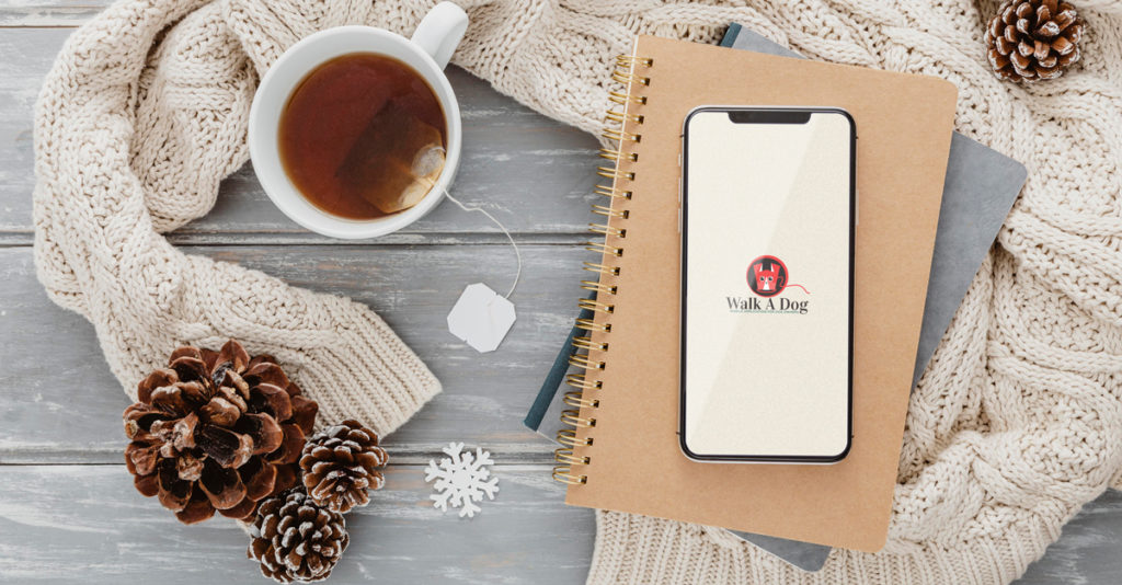
For our clients from the Walk A Dog application, we designed the entire visual identity and UI/UX design of the mobile application. An app made for dog owners who want to connect with each other. So, it is not surprising that we chose this cute illustrated dog as our icon. This colorful and cheerful design faithfully represents this social app, their users and their furry pets.
UX and UI design
UX and UI design are terms that we encounter a lot nowadays. App development is on the rise and many companies are looking to create mobile or web apps to improve their customer experience and boost sales.
UX design is an abbreviation of User Experience, and UI of User Interface. The UI usually encompasses the overall design of the application (from choosing colors, layout design, individual design elements, etc.), and UX is part of that process, but the focus is more on the use of the application, than its appearance. With UX, it is important that the communication between the application and the user is uninterrupted, simple and functional. UI is a part (usually the last stage) of UX design.
One of the most important things to remember about UX design is that you don’t try to invent something completely different and special. Clients are already used to mobile phones and apps and expect certain items to be in a certain places. Very often there is a good reason for this, such as better visibility of the application and its easier use. It’s okay to change some things, of course, but don’t be tempted to innovate how apps are used. Because of this, the application could encounter resistance from users and so become unsuccessful. We want users to use the application as much as possible, to make it simple and easy to use.
Also, don’t overwhelm the user with information. Emphasize the most important things with your design. Remove unnecessary text and design elements. Focus only on what is really important.
Since mobile apps are used with fingers, it is important that design elements are easily accessible. All important elements should be located at the bottom of the screen so that users can reach them with their thumb.
Do you like this logo? Then take a look at our other works from the Logo category.
Logo design for mobile app
Designing a logo for a mobile app is similar to designing a logo for other purposes, but there are some differences that need to be addressed.
SIZE AND RESOLUTION
The logo used for mobile applications is displayed in different sizes. From small icons to larger sizes on banners. The logo should therefore be legible and recognizable in all sizes. It should be able to scale without losing its original quality. The resolution of the screen on which the logo will be displayed should also be taken into account, as this can additionally affect the quality of the appearance, i.e. again its clarity and legibility.
CONTRAST
When designing a logo for a mobile app, contrast is very important. The goal should be high-contrast logos. Whether the contrast is made through color (this is why we often see logos in black and white contrast in mobile apps) or through a design element (font size and type), this is what will make the logo stand out. That is what we want. So that users can quickly find and recognize our company’s logo in a sea of other icons.
VERSATILITY
More than other logos, a mobile app logo needs to be extremely versatile. While many other businesses may never need a mobile application together with some other forms of advertising, and their logo design can then have more freedom, this is not the case with mobile app logos. This logo will be used in many different media, digital and print, in many sizes and in many ways.
That is why it is extremely important to keep in mind that this type of a logo must be adapted to the design in order to be easily applied in all the necessary ways. It should be able to adapt to different color schemes and layouts and work well in both horizontal and vertical orientations.
BRANDING
Finally, don’t forget about branding. If the app is a part of a larger brand, the design should follow the guidelines from the book of standards. This includes using the same color palette, typography and overall visual style as the rest of the brand. In that way, a cohesive and consistent brand identity is created at all touch points.
In short, designing a logo for a mobile app is a unique challenge that requires careful consideration of simplicity, scalability, versatility, and branding. Keeping these factors in mind, you can create a logo that will help you further your business.
You can view our other works in the portfolio.
Do you want to make a logo with us? Contact us at the email address or via the contact form. We are waiting for you!
If you want to know more about graphic design, feel free to take a look at our blog, where you will find many interesting articles, one of which is about logo.
Zale Design Studio